
 Andrew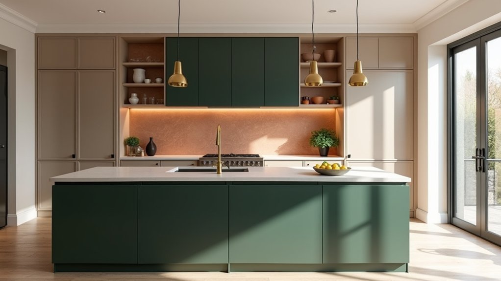
Like the best-designed retreats, your 2025 kitchen starts with a palette that feels calm but intentional. You’re seeing the market move toward warmer neutrals, clay tones, and deeper blues and greens because they photograph well, pair with natural materials, and hold value beyond a single season. But your light, layout, and finish choice can make the same colour look premium or flat—so the next step is to choose what works in your space before you commit…
Kitchen Colour Trends 2025: The Big Shifts
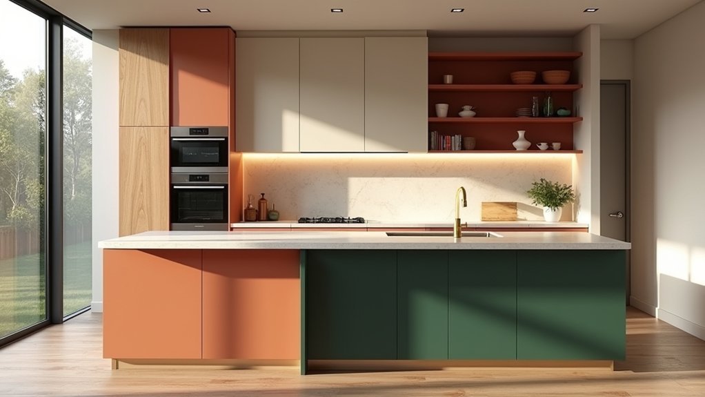
While last year’s kitchens leaned hard into safe whites and soft greiges, 2025 shifts the palette toward warmer neutrals, nature-led greens, and deeper “new classic” tones like navy and oxblood—colours that feel grounded but still premium. You’re seeing brands expand these ranges because shoppers keep paying more for “heritage” hues and biophilic shades that photograph well and reduce reno regret.
Kitchen colour psychology is driving the move: warm taupes read welcoming, greens signal calm and health, and dark blues telegraph quality without feeling stark. You’ll also notice Sustainable colour choices gaining share—low-VOC paints, mineral pigments, and longer-wear finishes—because buyers increasingly filter products by eco labels and lifecycle durability, not just swatch appeal.
Choose Kitchen Colours for Your Light and Layout
Those 2025 “heritage” hues and biophilic greens only land well if they match your kitchen’s daylight, artificial lighting, and sightlines. Start by mapping exposure: north light skews cool, so you’ll need warmer undertones; south light amplifies saturation, so dial chroma back to avoid glare. Use Color psychology to decide impact—energising tones on island seating, calmer shades where you prep.
Then optimise color application for layout. In galley kitchens, keep perimeter cabinetry lighter to widen the corridor, and place darker colour on the far wall to pull depth. In open-plan spaces, repeat one accent across tall units, splashback, and stools so the zone reads intentional.
Finally, test swatches under 2700K and 4000K LEDs; buyers notice mismatches instantly.
Earthy Neutrals: Warm Kitchen Colours for 2025
Because buyers keep rewarding warmth and tactility in surveys and resale reports, earthy neutrals are set to be the safest, most design-forward kitchen colours for 2025. You’ll see soft oat, mushroom, greige, warm putty, and sand outperform stark white because they photograph well and feel calmer under mixed lighting.
If you’re planning for resale, keep undertones consistent: pair warm neutrals with brushed brass or matte black, and use one deeper shade on an island for contrast without risk. You can also signal value by specifying sustainable materials—oak veneers, cork accents, recycled glass—so the palette reads intentional, not bland.
Choose eco-friendly paints in low-VOC, washable finishes to meet healthier-home demand and reduce callbacks from scuffs and splashes. This approach stays modern across price tiers nationwide.
Clay and Terracotta: 2025 Kitchen Colour Warmth
You’re seeing clay and terracotta climb the 2025 kitchen colour charts as buyers pivot toward grounded, earthy warmth.
You’ll get the strongest ROI when you pair these tones with natural materials like oak, travertine, rattan, and brushed brass for a cohesive, premium look.
You’ll also want layered warm lighting—2700–3000K LEDs, under-cabinet strips, and soft pendants—to keep the colour reading rich instead of flat.
Earthy Tones Rising
As homeowners keep prioritising warmth and natural materials in 2025 remodels, earthy kitchen colours—especially clay and terracotta—are rising fast as the go-to alternative to stark white and cool grey. You’ll see this shift in new-home finish packages and cabinet launches, where warm neutrals now outpace icy tones in assortment depth and reorder rates.
Designers report higher client “yes” rates when these hues soften light, hide minor scuffs, and photograph well for listings. You can also tap the eco angle: brands are marketing Natural dyeing inspirations and Sustainable pigments to justify premium paint lines and quicker sell-through.
For a modern look, you’ll specify muted terracotta, dusty clay, or sunbaked sienna, then balance them with crisp trim and controlled sheen levels.
Pairing With Natural Materials
While clay and terracotta bring the warmth buyers want in 2025, they sell the look fastest when you pair them with honest, natural materials—think rift-sawn oak, walnut, travertine, tadelakt-style plaster, and unlacquered brass.
You’ll get higher perceived value because these finishes photograph authentically and signal longevity, two traits driving shortlist decisions in listings and showrooms.
Build natural wood accents into island panels, open shelving, or toe-kicks to soften saturated clay fronts without turning rustic.
Then use stone texture contrast—honed travertine, leathered granite, or sandblasted quartzite—to keep the palette grounded and premium.
Stick to low-sheen, tactile surfaces so the colour reads rich, not flat.
If you’re renovating to resell, this combo widens appeal across modern, Mediterranean, and Japandi buyers.
Lighting For Warmth
Because clay and terracotta sit in the red–orange range, lighting choice can make the difference between “sun-baked and premium” and “muddy and flat” in photos and walkthroughs. Aim for 2700K–3000K LEDs: warm enough to amplify depth, neutral enough to keep orange from skewing too pumpkin.
Layer your plan—ceiling ambient glow, under-cabinet task strips, and one statement pendant—so shadows don’t dull the colour. Choose high-CRI (90+). It renders clay undertones accurately, a spec buyers and designers increasingly ask for in 2025.
Put dimmers on all lighting fixtures, then set scenes: 100% for prep, 60% for entertaining, 30% for evening calm. If you’ve got matte fronts, add a soft wall wash to lift texture without glare.
Moody Green Kitchen Colours That Feel Timeless
If you want a colour that signals “2025” without feeling like a short-lived trend, moody green delivers: it’s showing up across new cabinet launches and top-performing kitchen inspiration boards because it reads both modern and enduring.
You’ll see Moody greens winning because they balance warmth and restraint, giving you a grounded backdrop for brass, blackened steel, or oak.
For resale-minded choices, lean into mid-to-deep olives, forest, and eucalyptus: they photograph richer than pale sages and hold contrast under mixed lighting.
Pair them with off-white walls and pale stone to keep the room bright, then add texture through fluted fronts or honed finishes.
You’ll get classic elegance without looking traditional, and you won’t tire of it next season.
Deep Blue Kitchen Colours for a Modern Classic
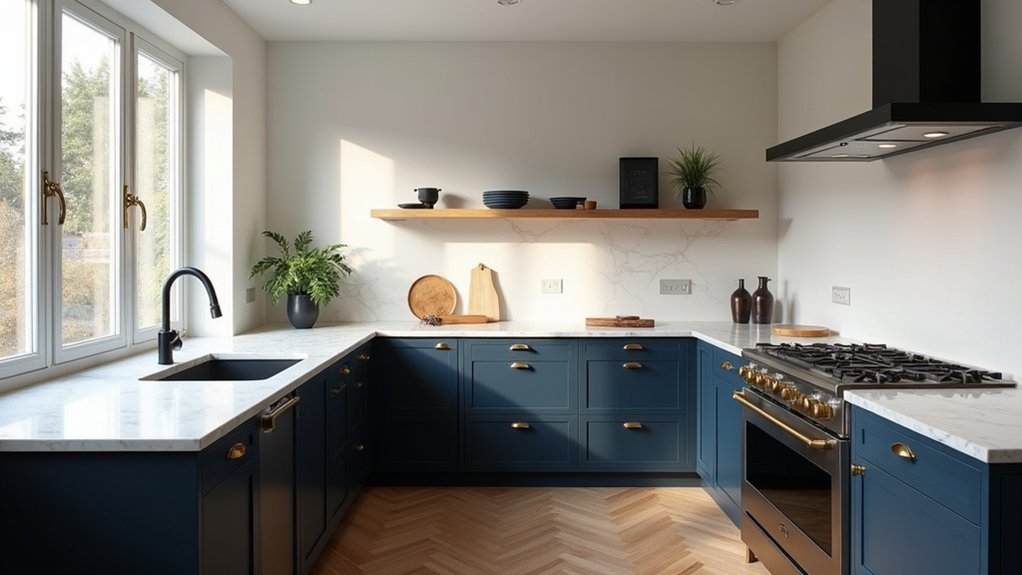
In 2025, you can use deep blue to land that modern-classic sweet spot, and demand data keeps it strong because it reads premium without feeling trendy.
You’ll get the most timeless impact when you pair it with warm whites, walnut tones, brushed brass, or honed stone that balances the depth.
For deep blue cabinet finishes, you can choose velvety mattes for a tailored look or low-sheen lacquers to boost light and resale appeal.
Timeless Deep Blue Pairings
Why does deep blue keep showing up in 2025’s most-saved kitchen palettes? Because it reads premium, grounds open-plan spaces, and performs well in buyer surveys—especially when you balance it with light, warm neutrals.
Pair deep blue with creamy off-whites to lift the room, or with greige for a softer, design-led look that still feels current.
For a modern classic, add Deep blue accents through bar stools, glassware, or a statement runner, then sharpen the scheme with brass or brushed nickel.
The real upgrade comes from contrasting textures: honed stone beside glossy tile, fluted oak against smooth quartz, or matte paint paired with ribbed glass.
Keep the palette tight—two neutrals plus blue—and you’ll get timeless impact without trend fatigue.
Deep Blue Cabinet Finishes
How do you make deep blue feel modern—not moody—across a whole run of cabinetry? You start with finish choice: matte reads contemporary, while satin gives a cleaner, higher-end reflectance under LEDs.
Deep blue cabinet finishes are trending because they photograph like black but hide fingerprints better; retailers report higher buyer interest in “navy” versus true black on 2025 mood boards.
Keep the look light by pairing blue lowers with warm white uppers, or run full-height blue and switch to pale quartz with subtle veining. Add brushed brass or champagne bronze pulls to lift contrast without harshness.
Use Deep blue paint accents on an island end panel, toe-kick, or pantry door to tie the palette together and control cost.
Soft Pastels: 2025 Kitchen Colours Made Grown-Up
Although bold colour still grabs headlines, soft pastels are set to do the heavy lifting in 2025 kitchens because they deliver “newness” without the resale risk—design trend reports and showroom feedback keep pointing to muted blush, powder blue, misty lavender, and pistachio as the sweet spot between warmth and restraint.
If you want an on-trend update that still reads premium, lean into Pastel palettes with low-saturation undertones and a matte-to-satin sheen. You’ll get a calmer backdrop for open-plan living, and you won’t lock yourself into a fad.
Soft shades also photograph cleaner for listings and social content, which matters as buyers increasingly shortlist homes online. For impact, use pastels on lower cabinetry or a statement island, then repeat the tone subtly in stools, art, or textiles to keep it cohesive without feeling themed.
Match Kitchen Colours With Benchtops and Splashbacks
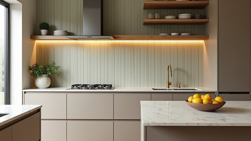
When you pair kitchen colours with benchtops and splashbacks, you control the two surfaces buyers notice first—and 2025 showroom trends keep rewarding combinations that read intentional on camera and in open-plan light.
Start with the benchtop’s undertone: warm whites suit beige, oak, and brass flecks; cool marbles prefer blue-greys and crisp whites. Use Color psychology to steer perception: dark splashbacks plus light cabinetry signal premium contrast, while tonal pairings feel calm and “new-build” clean.
Keep ratios predictable—designers lean on a 60/30/10 balance across cabinets, stone, and splash.
For durability and finish clarity, choose Paint application techniques that match sheen to material: matte hides wall flaws near textured tiles, satin cleans better beside polished stone.
Pick Hardware and Lighting for Your Kitchen Colours
Because hardware and lighting sit at eye level and get used daily, they can make your 2025 kitchen colour palette look premium—or visually “off” in listings and open-plan light.
Choose Hardware finishes that echo your undertones: brushed nickel or chrome sharpens cool whites and blue-greys, while brass and bronze elevate warm neutrals, greige, and clay. Matte black still signals “architectural,” but use it to outline, not dominate, when cabinets are dark.
For lighting styles, buyers respond to layered light: recessed LEDs for clean coverage plus pendants to define the island.
Pick 2700–3000K for warm palettes and 3000–3500K for crisp, modern schemes, and match metals to taps for cohesion. Use dimmers to shift from daytime clarity to evening warmth.
Avoid These Kitchen Colour Mistakes in 2025
Even if you’re chasing a 2025 “timeless” look, a few colour missteps can date your kitchen faster than the cabinets themselves and weaken resale appeal in photos. First, don’t ignore undertones: pairing warm oak with cool greys can read “mismatched” under LED and daylight, a common complaint in listing feedback.
Second, avoid ultra-saturated trend colours on big surfaces; buyers scan faster online, and bold walls can shrink perceived space. Use Color psychology: calm greens and soft neutrals test well for comfort and cleanliness, while harsh reds can signal clutter or heat.
Third, skip flat, bargain paint in work zones. Prioritize paint durability—scrubbable, stain-resistant finishes protect value where splatter and steam hit hardest.
Finally, sample on multiple walls before you commit.
Frequently Asked Questions
How Do Kitchen Colours Affect Home Resale Value in 2025?
Kitchen colours can lift your 2025 resale value, like a fresh coat of confidence. You’ll use color psychology—warm neutrals, soft greens, and crisp whites—to signal move-in readiness, align with buyer trends, and support stronger comps.
What Paint Finish Is Best for Kitchen Walls: Matte, Satin, or Semi-Gloss?
Choose satin for most kitchen walls; you’ll balance paint durability with a modern, buyer-friendly sheen. Use semi-gloss near sinks and backsplashes for scrub resistance, and matte only for low-traffic texture options and touch-ups.
How Can I Make Existing Cabinet Colours Look Updated Without Repainting?
You can refresh existing cabinets with cabinet colour updates: swap hardware, add under-cabinet lighting, and apply cabinet finishing techniques like glazing or clear-coat toners. You’ll align with top remodel ROI trends and boost buyer appeal.
Are There Low-Voc or Non-Toxic Kitchen Paint Options in Trending Colours?
Yes—you’ll find low-VOC, zero-VOC paints in trending sage, clay, and warm whites. Choose brands using Eco friendly pigments and non toxic finishes; they meet strict emissions standards and boost buyer appeal in listings.
How Much Should I Budget for a Full Kitchen Colour Refresh in 2025?
Budget $800–$4,500 for a full kitchen colour refresh in 2025: low-cost paint versus pro labour. You’ll spend more on Color coordination, yet paint durability pays. Trend-driven accents add $150–$900 extra.


