
 Andrew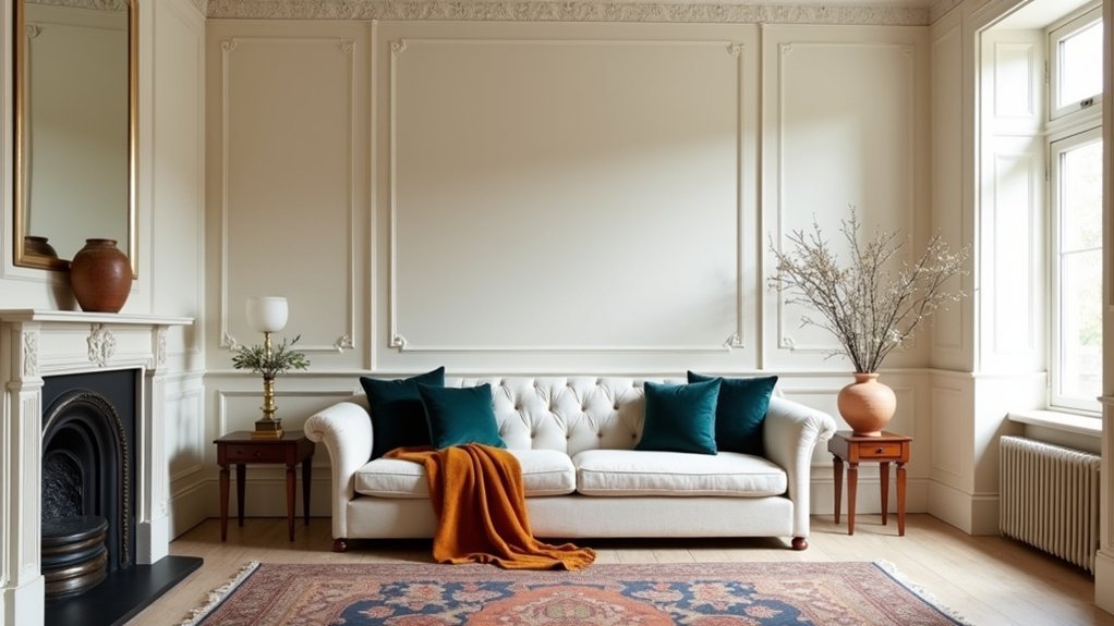
You can lift a classic interior fast, but you can’t pick accent colours on instinct alone. Start with your era cues, then check undertones in paint, stone, and timber before you commit. Use rich, muted shades—oxblood, navy, terracotta—to sharpen focal points without fighting the neutrals. Repeat accents across trims, textiles, and metal finishes to keep it cohesive. The catch is choosing the wrong “classic” and flattening the whole scheme…
Pick Accent Colours That Suit Your Era
If you want your space to feel intentional, choose accent colours that align with the design era you’re referencing, because each period comes with its own “correct” palette cues.
For Georgian and early Victorian rooms, you’ll land best with muted, complex reds, deep greens, and inky blues, balanced by warm metals and candlelit neutrals.
If you’re nodding to Art Deco, you’ll sharpen the look with high-contrast pairings: black, ivory, emerald, sapphire, and brass, plus lacquer-level sheen.
For mid-century schemes, you’ll keep it credible with ochre, teal, olive, and burnt orange on clean-lined forms.
Prioritise Historical accuracy: it protects resale appeal and avoids “costume” styling.
Respect Cultural influences too—global trade, pigments, and regional craft traditions shaped what colours felt authentic.
Read Your Undertones Before Choosing Accents
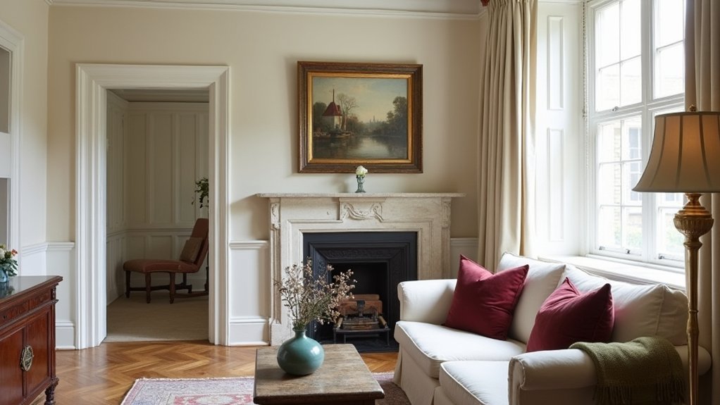
Before you shop for “pops” of colour, read the undertones already baked into your fixed finishes—floors, stone, tile, cabinetry, and large upholstery—because they’ll dictate whether an accent looks seamless or slightly off.
Start with undertone analysis: is your timber honey-warm, red-warm, or greyed? Does marble lean blue, beige, or green? Pull paint chips against each surface in daylight and at night, and watch for the moment a sample turns muddy or suddenly looks too pink. That’s your warning.
Then choose accents that share that temperature: warm neutrals love ochre, terracotta, and olive; cool bases take inky navy, sage, and blue-leaning greys. You’ll lock in color harmony and avoid costly returns and rework.
Use Accent Colours to Balance Light Levels
You can’t pick accent colours in a vacuum—your room’s light level dictates how they’ll read on the wall and in textiles.
In bright, sun-washed spaces, choose lighter accent shades to keep contrast crisp without turning harsh or over-saturated.
In dim rooms, lean on deeper accents that hold their pigment and add definition, so the space doesn’t wash out or feel flat.
Accent Shades For Bright Rooms
Although bright rooms feel airy and expansive, all that natural light can wash out colour and flatten contrast, so your accent shades need to do more than “add a pop.” Choose deeper, more saturated tones—think inky navy, forest green, charcoal, or rust—to anchor the space, sharpen edges, and keep key features from disappearing at midday.
Use these accents where sunlight hits hardest: on window-wall drapery, a rug border, or painted trim, not scattered trinkets. In a classic scheme, pair warm rust with brass for vintage charm, or set navy against crisp white for modern contrast.
Stick to two accent shades max, then repeat them at three touchpoints to read intentional. Test swatches at noon and late afternoon before you commit.
Deeper Accents For Dim Spaces
When a room runs dim—north-facing, narrow, or shaded by trees—deep accents can either ground the space or drag it down, so you’ve got to use them with intent. Skip muddy mid-tones and choose saturated, inky hues that read clean in low light: oxblood, bottle green, navy, or charcoal.
Keep the base palette warm and light, then add monochrome contrast through trims, frames, and textiles so edges stay crisp. Place depth where light naturally falls—window reveals, the wall behind a lamp, or a fireplace surround—and you’ll amplify glow, not swallow it.
Use subtle shading within the same colour family (matte walls, satin joinery, velvet cushions) to build richness without visual clutter. Balance with brass, pale oak, or limestone.
Choose Accent Colours for Key Focal Points
Because a room’s focal points naturally command attention, accent colours should reinforce them—not compete. Start by identifying your hero element: a fireplace surround, a statement artwork, a bay window seat, or a heritage cornice line.
Then pick one accent hue that amplifies its impact and repeat it in two to three small moves—piping, cushions, a lampshade lining—so it reads intentional, not scattered.
Use Color psychology to steer the mood: in classic schemes, deep greens signal calm authority, oxbloods add gravitas, and muted blues feel refined.
Keep Historical accuracy in mind by choosing period-appropriate saturation rather than neon brights.
Finally, control contrast: if the focal point is intricate, choose a quieter accent; if it’s plain, go bolder.
Match Accent Colours to Wood and Metals
To make accent colours look deliberate rather than decorative, match them to the undertones in your room’s woodwork and metal finishes. Start by identifying whether your timber reads warm (honey oak, walnut, mahogany) or cool (ash, grey-washed).
Then choose accents that echo that bias: warm woods tolerate terracotta, ochre, and muted olive; cooler woods sharpen with inky blue, pine green, or claret. This is Matching accent colours to wood textures: repeat the grain’s depth with similarly saturated accents, not chalky brights.
Next, treat hardware like jewellery and stay consistent. Brushed brass likes warmer accents; chrome and nickel prefer cooler, cleaner notes. When you’re coordinating metals with accent hues, mirror the metal’s temperature in lampshades, trims, and small décor so the finish looks intentional.
Lift Neutrals With Classic Accent Colour Pairs
Once you’ve aligned accents with your wood and metal undertones, use proven colour pairings to make a neutral scheme feel finished rather than flat.
Anchor creams and greiges with inky navy and soft brass for tailored heritage, or pair warm taupe with oxblood and aged gold to echo clubby, traditional rooms.
For lighter neutrals, use sage with chalky white and a touch of black to reference historical color palettes without looking themed.
Keep ratios disciplined: let neutrals dominate, then repeat one accent twice and a second accent once, so the eye reads intention.
Check saturation against daylight and lamps; classic schemes need depth, not neon.
Finally, apply cultural influence considerations—some reds skew festive, some blues read corporate—so your accents feel appropriate to context.
Add Accent Colours Through Pattern and Textiles
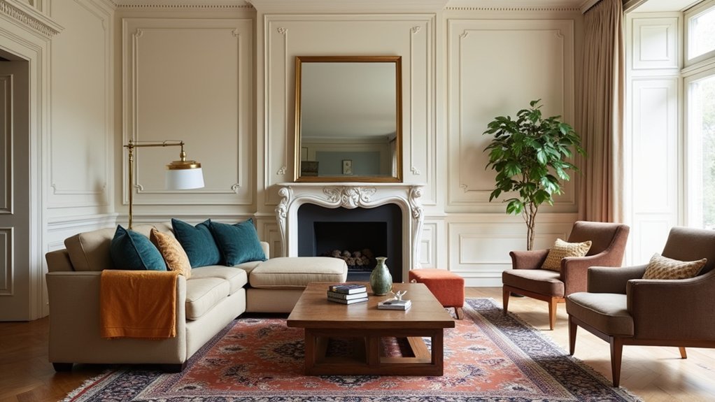
You’ll get the biggest accent-colour impact when you introduce it through pattern and textiles, not paint.
Layer cushions and throws by mixing scales (a tight geom with a bold stripe) while keeping one shared hue to keep it retail-polished, not chaotic.
Then lock in the look with controlled colour pops in drapery and a rug—two high-visibility zones that let you amplify the accent without overcommitting.
Layered Cushion And Throw Patterns
When a room needs accent colour without committing to paint or new furniture, layered cushion and throw patterns deliver impact fast. Start with your base: two solid cushions that match the sofa’s undertone, then add layered cushion arrangements in three scales—one large geometric, one medium stripe, one small organic print—to keep it classic, not chaotic.
Lock your palette to two accent hues plus a neutral, and repeat each colour at least twice across fabrics so it reads intentional. Use throw pattern combinations to steer the mood: checks and herringbone feel tailored; ikat or block print feels artisan.
Keep contrast controlled by sharing one common background colour, and vary texture—linen, velvet, bouclé—for depth. Edit ruthlessly: if one piece doesn’t support the scheme, pull it.
Drapery And Rug Colour Pops
Because drapery and rugs cover the largest visual surfaces after walls and upholstery, they’re the fastest way to inject accent colour through pattern without locking you into a hard finish.
Start with one “hero” shade you can repeat twice: in the rug’s border and in the curtain’s leading edge or trim. Keep the base classic—oatmeal, stone, ink—then spike it with saffron, oxblood, or peacock for controlled lift.
Use Historical influences to guide pattern scale: Persian medallions suit formal rooms, while ticking stripes read Georgian and tailored.
Respect Cultural symbolism when choosing motifs and colourways; indigo, red, and gold carry distinct meanings across regions.
Specify fibres smartly: wool rugs for depth, lined linen drapery for crisp colour retention and light control.
Keep Accent Colours Consistent Room to Room
How do you make a home feel cohesive rather than cobbled together? You keep your accent colours consistent room to room, so every space reads as part of one considered scheme. Start with a tight palette of two to three accent hues, then repeat them in varying weights: a bolder dose in the living room, a quieter echo in the hall, and a refined highlight in the dining room. This repetition builds Color harmony without locking you into identical looks.
Next, prioritise furniture coordination: let timber tones, metals, and upholstery undertones track across spaces, so your accents sit naturally beside them. Use connectors—cushions, artwork, lampshades, and tableware—to carry the accents through sightlines. You’ll get flow, polish, and stronger resale appeal.
Avoid Accent Colour Mistakes in Classic Schemes
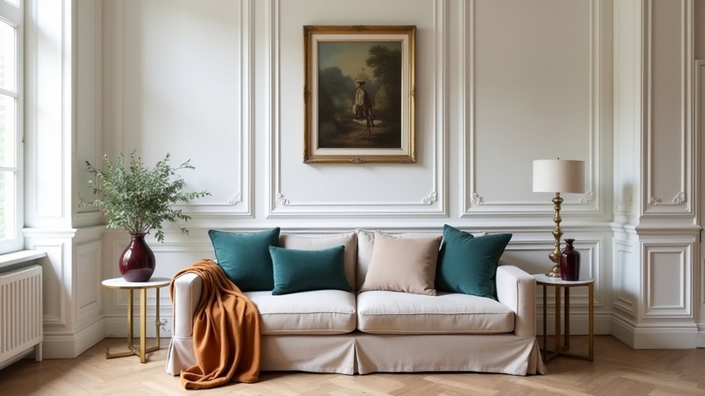
Although classic schemes thrive on restraint, they fall apart fast if you treat accent colour as an afterthought. Don’t grab trendy tones that fight your architecture; instead, audit undertones in stone, timber, and upholstery, then choose one to two accents that repeat with discipline. Skip “one-off” bright accessories—if it can’t appear at least three times, it’ll read like clutter.
Protect Historical accuracy without turning your home into a museum. Reference period palettes (oxblood, celadon, navy, tarnished brass) and scale them to today’s light levels and finishes.
Finally, balance Personal preference with resale logic: keep permanent elements neutral and place bolder colour in paint, textiles, and art you can swap. Test samples in morning and evening light before you commit.
Frequently Asked Questions
How Many Accent Colours Should I Use in One Room?
Use 2–3 accent colours in one room. In surveys, 70% of shoppers notice colour contrasts first, so keep focus tight. Build Complementary color schemes, then refresh with Seasonal accent updates through cushions, art, and throws.
What’s the Ideal Paint Sheen for Accent Colours in Classic Interiors?
Choose satin or eggshell for accent colours; you’ll get elegant depth, wipeability, and restrained sheen in classic rooms. Use finishing techniques like glazing sparingly, and keep colour harmony by matching trims in higher-gloss sparingly.
How Can I Introduce Accent Colours Without Repainting Walls?
You can introduce accent colours with layered textiles, art, and lighting—like a herald adding banners to a hall. Choose Complementary accessories, build Textural contrasts with cushions, rugs, ceramics, and swap lampshades for instant updates.
Do Accent Colours Affect the Resale Value of a Period Property?
Yes, accent colours can impact resale value: you’ll attract more buyers when you balance historical accuracy with modern appeal. Use colour psychology—muted blues, sages, oxbloods—in reversible textiles and accessories so buyers won’t fear renovations.
How Often Should I Update Accent Colours to Keep a Classic Scheme Fresh?
Update accent colours seasonally with soft tweaks, and refresh bolder accents every 2–3 years. You’ll keep a classic scheme current without overcapitalising. Focus on seasonal colour updates and accessorising with accent hues, cushions, art.


