
 Andrew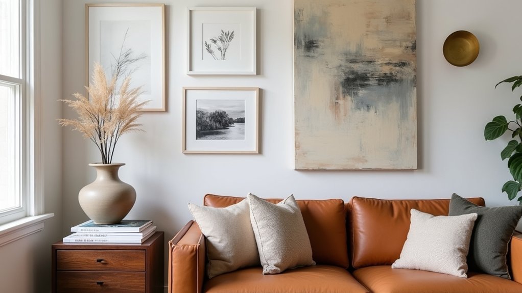
You choose, you curate, you edit—artwork and wall décor let you signal who you are without saying a word. Start by matching pieces to your style story, then size them to the room and hang them at true eye level so they feel intentional, not random. Use frames, texture, and a tight color palette to control the mood and the budget. The key is knowing what to place first, and what to leave out…
Choose Artwork That Matches Your Style Story
Why does one piece of art feel “right” in your space while another looks like a random add-on? It’s usually because the “right” piece reinforces your style story—your repeating cues in color, era, materials, and mood.
Start by naming your baseline: modern minimal, warm interlude, eclectic vintage, or coastal calm. Then audit what you already own: rugs, textiles, and finishes reveal your true preferences faster than Pinterest does.
Choose artwork that echoes those signals, not fights them. Use artistic expression as a connector: pick subjects and palettes that mirror how you want the room to feel—energized, grounded, or contemplative.
Finally, curate like a buyer: invest in a few anchors and build a personal collection with smaller, flexible finds.
Pick Wall Décor Sizes That Fit the Room
You can’t rely on great art alone if the scale fights your furniture, so size your wall décor to the anchor pieces it sits above or beside.
Then balance the wall against the room’s volume—too small reads like clutter, too large overwhelms and wastes visual “real estate.”
Aim for clean proportions by selecting art dimensions that relate logically to the wall span and the viewing distance.
Match Scale To Furniture
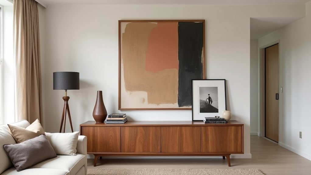
Although color and style grab attention first, scale determines whether wall décor feels intentional or accidental. Start by sizing art to the furniture it hangs over: aim for roughly two‑thirds to three‑quarters of a sofa, bed, or console width.
If you choose a single piece, go taller when the furniture is low-profile; go wider when the piece is visually heavy. For pairs or triptychs, treat the full span as one unit.
Use market logic: large statements cost more, but they reduce the need for extra accessories. Check viewing distance—bigger rooms demand bolder dimensions. Test with paper templates before buying.
Keep color schemes and lighting effects consistent so the scale reads premium, not patchy.
Balance Wall And Room
Once you’ve matched art to the furniture, sanity-check it against the room itself so the wall doesn’t feel top-heavy or underdressed. Step back to the doorway and read the whole space: ceiling height, window breaks, and traffic paths. If the wall competes with architectural features, scale down the visual weight by choosing fewer pieces, lighter frames, or more negative space.
Aim for Color harmony that supports the room’s dominant finishes, not a random accent that hijacks attention. Use Texture layering to balance sleek rooms: mix matte paper, woven elements, and a single reflective surface so the wall feels intentional without glare.
In small rooms, keep depth shallow; in larger rooms, add dimensional objects to prevent a flat, vacant look.
Choose Proper Art Proportions
When art scales correctly, it makes the room feel finished rather than improvised. Start by sizing the piece to the wall zone, not the whole wall: aim for 60–75% of the width of the sofa, console, or bed it sits above.
If you’re hanging a single work on an empty wall, let it fill enough visual real estate to compete with furniture mass, especially in open-plan spaces where undersized art looks budget-driven.
Use grids and tape to mock dimensions before you buy, then compare against ceiling height and sightlines. Keep color harmony tight with adjacent textiles, but add material contrast—glass, metal, wood—to avoid flat, showroom sameness.
Choose frames and mats that scale the artwork up without overpowering it.
Plan Artwork Placement at Eye Level
You’ll get the most polished, gallery-like impact when you hang art at eye level, not where leftover wall space suggests. Start by setting a consistent center height as your baseline.
Then fine-tune it to suit the room’s function—seated viewing in a living room, standing traffic in a hallway, or above furniture in a dining area. This simple adjustment keeps your décor looking intentional, balanced, and buyer-approved.
Find The Ideal Height
Although size and style grab attention first, height is what makes artwork feel intentional instead of random. Start by targeting a gallery-standard centerline around 57–60 inches from the floor, then measure your frame’s height and mark the midpoint. If you’re grouping pieces, treat the entire arrangement as one unit and find that collective center. This approach keeps sightlines consistent and boosts perceived value, like a well-merchandised showroom wall.
Use reliable hanging techniques: level, painter’s tape mockups, and two-point support to prevent tilt. For wall mounting, choose hardware matched to weight and material—anchors for drywall, screws into studs when possible, and picture hooks for lighter frames. Recheck with a tape measure before drilling; small shifts change the whole read.
Adjust For Room Function
Because each room gets used differently, the “right” eye level shifts with function, not just aesthetics. In living rooms, you’re typically seated, so drop art a few inches so the center aligns with your seated sightline and anchors the sofa zone.
In dining areas, keep pieces slightly higher to clear chair backs and maintain a clean horizon line above the table.
In hallways and stairs, follow the primary walking line: measure from the tread or floor where you’ll stand most, then keep centers consistent to avoid a choppy gallery effect.
Bedrooms benefit from lower placement near nightstands for calmer viewing, especially with soft lighting ambiance.
In kitchens or entries, place art above storage solutions so it reads intentional, not cluttered.
Build a Gallery Wall That Looks Intentional
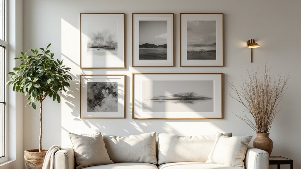
Whether you’re working with a blank wall or trying to corral a mix of prints, photos, and objects, a gallery wall looks intentional when it follows a clear system instead of a random accumulation. Start by choosing one unifier: matching frames, consistent mat widths, or a tight palette for color coordination.
Then pick a layout rule—grid for modern spaces, salon-style for eclectic rooms—and stick to repeatable spacing (2–3 inches). Mock it up with paper templates and painter’s tape so you can edit fast without extra holes.
Anchor the arrangement with one oversized piece or a centered “hero” image, then build outward in balanced rows.
Finally, plan lighting enhancement: aim a picture light or adjustable spot to reduce glare and keep contrast consistent across different finishes.
Use Wall Décor to Add Color and Texture
When your room feels flat, wall décor can do more than fill space—it can introduce targeted color and tactile contrast without the cost or commitment of repainting. Start by auditing your palette: pick one accent hue already present in pillows or rugs, then echo it on the wall for controlled Color contrast rather than random pops.
Next, use Texture mixing to keep the look layered and current. Pair smooth pieces (metal, glass, lacquer) with fibrous or dimensional options like woven baskets, textile panels, carved wood, or sculptural ceramics. If your furniture is sleek, prioritize matte, nubby surfaces; if your room is rustic, add a glossy or graphic element to sharpen it.
Shop smart: larger, textured items read premium, so you can buy fewer pieces and still get impact.
Frame and Hang Artwork Like a Pro
Color and texture set the mood, but clean framing and precise hanging make the room look intentional instead of improvised. Start by matching frame finish to your home’s “metal mix” and wood tones; consistency signals quality.
Use framing techniques that protect value: acid-free mats, UV acrylic for sunny rooms, and deeper float frames for textured pieces. Keep mat borders even, and don’t undersize frames—buyers read that as cheap.
Next, treat placement like a planogram: center art at 57–60 inches, align edges across a wall, and keep spacing in a gallery grid to 2–3 inches.
Choose hanging hardware for weight and wall type: D-rings and wire for midweight, French cleats for large pieces, anchors for drywall. Level twice, then lock with bumpers.
Refresh Artwork and Wall Décor Seasonally
As the seasons shift, your wall décor can do more than look “fresh”—it can strategically rebalance light, palette, and energy in a room without a full redesign. Treat Seasonal updates like a quarterly reset: swap one hero print, rotate textiles-as-art, or move a mirror to amplify winter daylight and soften summer glare.
Use artwork curation to match what the market calls “seasonal color stories.” In fall, lean into rusts and ochres to warm neutrals; in spring, introduce high-key botanicals to lift contrast.
Keep costs controlled by standardizing frame sizes and storing alternates in labeled sleeves. Edit ruthlessly: retire pieces that feel visually “heavy” when natural light increases. You’ll maintain novelty without adding clutter or overspending.
Frequently Asked Questions
How Do I Insure Valuable Artwork Displayed at Home?
Like locking rare wine in a cellar, you insure home artwork by buying Art insurance, documenting provenance, and scheduling pieces. Use valuation methods—appraisal, auction comps, replacement cost—update annually, and add security and climate controls to cut premiums.
What’s the Best Way to Clean and Maintain Different Art Mediums?
Use medium-specific Cleaning techniques: dust with microfiber; avoid sprays on canvas; use soft brush for paper; wipe glass with ammonia-free cleaner; consult conservator for oil/acrylic issues. Maintenance tips: stable humidity, UV filtering, proper framing.
How Can I Protect Artwork From Sunlight, Humidity, and Temperature Changes?
You protect artwork by using UV protection glass, placing pieces away from direct sun, and keeping climate control steady. You’ll hold humidity near 45–55%, avoid vents, and use archival backing and sealed frames.
Are There Affordable Ways to Commission Custom Art for My Space?
Yes—you can, and you should, if you compare, you negotiate, you iterate. For Affordable commissioning, use Custom art sources like art students, local illustrators, and online marketplaces; request sketches, set usage rights, cap revisions.
How Do I Buy Art Online Safely and Avoid Counterfeit Pieces?
Buy from Authentic sources—reputable galleries, verified marketplaces, or artists with provenance. Use Secure transactions: escrow, credit cards, and HTTPS. Check seller reviews, request certificates, reverse-image search listings, and avoid prices far below market.


