
 Andrew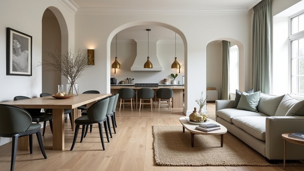
If your home feels a little “eclectic,” it’s usually just missing a clear throughline. You’ll get cohesion faster when you set three anchors—era, mood, and formality—then commit to a style direction that can flex room to room. From there, you repeat a tight color palette, core materials, and consistent finishes so the shifts feel intentional, not accidental. The catch is knowing what to standardize and what to vary—because that’s where most homes break.
Choose a Cohesive Interior Style Direction
If you want a home that feels intentionally designed rather than room-by-room improvised, you need to pick a clear style direction upfront. Start by defining three style anchors—era, mood, and level of formality—so every purchase supports the same story. Use market-proven categories like warm modern, transitional, or elevated coastal, then commit to them across rooms.
Next, translate the direction into decisions you’ll repeat: Furniture arrangement should reflect your style’s geometry (symmetrical for traditional, relaxed asymmetry for modern). Lighting design should reinforce it through fixture profiles and light quality (diffused, layered, or dramatic).
Audit what you already own, keep only pieces that match the direction, and sell the rest to fund higher-impact upgrades.
Build a Whole-Home Color Palette That Repeats
A clear style direction only holds together when your colors repeat from room to room, so lock in a whole-home palette before you buy another rug or paint sample. Pick one neutral base, one secondary neutral, and two accents; then assign ratios (70/20/10) so choices stay disciplined.
Audit sightlines: what you see from the entry should echo in adjacent spaces, even if values shift lighter or darker. Use Furniture placement to “carry” color—repeat an accent on a chair, pillow, or art where the eye naturally lands.
Calibrate for lighting design: north light cools, warm LEDs amberize, and daylight swings change saturation. Test swatches in morning and night, then standardize finishes to avoid unintended contrast. This reduces decision fatigue and protects resale appeal.
Repeat Key Materials for Cohesive Interior Style
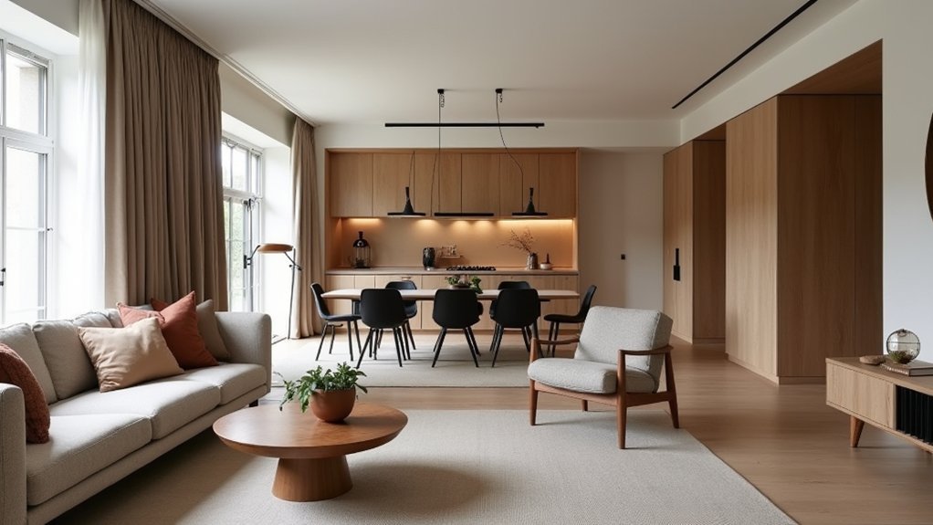
You’ll get a cohesive whole-home look faster when you anchor a few key materials—like oak, marble, or blackened steel—and repeat them room to room.
You should mix finishes with restraint so each space feels intentionally varied, not visually noisy or trend-chasing.
Then layer repeated textures (woven, matte, napped) across upholstery, rugs, and window treatments to create continuity that still reads premium.
Anchor Materials Room-To-Room
While each room can carry its own mood, repeating a tight set of anchor materials—think the same wood tone, metal finish, or stone family—creates a continuous visual logic as you move through the home. Choose two or three “core” materials and deploy them in every space, even if scale shifts: oak on floors, then on a vanity; a limestone family on counters, then on a hearth.
Evaluate material durability up front so high-touch zones don’t force later substitutions that break continuity. Use surface textures strategically: keep one signature texture consistent (matte wood grain, honed stone) and let color, pattern, or upholstery vary around it.
This approach reads as intentional, supports resale expectations, and simplifies sourcing, budgeting, and maintenance across renovations.
Mix Finishes With Restraint
Anchor materials set the backbone; finish choices decide whether that backbone reads polished or pieced together. You’ll get the most cohesion by limiting your finish family to two primaries and one accent across rooms—think brushed nickel plus matte black, with a touch of aged brass.
Keep sheen consistent on large elements: if you choose satin for door hardware, stay in that lane for faucets and lighting. Use contrast strategically, not everywhere, so bold color choices don’t compete with a chaotic metal mix.
When you place eclectic furniture, let finishes quietly connect the dots: repeat the same leg tone, frame color, or stone edge detail. Edit aggressively; if a finish doesn’t repeat twice, cut it.
Layer Repeated Textures
Because the eye trusts patterns more than statements, repeated textures do more for whole-home cohesion than another “signature” color ever will.
Pick three to five core materials—oak, linen, boucle, honed stone, aged brass—and let them reappear in every room at different scales. You’ll get layered textures without locking yourself into matchy sets: a linen drape echoes a linen sofa; a boucle chair reinforces a nubby rug; a stone tray nods to a stone countertop.
Treat pattern mixing as a controlled system: vary motif size, keep one background neutral, and repeat one tactile “anchor” in adjacent spaces. This strategy reads premium because it signals intentional sourcing, not trend-chasing, and it makes future swaps easier without breaking continuity.
Keep Finishes Consistent Across Multiple Rooms
To keep your home reading as one cohesive design, you need finishes to align as tightly as your layout. You’ll get the cleanest result by unifying metal finish tones, repeating the same wood-stain shade family, and standardizing where sheen shifts happen.
When you control those variables, each room feels intentional—not like a separate purchasing decision.
Unify Metal Finish Tones
How do you keep a whole-home design feeling intentional instead of pieced together? Start by unifying metal finish tones across rooms. Pick one dominant family—warm (brass, bronze) or cool (chrome, nickel)—and let it lead on the most repeated touchpoints: door hardware, plumbing, and key light fixtures. This reduces visual noise and makes flow feel planned.
You can still use metal finish variations, but control them: stay within the same undertone and limit the mix to two finishes total. When you want edge, apply finish contrast techniques strategically—use a single “accent” finish on statement pieces like a kitchen island pendant or a fireplace screen, then repeat that accent once elsewhere.
Consistency reads premium, and buyers notice.
Repeat Wood Stain Shades
Even if you mix eras and textures from room to room, repeating the same wood stain family instantly signals a deliberate, whole-home plan. Pick one undertone lane—warm walnut, neutral oak, or espresso—and let it recur on floors, stair parts, built-ins, and key casegoods.
You don’t need perfect matches, but you do need stain consistency: keep depth and undertone aligned so progressions feel intentional, not accidental. Audit each room in daylight, then standardize with a short, named palette (two to three stains max) and require samples before you buy.
When you vary species or grain, hold the wood finish constant in sheen level and color cast. This reduces visual noise and protects resale by reading “custom,” not “collected.”
Coordinate Paint Sheens
Because light hits a gloss level before it ever “reads” color, mismatched paint sheens can make adjacent rooms feel disjointed and cheaper than they are. To keep continuity, pick a primary paint sheen for most walls—typically eggshell or satin—and hold it across connected sightlines like halls, open-plan living areas, and stair runs.
Then assign sheens by function, not by room mood: flat for low-traffic ceilings, satin for trim you wipe, semi-gloss for doors, and moisture-rated satin or semi-gloss for baths. This structure protects finish consistency while still letting you vary color.
Before you buy gallons, test sheen shifts under day and night lighting; reflective finishes amplify bumps and patching. If resale matters, uniform sheen reads “well-maintained” to buyers and appraisers alike.
Use Patterns and Textures to Connect Spaces
While color sets the baseline, patterns and textures do the heavy lifting when you want multiple rooms to feel intentionally connected rather than copy-pasted. You’ll get better continuity by repeating a few motifs at different scales: a thin stripe in drapery, a bolder stripe in a hallway runner, or a micro-geom on pillows that echoes a larger rug pattern elsewhere.
Use Pattern pairing to manage contrast: keep one pattern dominant, one supporting, and hold them to a shared undertone so they read coordinated, not chaotic. Then build Texture layering across rooms—bouclé, linen, matte ceramics, rattan, brushed metals—so progression feel intentional even when palettes shift.
Track repeats like a merchandiser: limit to three core textures and rotate placements for a curated, premium finish.
Create Room-by-Room Focal Points That Still Match
If you treat focal points like a system instead of a series of one-off statements, you’ll get rooms that feel distinct yet unmistakably related. Start with Focal point selection: decide what “wins” in each room—fireplace, art wall, headboard, or statement lighting—then map those winners to your home’s core palette and finishes.
Next, control contrast. You can vary scale and shape, but keep one repeating cue: the same metal tone, wood species, or color family. That’s matching decor without copy-paste styling. Use a consistent frame profile, textile weight, or stone veining direction to signal continuity.
Finally, budget like a buyer: invest in high-visibility anchors, then echo them with smaller accessories so each room reads intentional, not competing.
Make Open-Concept Rooms Feel Cohesive, Not Flat
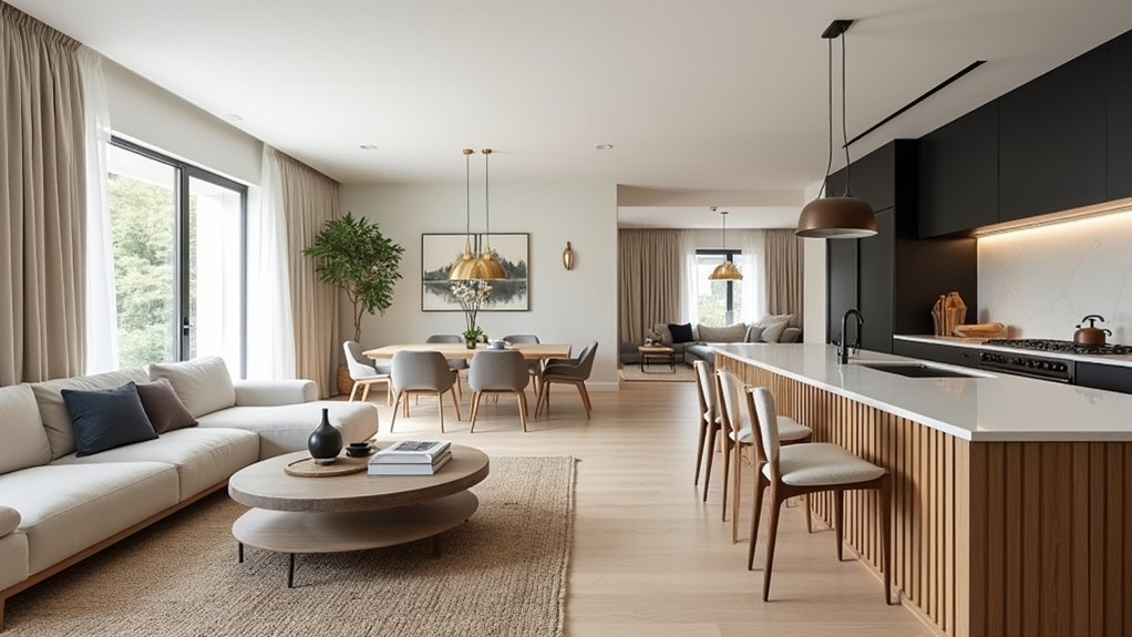
In an open-concept layout, you need cohesion that reads intentional without turning the whole space into one endless “matching set.” Start by defining one unifying backbone—your dominant neutral, primary wood tone, and metal finish—then let each zone (kitchen, dining, living) riff on it with controlled variation in texture and silhouette.
Use Furniture placement to “draw borders” without walls: float the sofa to anchor living, align dining chairs with island edges, and keep major pieces on parallel sightlines. Calibrate scale so one statement item doesn’t hijack the whole volume.
In lighting design, layer a consistent color temperature, then differentiate with purpose: pendants for task, a chandelier for dining emphasis, and floor lamps for lounge mood. Repeat one shade style to unify.
Tie Closed-Off Rooms Together With Transitions
Because closed-off rooms break sightlines, you need shifts that carry a few signature decisions from one space to the next without copying entire schemes. Start with thresholds: repeat one metal finish or wood tone in hardware, then echo it as doorway accents—casing paint, a slim picture light, or a consistent lever style.
Use flooring changes strategically: keep plank width consistent, but swap stain or lay direction to signal purpose without visual whiplash.
Treat the corridor as your brand bridge. Upgrade hallway lighting to a clear, intentional rhythm—matching sconces, consistent color temperature, and dimming—so every door reads as part of one system.
Finally, align trim heights, rug border colors, and one recurring art frame finish to reinforce continuity across stops.
Fix Common Cohesive Interior Style Mistakes Fast
Even when you’ve picked a clear style direction, a few high-impact mismatches can make the whole home feel piecemeal. Start by auditing your “repeatables”: metals, woods, and key textiles. If each room uses different finishes, pick one dominant metal and one wood tone, then swap the outliers (hardware, lamps, frames) for quick unity.
Next, fix scale errors. If your living room reads oversized and your dining room reads tiny, standardize visual weight with similarly proportioned rugs, curtains, and art.
Then tighten your palette: keep one neutral base and two accents across rooms, varying only intensity. Finally, resolve style conflict deliberately—pair Vintage charm with Modern minimalism by repeating a single era marker (arched mirror, clean-lined sofa) everywhere.
Track changes, don’t impulse-buy.
Frequently Asked Questions
How Do I Blend My Partner’s Style With Mine Without Clashing?
You blend styles without clashing by defining shared priorities, then using color coordination to unify. Audit both tastes, choose a dominant base, layer complementary accents, and enforce repeatable rules for style blending across key purchases.
What’s the Best Order to Decorate Rooms for Whole-Home Cohesion?
Start with shared sightlines: entry, living, dining, then kitchen and primary bedroom, finishing baths and secondary spaces. Lock Color coordination early, then standardize key materials; finalize accessory selection last to align budgets and lead times.
How Can I Keep a Cohesive Style When Renting and Can’T Renovate?
Renting’s no roadblock—it’s your runway: use Color coordination via repeatable textiles, rugs, and art, and enforce Style consistency with a tight palette, unified metals, and modular lighting. You’ll upgrade perceived value without permanent changes.
How Do I Make Existing Furniture Work With a New Cohesive Style?
Edit what you’ve got by standardizing Color harmony, then upgrade impact pieces. Refinish or re-cover key items, and use Texture pairing with pillows, rugs, and throws. Keep silhouettes consistent, remove outliers, and repeat materials.
What Budget-Friendly Upgrades Create the Biggest Cohesive Impact?
You’ll get the biggest cohesive impact by standardizing Color palettes, swapping Decorative accents, and updating lighting. Add matching hardware, consistent textiles, and one signature finish. You’ll signal intentional design while keeping spend low.


