
 Andrew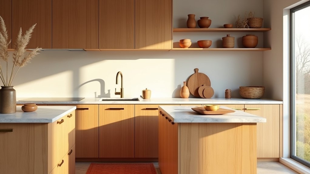
You can make your kitchen feel warmer and more finished by tightening your palette first—think butter yellow, terracotta, and caramel—then repeating those tones in wood, tile, and small accents. You’ll get the most impact from lighting that runs warm, not stark, and from décor that’s grouped with intention instead of scattered. The trick is knowing where to add texture and where to hold back, especially on counters and open shelves…
Pick a Warm Kitchen Color Palette
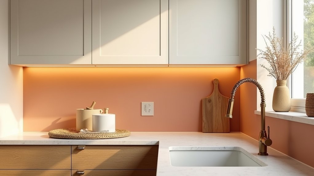
If you want your kitchen to feel welcoming instead of stark, start by choosing a warm color palette with a clear undertone. Decide whether you’re leaning yellow-gold, red-terracotta, or brown-caramel, then keep that undertone consistent across walls, trim, and any painted accents.
Use Color psychology to guide choices: soft clay and creamy whites read calm and appetizing, while cinnamon or rust adds energy without feeling loud.
Balance saturation by pairing one mid-tone with two lighter neutrals, and limit high-contrast black to small touches so the room stays cozy.
Factor in Cultural influences too: Mediterranean palettes favor sun-baked ochres, while Scandinavian warmth often comes from muted beige and blush.
Test swatches under morning and evening light before committing.
Choose Warm-Tone Materials for Cabinets and Floors
Once you’ve locked in a warm palette, reinforce it with cabinet and flooring materials that naturally skew golden, rosy, or caramel. Choose white oak, alder, or walnut with a honey stain for cabinets, or go for warm greige paint that reads creamy, not icy.
Prioritize Material durability: hardwearing finishes, quality hinges, and stain resistance matter more than trendy tones.
For floors, pick oak, maple with amber undertones, terracotta tile, or muted travertine to keep the room grounded.
Use Texture contrast to add depth—pair smooth, matte cabinet fronts with a lightly wire-brushed floor, or balance rustic planks with refined shaker doors.
If you’re mixing woods, match undertones (yellow-to-gold or red-to-rose) and keep sheen consistent so it feels intentional.
Add Warm Lighting That Flatters Everything
Once you’ve nailed warm-tone cabinets and floors, you’ll want lighting that makes those finishes look richer, not washed out—start with warm color temperatures in the 2700K–3000K range.
Then layer your plan with ambient ceiling light, focused task lighting over counters, and a few accent sources to highlight texture and décor.
Choose dimmable fixtures so you can shift from bright prep to a softer, inviting glow at dinner.
Choose Warm Color Temperatures
Because warm lighting shifts the whole mood of your kitchen, start by choosing warm color temperatures in the 2700K–3000K range to make cabinets, counters, and skin tones look richer rather than washed out. This is Color psychology in action: warm whites read welcoming, make wood grains glow, and soften hard surfaces like stone and stainless.
For Mood enhancement, keep Kelvin consistent across visible fixtures so the room doesn’t feel patchy or “blue” in spots. If you love crispness, pick 3000K; if you want cozy, choose 2700K.
Check the CRI, too—aim for 90+ so food, paint, and textiles look true. Before you commit, test bulbs at night and in daylight to confirm your finishes stay flattering.
Layer Ambient Task Accent
While warm bulbs set the tone, you’ll get the most flattering, functional kitchen by layering three types of light: ambient for overall glow, task for precision work, and accent for depth.
Start with ambient lighting from a flush mount, semi-flush, or well-placed recessed cans so corners don’t read dull or dated.
Add task light where you chop and prep: under-cabinet bars, a bright sink sconce, or focused pendants over the island to cut shadows on countertops.
Finish with accent light to make the room feel designed—aim small picture lights at art, tuck LEDs above uppers, or highlight open shelving.
This mix elevates your finishes, makes warm tones look richer, and lets decorative accessories shine without stealing focus.
Use Dimmable Light Fixtures
Layered lighting works best when you can tune it to the moment, so choose dimmable fixtures throughout the kitchen to keep warm tones looking polished from morning prep to late-night clean-up.
Prioritize LEDs rated 2700K–3000K, then add dimming technology that’s compatible with your bulbs (ELV, TRIAC, or smart).
Put recessed cans and pendants on separate dimmers so you can balance glow on counters without washing out wood, brass, or terracotta.
Install under-cabinet strips on a low-voltage dimmer for even task light that won’t glare off glossy tile.
For mood lighting, set scenes: 80% for cooking, 40% for dining, 15% for after-hours.
Choose matte diffusers and warm-dim options to keep skin tones flattering.
Layer Warm Kitchen Décor on Counters
When you treat your counters like curated display space, warm décor reads intentional instead of cluttered. Start by editing: keep 60–70% of surface area clear so prep stays easy and buyers see function.
Then layer warm kitchen décor on counters in tight, purposeful zones—one by the cooktop, one by the sink, one near the coffee setup.
Anchor each vignette with a tray or wooden board to corral items and add grain. Mix heights: a ceramic utensil crock, a small amber bottle for soap, and a low bowl for citrus.
Incorporate cozy textiles with a folded linen towel or woven coaster stack in rust or oatmeal. Repeat one metal finish, and keep packaging minimal for a premium, calm look.
Style Open Shelves With Warm Tones
Because open shelves sit at eye level, every piece you place on them reads like part of the kitchen’s “brand,” so keep the palette warm and the edit tight. Start with a core mix: creamy stoneware, amber glass, and wood boards to echo cabinet tones and add Vintage charm without clutter.
Choose one of three open shelving styles: monochrome stacks for a clean look, curated collections for personality, or utility-first with daily dishes front and center. Group items in twos and threes, vary heights, and leave breathing room so negative space feels intentional.
Add texture with woven baskets for linens, a small framed print, or a cookbook with a warm spine. Keep repeats consistent—matching mug sets and aligned plate stacks—so the shelf reads polished, not busy.
Use Brass and Mixed Metals for Warmth
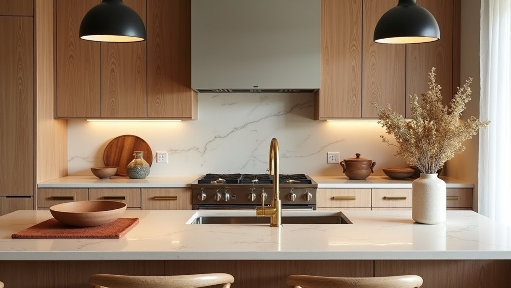
You can instantly warm up a stainless-heavy kitchen by layering in brass—think cabinet pulls, a bridge faucet, or a slim pendant.
Keep mixed metals looking intentional by balancing finishes across zones (hardware, lighting, and accessories) and sticking to two or three tones max.
Then repeat warm metallic accents in small, high-impact places like shelf brackets, tray edges, or barstools so the whole space feels cohesive.
Layer Brass With Stainless
Even if your kitchen already leans sleek and modern, layering brass with stainless instantly adds warmth without sacrificing that clean, professional finish. Start with one “hero” upgrade: swap bar pulls or a faucet for brass, while keeping appliances and the sink in classic stainless.
Choose brushed or satin Brass textures to soften glare and hide fingerprints, especially on frequently touched hardware. Then match the sheen of your stainless steel finishes—brushed pairs best with muted brass, while high-polish stainless needs a clearer, brighter brass to avoid looking dull.
Use brass where your eye lands: island pendants, cabinet knobs, or open-shelf brackets. Keep stainless on workhorse zones like ranges, vent hoods, and prep sinks so the kitchen still reads crisp, durable, and resale-friendly.
Balance Mixed Metal Finishes
When a kitchen mixes metals on purpose, it reads curated—not chaotic—and brass becomes the warmth anchor that ties everything together. Start by choosing a lead finish for sightline items like faucets or hood trim, then support it with one secondary metal in lighting or stools.
For clean metal finish coordination, keep undertones consistent: pair warm brass with blackened steel or brushed nickel rather than icy chrome. Match sheen levels too—mix brushed with brushed, polished with polished—so reflections don’t fight. Use proportion as your rule: let the primary finish dominate, the secondary appear in smaller doses.
Finally, align decorative hardware choices with function: choose one knob style, one pull profile, and one hinge look, then vary only the metal. You’ll get contrast without visual noise.
Repeat Warm Metallic Accents
Because the eye reads repeated highlights as intentional, sprinkling warm metallic accents—especially brass—across multiple touchpoints makes the whole kitchen feel cohesive and inviting. Start with your “anchors”: cabinet pulls, faucet, and pendant hardware. Then echo that tone in smaller moves—tray handles, pot rail hooks, or a brass-framed mirror—so the finish feels curated, not random.
Keep your mix controlled by repeating one warm metal twice as often as any secondary finish. If you’ve got stainless appliances, treat them as the neutral base and layer elegant metallic accents in brushed brass or aged bronze.
Choose textured metal finishes (knurled knobs, hammered sconces, ribbed pendants) to add depth without adding clutter. Finally, match sheen levels within each metal family for a clean, high-end look.
Finish With Textiles, Art, and Greenery
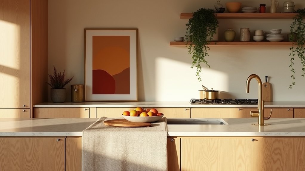
After you’ve locked in your warm-toned palette and key finishes, bring the space to life with textiles, art, and greenery that add softness and intention.
Start with Textile textures: a washed-linen runner, a nubby cotton dish towel, or a low-pile vintage-style rug to warm up hard surfaces and dampen echo. Keep patterns tight—one hero stripe or small-scale motif—so your counters don’t feel busy.
Hang art where you’ll see it daily, like above a breakfast nook or near open shelving; choose earthy abstracts, food sketches, or a framed vintage print that echoes your metals and wood.
Finish with Greenery arrangements: one sculptural branch in a crock, a small herb pot by the sink, and a simple bowl of citrus for color. Rotate weekly.
Frequently Asked Questions
How Can I Add Warmth Without Repainting Cabinets or Walls?
Add warmth by layering wood accents, textured runners, and warm metals. Create color contrast with cream linens and earthy ceramics. Prioritize lighting enhancement: swap to 2700K LEDs, add under-cabinet strips, and soften glare.
What Warm-Tone Décor Works Best in a Small, Dark Kitchen?
Go warm yet bright: pair Vintage accents like brass pulls and amber glass with light Textured fabrics—linen café curtains, woven runners. You’ll soften shadows, add depth, and keep surfaces uncluttered with compact wooden boards and baskets.
How Do I Balance Warm Tones With Existing Stainless Steel Appliances?
Pair stainless steel with warm woods, brass, and creamy neutrals so you’re balancing color schemes, not fighting them. Keep warm tones on textiles and walls, and focus on choosing accent accessories like amber glass, tan ceramics.
Which Warm Colors Help a Kitchen Feel Cleaner and Less Yellow?
Choose creamy whites, warm greige, soft sand, blush-beige, or muted terracotta; they read fresh, not buttery. Your color palette stays tidy with warm undertones. Use lighting techniques: 3000K LEDs, diffusers, and high-CRI bulbs.
How Can I Keep Warm-Toned Kitchens From Looking Dated?
Keep warm-toned kitchens current by choosing clean-lined cabinets, muted ochre or terracotta, and simple hardware. Mix Vintage accessories sparingly with Modern lighting, add slim-profile appliances, and use matte finishes plus uncluttered open shelving.


