
 Andrew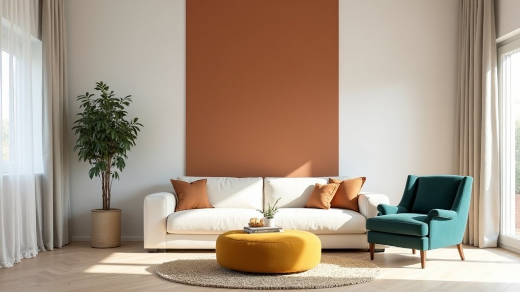
If your room’s feeling a little “busy,” colour blocking can bring order without draining personality. You’ll get the best results when you choose one dominant hue, one supporting colour, and a steady neutral, then place blocks where they earn their keep—behind a sofa, on a single feature wall, or in clean horizontal bands that adjust proportion. Repeat key tones across the space so it looks intentional, not random. Next, you’ll need to decide what to block first…
Pick a Colour-Blocking Palette That Feels Balanced
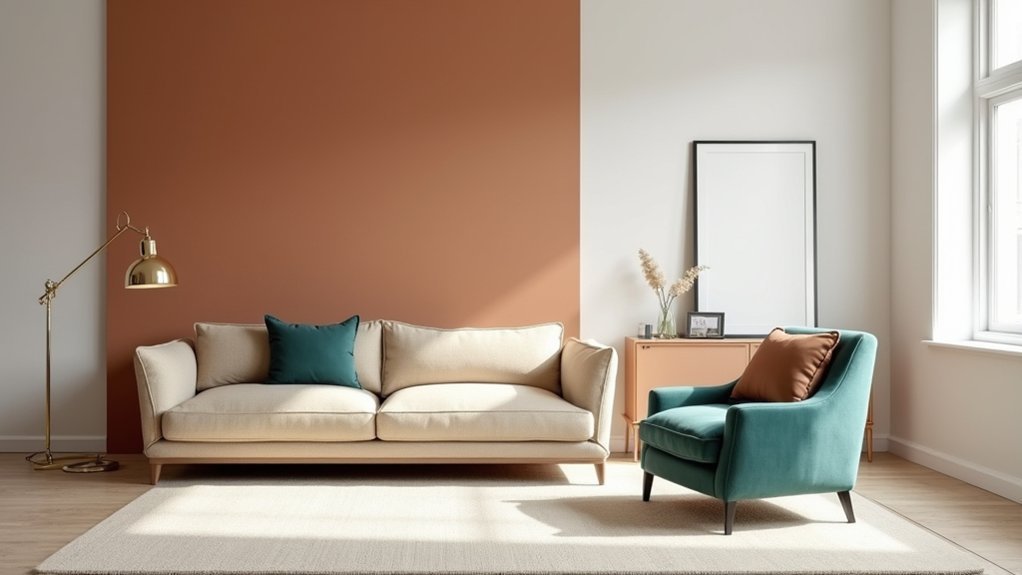
Even if you love bold colour, your space will look more intentional when you start with a balanced palette rather than picking shades at random. Choose one dominant hue, one supporting hue, and one crisp neutral to keep the scheme commercially polished and easy to live with.
Build color contrast by pairing warm with cool, or deep with light, but keep undertones consistent so colours don’t fight. Use a 60/30/10 split to control intensity, and test swatches under daytime and evening lighting before you commit.
If you’ll include pattern mixing, limit prints to the same palette and vary scale—one large motif, one medium, one subtle texture—so the room reads cohesive, not chaotic.
Decide Where Colour Blocking Will Go First
Once you’ve locked in a balanced palette, decide where colour blocking will live before you buy paint or start rearranging furniture. Start with one high-impact zone you already look at daily: the wall behind the sofa, the bed wall, or the entry sightline. This keeps the idea intentional, not scattered.
Audit the room’s existing anchors—rug, large art, cabinetry, or a sectional—and choose a block that supports them. Use painter’s tape or digital mockups to test scale, edges, and contrast under your real lighting.
Prioritise decor placement: plan where artwork, shelves, mirrors, and lamps will sit so blocks don’t get chopped up awkwardly. For focal point creation, pick one hero surface and keep surrounding blocks quieter, so your eye lands exactly where you want.
Use Colour Blocking to Shape the Room
Where do you want the room to feel wider, taller, or more grounded? Use colour blocking like architectural shorthand: horizontal bands widen, vertical blocks lift, and darker lower sections anchor.
Paint a deep block on the bottom third of a wall to visually lower high ceilings and add stability.
To stretch a narrow room, run the same colour across the long wall and continue it onto adjacent returns for a wraparound effect.
To heighten, keep the block narrow and extend it from skirting to cornice behind a focal piece.
Prioritise Color coordination by repeating each hue in one other zone—art, upholstery, or trim.
Add Texture contrast (matte paint vs. satin, plaster vs. wood) to sharpen edges without adding more colour.
Keep Colour Blocking Cohesive With Neutrals
After you’ve used colour blocking to change a room’s proportions, you need a neutral framework to keep those bold moves feeling intentional instead of busy. Anchor walls, large upholstery, or flooring in warm whites, greiges, soft taupes, or charcoal so your colour blocks read as deliberate accents, not visual noise.
Pick one dominant neutral and repeat it across finishes—paint, rugs, window treatments, and key casegoods—to create continuity. Then let colour appear in defined zones, balanced by negative space.
If you want subtle sophistication, use monochrome variations within one colour family and shift only value and texture. For higher contrast, pair complementary hues, but keep the neutral constant so progressions stay crisp.
Finish with neutral metals and natural woods to tie everything together seamlessly.
Avoid These Colour Blocking Mistakes
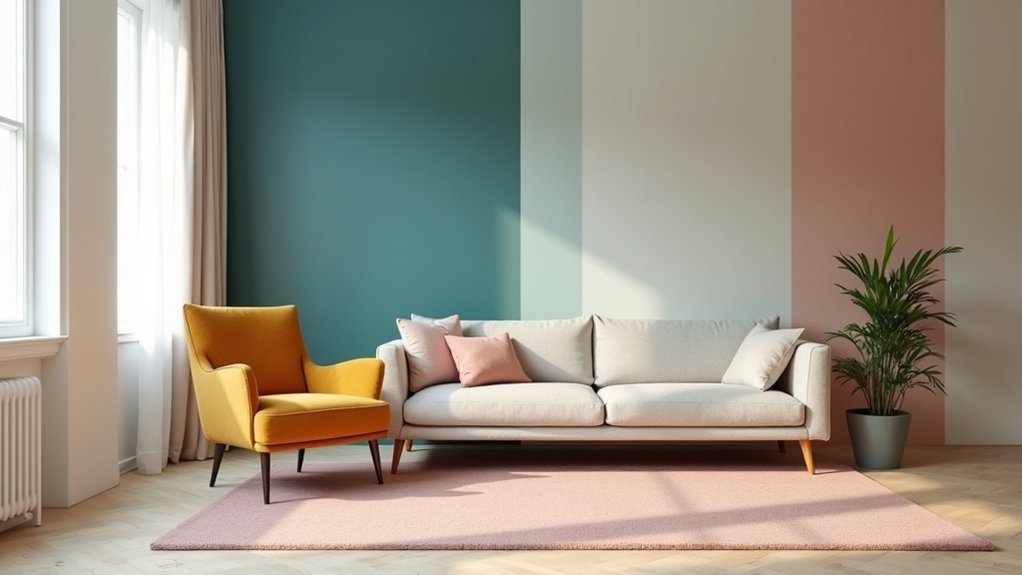
Even if you love bold colour, colour blocking falls apart fast when you skip a plan and start “adding accents” wherever there’s an empty spot. You’ll get accidental clashing and a room that feels busy, not intentional. Decide your palette first: one dominant colour, one support, one small pop. Limit blocks to two or three surfaces so your eye can rest.
Don’t ignore undertones. A cool blue next to a warm red reads muddy unless you separate them with a neutral or repeat a bridging shade elsewhere. Avoid equal saturation everywhere; pair a vivid block with softened versions to control intensity.
Watch scale: tiny blocks look fussy, oversized blocks can flatten a room. Use monochrome contrast to add depth without introducing extra hues.
Frequently Asked Questions
How Do I Colour Block in a Rental Without Repainting Walls?
You can colour block in a rental by using removable wallpaper panels, large art, and bold textiles to define zones. Add Temporary paint on furniture or doors, then anchor blocks with rugs and curtains.
Which Paint Finishes Work Best for Crisp Colour-Blocked Edges?
Like a tailored suit, you’ll get crisp blocks with matte or eggshell for paint sheen on walls, and satin/semigloss for trim. You’ll boost edge precision by cutting in first, then taping and burnishing tightly.
How Do I Choose Colour-Blocking Shades That Match Existing Flooring?
Match your colour blocks to flooring undertones: pull a midtone from wood grain or tile veining, then build complementary color schemes with one muted anchor and one accent. Prioritize texture integration via matte walls against glossy floors.
Can Colour Blocking Work in Open-Plan Spaces Without Looking Choppy?
Yes—if you plan it: 60% of designers anchor open plans with one dominant hue to avoid chop. Use controlled Color contrast to zone functions, repeat accents across areas, and maintain Visual balance with shared undertones.
What’s the Best Way to Test Colour-Blocking Layouts Before Committing?
Mock it up first: use painter’s tape, movable samples, and a digital room app. Check Color harmony under daylight/night lighting, then add pattern integration with textiles. Live with it 48 hours, then decide.


