
 Andrew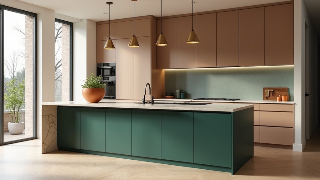
You considering new kitchen colours, so you’ll want warmth, you want depth, you want a kitchen that won’t feel dated next year. In 2024, the market’s moving toward warm neutrals, earthy greens, and terracotta tones that suit both modern and vintage-leaning homes. Your light and layout should drive every choice, because the right shade can lift value while the wrong one can flatten the space. The key shift is where you place bold colour—and where you don’t…
Kitchen Colour Trends for 2024 at a Glance
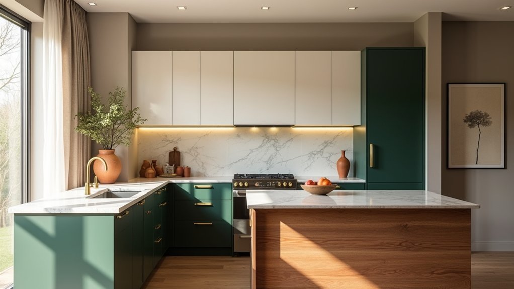
Whether you’re planning a full remodel or a quick refresh, 2024’s kitchen colour trends make it easier to get a high-end look without overcomplicating your choices: expect warmer neutrals, earthy greens, clay and terracotta tones, deep navy and charcoal accents, and bold, confident statements (like colour-drenched cabinetry) balanced by natural wood and mixed metals for a modern, lived-in finish.
You’ll see Color psychology driving demand: soft greige reads calm and premium, green signals wellness, and terracotta adds appetite and warmth.
Cultural influences matter too—Japandi minimalism keeps palettes grounded, while Mediterranean and desert-inspired hues push sunbaked clays and olive tones.
To maximize resale appeal, you can anchor with timeless neutrals, then add ROI-friendly impact through paint, hardware, or a statement island.
Designers also favor matte finishes to hide wear.
Choose Kitchen Colours by Light and Layout
Start by sizing up your kitchen’s natural light—bright, south-facing rooms can handle richer 2024 tones, while dimmer spaces need lighter, warmer shades to stay fresh and resale-ready.
Then match colour placement to your layout, using zoning to widen galley kitchens or anchor open-plan spaces without visual clutter.
Finish strong with light-boosting sheens and reflective surfaces so your chosen palette looks brighter, cleaner, and more premium all day.
Assess Natural Light Levels
Because natural light changes how every paint pigment reads, you’ll get better-looking 2024 kitchen colours by checking your daylight first. Track morning, midday, and late-afternoon light for a few days, then note whether it feels cool, neutral, or warm.
Start with window placement: north-facing light can mute warmth, while south-facing sun boosts creamy whites and honeyed beiges. East light flatters fresh greens at breakfast; west light intensifies terracotta and bronzy neutrals by evening.
Hold large paint swatches on the wall, not the counter, and view them in shade and direct sun. If your kitchen runs dim, choose higher-LRV neutrals or soft pastels so surfaces don’t look heavy. If it’s bright, you can afford deeper, moodier colour confidently.
Match Colours To Layout
Once you’ve clocked your kitchen’s natural light, map those findings onto your layout so the colour works with the room’s proportions, not against them.
In galley kitchens, keep the run feeling wider by using lighter tones on long walls and a deeper accent at the far end to pull the eye forward.
In open-plan spaces, define zones: anchor the island in a richer hue while keeping perimeter cabinetry calmer, creating a premium, designed look buyers notice.
In L- and U-shapes, use one dominant colour to avoid visual chopping, then shift intensity on the shortest return for balance.
Apply Color psychology: warm neutrals feel welcoming, cool greens feel restorative.
Respect cultural influences too—white reads crisp to some, clinical to others—so your palette fits your household and resale market.
Use Light-Boosting Finishes
If your kitchen doesn’t get much daylight, the right finish can add more visual brightness than a full repaint. Choose satin or eggshell walls to bounce light without the harsh glare of high gloss.
On cabinets, a soft sheen feels current in 2024 and hides fingerprints better than shiny lacquer, so you get style and durability.
Prioritise light-reflective whites, warm greiges, or pale sage, then let Material finishes do the heavy lifting: brushed nickel, polished chrome, or pale oak amplify Lighting effects.
Add a glossy splashback tile or quartz with subtle sparkle behind the hob to lift the whole room.
Keep ceilings matte for calm, but use semi-gloss trim to frame light and sharpen edges.
Best Kitchen Cabinet Colours for 2024
Whether you’re planning a full remodel or a quick refresh, the best kitchen cabinet colours for 2024 strike a smart balance between on-trend style and long-term value. You’ll get the safest resale lift from warm whites and creamy off-whites, which keep spaces looking clean and premium without feeling stark.
For a modern upgrade, choose greige or taupe for a tailored, builder-approved look that hides everyday wear. If you want personality without risking dated vibes, go with muted sage, dusty blue, or soft clay—these tones read sophisticated and pair easily with most finishes.
Lean into Vintage accents by selecting deep olive or inky navy, then add aged brass or brushed nickel hardware. Create Bold contrasts with two-tone cabinetry: darker lowers, lighter uppers, for depth and visual polish.
Kitchen Wall Colours That Work With Cabinets
Cabinet colour sets the tone, but your wall colour decides how expensive (or flat) the whole kitchen reads. If you’ve chosen warm whites, lean into creamy greige or soft clay for a premium, 2024-forward calm.
With deep navy, forest, or charcoal cabinets, pick a crisp off-white or pale mushroom to keep the room bright and resale-friendly. For light oak or walnut, muted sage, linen beige, or dusty blue modernises the grain without fighting it.
Use Wall paint techniques to add polish on a budget: matte on main walls, washable eggshell near traffic, and colour-drenching to make small kitchens feel intentional.
Want impact without overcommitting? Try accent wall ideas behind open shelving or a breakfast nook in a deeper tone pulled from your cabinet’s undertone.
Match Kitchen Colours to Countertops and Splashbacks
Once you’ve nailed your cabinet-friendly wall colour, make your countertops the next anchor in your 2024 palette. You’ll get the most value by pairing paint tones to your countertop’s undertones—crisp whites and pale greiges sharpen marble, while warm taupes and earthy greens elevate timber and beige stone.
Then coordinate your splashback to either echo that base for a seamless, high-end look or add a controlled contrast that feels current, not chaotic.
Countertop Colour Pairings
As 2024 kitchens lean more curated and less “matchy-matchy,” the fastest way to lock in a high-end look is to pair your main colour with the right countertop and splashback tones. Start by choosing a countertop that either grounds your palette or adds controlled contrast—this is where the resale-friendly “designer” feel comes from.
If you’re using warm whites, greiges, or muted sage, you’ll get instant polish with Marble textures that feature soft veining in taupe or charcoal.
Going bold with ink blue, forest green, or graphite? Choose light quartz or pale stone-look surfaces to keep the room bright and premium.
For minimalist trends, pair putty, sand, or black cabinetry with Matte finishes in concrete-look or honed stone to reduce glare and hide daily wear.
Splashback Colour Coordination
Lock in your countertop choice, then use the splashback to sharpen the whole palette and make the finish feel intentionally “designed.” Aim for either harmony (pull a veining tone from marble or quartz into a tile or slab) or clean contrast (pair dark cabinetry and pale stone with a warm white, greige, or lightly textured splashback) so the room reads brighter and more premium.
You’ll get the best ROI by choosing diverse splashback materials that suit your lifestyle: porcelain for durability, glass for light bounce, zellige for artisan texture, or a full-height stone slab for seamless luxury. Keep grout minimal and tones consistent if you’re selling soon; it photographs better and feels higher-end.
Want trend energy without overcommitting? Add bold colour accents in a niche, behind the hob, or as a slim border that can refresh the look fast.
Two-Tone Kitchen Colour Combinations Designers Love
While a single standout shade can still turn heads, designers keep coming back to two-tone kitchens because they deliver a custom, high-end look without committing your entire space to one colour. Start with Neutral palettes on uppers to keep sightlines light, then anchor the room with deeper lowers in ink blue, forest green, or warm charcoal. You’ll get instant contrast that photographs well and boosts perceived value.
To add Bold accents without overwhelm, pair soft greige cabinets with a matte black island, or crisp white uppers with walnut base units for a modern organic feel.
If you want a 2024-forward twist, try clay-toned lowers with creamy off-white uppers and brushed brass hardware. Keep finishes consistent, and repeat your darker tone in stools or lighting for a cohesive, designer-approved result.
Kitchen Colour Mistakes That Date a Remodel
Two-tone kitchens can look instantly bespoke, but colour choices that feel “of the moment” can also stamp a remodel with a specific year. If you go all-in on ultra-saturated cabinet colours or glossy primaries, you risk fast visual fatigue and weaker resale appeal.
Instead, anchor the room with Neutral bases—warm whites, greiges, soft taupes—then layer personality in replaceable elements.
Another mistake: matching every surface to the same trendy shade, from island to splashback to walls, which flattens depth and reads like a showroom set. You’ll get longer value by balancing timeless cabinetry with a single Bold accent, such as a painted pantry door, range hood, or bar stools.
Finally, don’t ignore undertones: clashy warm/cool mixes make expensive finishes look accidental, not curated.
Frequently Asked Questions
How Do I Choose Kitchen Colours That Boost Home Resale Value?
Choose neutral, broadly appealing kitchen colors—warm whites, soft greiges, muted blues—to attract buyers and maximize resale. Use color psychology to signal cleanliness and calm, and consider cultural influences so your palette resonates locally. Keep accents timeless.
Which Paint Finishes Are Best for Kitchens: Matte, Eggshell, Satin, or Semi-Gloss?
Like a well-tailored suit, choose satin or semi-gloss for kitchens: you’ll get easy cleaning and standout resale appeal. Matte hides flaws but stains; eggshell balances. These paint sheen differences drive your finish durability comparison for long-term value.
How Can I Test Kitchen Colours Accurately Before Committing to Paint?
You can test kitchen colours accurately by buying peel-and-stick swatches, painting large boards, and moving them daily. Do sample testing in daylight and at night, then compare against cabinets, counters, and your color palette.
What Kitchen Colour Choices Help Hide Fingerprints, Stains, and Cooking Splatters?
Choose mid-tone greige, warm taupe, or soft matte navy—they’re your kitchen’s armor, masking marks. Pair stain hiding shades with Fingerprint resistant finishes (matte/satin) and subtle texture on cabinets and walls to conceal splatters.
How Do I Coordinate Kitchen Colours With Existing Appliances and Hardware?
Match your cabinet and wall tones to your appliance finish undertones for Color palette harmony. Repeat hardware metals in lighting. Add contrasting accents with paint or tile. You’ll get a cohesive, on-trend look that boosts resale value.


