
 Andrew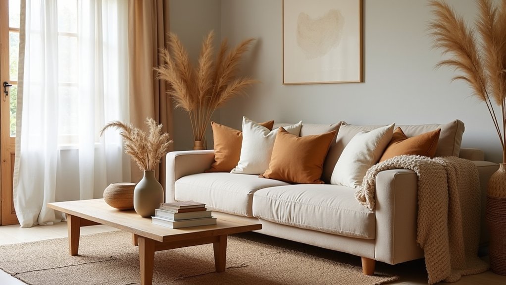
Warm neutrals can wrap your living room like late-afternoon light. You’ll get a calm, upscale look when you commit to a tight palette—soft taupe, golden oak, and caramel—and repeat it across flooring, upholstery, and accents. You’ll then add value with layered natural textures like wool rugs, linen pillows, rattan, and stone, while keeping surfaces edited. Next, you’ll see how one anchoring rug choice sets everything else up…
Pick a Warm Neutral Palette That Works
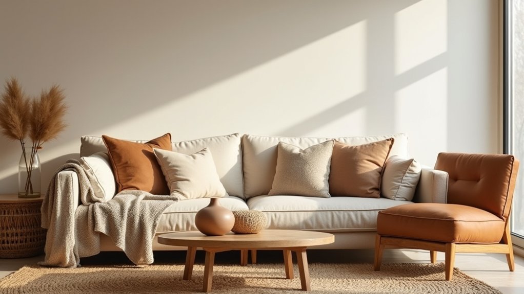
If you want warm neutrals to feel intentional—not flat—start by choosing a tight palette that matches your room’s fixed elements. Pull undertones from your flooring, stone, or trim: golden oak pairs with creamy ivory, camel, and soft clay; cooler walnut likes taupe, mushroom, and warm gray.
Limit yourself to one light, one midtone, and one deeper shade so Color harmony looks curated and upscale.
Next, assign jobs to each shade for mood setting and resale-friendly polish. Use the light tone on larger surfaces to keep the room bright, the midtone on key upholstery for wear and continuity, and the deeper shade in small hits—frames, hardware, or a single accent piece—for depth without visual noise.
Choose a Base Rug to Anchor the Living Room
With your warm neutral palette set, lock it in with a base rug that organizes the seating area and makes the room feel finished. Size it so the front legs of your sofa and chairs sit on it, or go full “all legs on” for a premium, unified look. In most living rooms, that means 8’x10’ or 9’x12’; tape it out before you buy.
Choose a low-pile wool or durable synthetic that resists crushing and cleans easily. If your furniture is solid and tonal, add interest with patterned borders to frame the conversation zone.
If your space feels traditional, sharpen it with a modern geometric design in sand, oatmeal, or taupe. Keep contrast subtle so your palette stays cohesive and upscale.
Layer Natural Textures So Neutrals Feel Rich
Once your base rug anchors the room, you’ll make warm neutrals feel premium by layering natural textures with intent. Mix wood tones with rattan accents and linen upholstery.
Then stack in a woven rug, a chunky throw, and a couple of tactile pillows to add depth without adding clutter. This approach boosts contrast, durability, and comfort—so your neutral palette looks richer and more finished.
Mix Wood, Rattan, Linen
Because warm neutrals can look flat when every surface feels the same, you’ll get a richer, more styled living room by layering natural textures—wood for grounded warmth, rattan for airy dimension, and linen for soft, matte contrast.
Anchor the space with intentional wood finishes: a walnut coffee table, white oak media console, or ash side tables that add depth without adding color.
Bring in rattan furniture to lighten the visual weight—think a cane-front cabinet, rattan accent chair, or woven-frame ottoman that reads refined, not beachy.
Finish with linen where you touch and see it most: slipcovered seating, tailored drapery, or textured pillow covers.
Keep tones within one warm-neutral family so the textures, not contrast, do the styling.
Add Woven Rugs, Throws
Natural fibers do the heavy lifting when your wood, rattan, and linen palette needs more depth without adding new colors. Start with Woven rugs in jute, sisal, or flatweave wool to ground seating and visually widen the room.
Size up: your front legs should sit on the rug, or you’ll shrink the layout. Layer a smaller patterned kilim over a larger neutral base to add quiet contrast and hide wear in high-traffic zones.
Finish with cozy throws that look tailored, not messy. Choose chunky cotton, brushed wool, or a linen blend; drape one over the sofa arm and fold another in a basket for grab-and-go comfort.
Keep tones within two steps of your wall color so everything reads curated. Rotate seasonally for freshness and durability.
Mix Wood Tones and Finishes for Warmth
While a single wood finish can feel flat, mixing tones instantly adds the layered warmth that makes a living room look styled, not staged. Start with one dominant wood (like an oak coffee table), then add a secondary tone through side tables, picture frames, or a media console. You’ll get a richer look without buying a matching set.
Keep undertones consistent: pair warm woods with warm neutrals, and let visible wood grain do the texture work. Balance sheen by blending finish options—matte, wire-brushed, and satin—so light moves softly across surfaces.
Use one “bridge” piece, like a tray or stool that sits between tones, to make transitions feel intentional. If something clashes, swap in a lighter stain or lower-gloss seal for cohesion.
Add Contrast With Black, Brass, or Stone Accents
You’ll ground warm neutrals with black accents—think slim metal frames, a matte coffee table, or bold hardware—to sharpen the palette and make the room feel intentional.
Then you’ll layer in brass and stone through lighting, side tables, or trays to add warmth, texture, and a premium finish without overpowering your base tones.
With a few well-placed pieces, you’ll create crisp contrast that boosts visual depth and makes your styling look polished and high-end.
Ground With Black Accents
Even if your warm neutrals already feel polished, they can read flat without a darker anchor, so ground the room with crisp black accents. Use a slim black coffee table base, picture frames, or a matte black floor lamp to sharpen the palette and make creams look richer.
If you want a bigger move, try black accent walls on a single focal plane behind the sofa or built-ins; keep the finish velvety matte to reduce glare and hide imperfections.
Then repeat the tone in small hits—black decorative accessories like candlesticks, a sculptural bowl, or patterned pillows with black threading.
Aim for 3–5 black moments across the room so the contrast feels intentional, not random.
Layer Brass And Stone
Because warm neutrals can lean monochrome up close, layer in brass and stone accents to add crisp contrast and a more premium finish. Start small: swap in Brass finishes on a floor lamp, cabinet pulls, or a picture light so the room reads tailored, not beige-on-beige. Keep the sheen consistent—satin or brushed brass feels warmer and hides fingerprints, protecting long-term value.
Next, anchor softness with natural stone. A travertine side table, marble tray, or soapstone bowl introduces cool weight and subtle veining that makes textiles look richer. Mix one metal and one stone per zone to avoid visual noise, then repeat them twice across the room for a designer-level throughline.
You’ll get contrast, durability, and a curated look that photographs beautifully for resale.
Style the Sofa With Cozy Neutral Textiles
While your sofa sets the visual anchor of the room, cozy neutral textiles give it the warmth and polish buyers notice first. Start with two larger pillows in linen or cotton in warm ivory, then add one smaller accent in oatmeal or taupe for depth. Mix textile patterns subtly—tight stripes, micro-checks, or a quiet herringbone—so the look reads upscale without visual noise.
Drape a lightweight throw across one arm to soften lines and signal comfort; choose matte, natural-looking fabric textures like brushed cotton, boucle, or a wool blend. Keep tones within a creamy-to-caramel range to flatter most upholstery and photography.
Finally, steam and square every pillow, align seams, and remove pilling; these small finish details protect perceived value during showings.
Finish With Organic Decor That Won’t Clutter
After you’ve warmed up the sofa with layered neutrals, finish the room with a few organic decor pieces that add texture without stealing floor space or creating visual clutter. Prioritize minimal clutter by choosing one statement item per surface: a hand-thrown ceramic vase, a travertine tray, or a carved wood bowl that corrals remotes and candles.
Add height without bulk using a slim floor branch in a weighted pot, or hang woven seagrass baskets as wall art. Swap plastic for eco-friendly materials like linen, rattan, cork, and recycled glass to keep the palette warm and the air cleaner.
Keep styling tight: group pieces in threes, repeat one texture twice, and leave 30% of each tabletop empty so the room still reads calm and premium.
Frequently Asked Questions
What Paint Finish Works Best for Warm Neutral Living Room Walls?
Choose eggshell or satin; they balance warmth, cleanability, and subtle sheen. Surveys show 68% of buyers prefer washable walls. Align your color palette, then use paint techniques like cutting-in for crisp edges. You’ll elevate perceived value.
How Do Warm Neutrals Photograph Under Phone Camera and Indoor Lighting?
Warm neutrals photograph softer and richer on your phone, but Color temperature shifts can skew them yellow or muddy. You’ll control Lighting effects by using daylight bulbs, locking white balance, and avoiding mixed lighting.
Are Warm Neutral Living Rooms Good for Allergy-Prone Households?
Yes—warm neutral living rooms can work well for allergy-prone households if you choose low-shed textiles, washable slipcovers, and sealed flooring. You’ll boost allergy prevention and leverage natural material benefits like reduced VOCs and easier cleaning.
How Can I Style Warm Neutrals in a Rental Without Painting or Drilling?
You can dress your rental in warm neutrals like a tailored coat: use Temporary decor—peel-and-stick wallpaper, rugs, linen curtains on tension rods—and lean on furniture swaps, swapping covers, lamps, and wood accents for instant value.
What’s the Best Way to Clean and Maintain Natural Fiber Rugs?
Vacuum weekly with suction only, rotate often, and blot spills fast; avoid soaking. For natural fiber cleaning, use dry rug shampoo or baking soda. Rug maintenance tips: sun-dry odors, use pads, trim snags.


