
 Andrew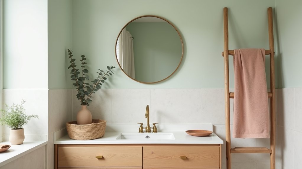
The easiest way to make a bathroom feel bigger is to soften it, not brighten it. You’ll start with a muted palette—misty blue, blush, or greige—then layer in natural accents like warm wood, stone, and rattan for quiet contrast. Swap harsh chrome for brushed brass, and choose organic cotton towels for that spa-grade finish. But the real difference comes from how you balance texture, lighting, and a few curated details…
Pick a Soft Colour Palette for Your Bathroom
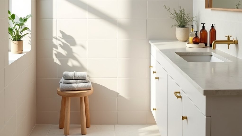
If you want your bathroom to feel calmer and more current, start by locking in a soft colour palette that flatters the light you already have.
In north-facing rooms, lean warm: creamy white, blush, or sand to counter cool daylight.
In bright, south-facing spaces, go quieter with pale sage, misty blue, or greige to prevent glare.
Use Color psychology to guide choices: greens cue balance, blues signal cleanliness, and warm neutrals read inviting and premium.
Keep contrast low for mood enhancement, then add definition with one deeper tone on the vanity or lower wall.
Match undertones across tile, paint, and grout, and test samples at morning and night.
You’ll avoid costly mismatches.
Choose Natural Accents That Add Warmth
While a soft palette sets the mood, natural accents give your bathroom the warmth and texture that paint alone can’t deliver. Start with eco-friendly materials that feel good and sell well: FSC-certified teak bath mats, bamboo trays, organic cotton towels, and refillable amber-glass soap bottles. These details signal spa-level intent and sustainability, two buyer-driven trends.
Add vintage accents for character without clutter. Hang a salvaged brass mirror, swap in porcelain knob pulls, or style a small apothecary jar set on the vanity. Keep finishes cohesive—warm metals pair beautifully with blush, greige, and misty blue walls.
Layer in a living element, like eucalyptus stems or a low-light plant, to soften hard lines. You’ll get instant warmth, refined and timeless.
Mix Wood, Stone, and Woven Textures Well
To get that spa-forward look buyers love, you’ll balance warm wood tones with cool stone finishes so the palette stays soft but never flat.
You’ll pair stone with wood—think a veined quartz top against a light-oak vanity—to add contrast that still feels natural and calm.
Then you’ll layer woven texture accents like a rattan tray, seagrass basket, or linen blind to soften hard surfaces and keep the space on-trend.
Balance Warm And Cool
Because soft-colour bathrooms can swing either flat or overly rustic, you’ll get the most polished, trend-right look by balancing warm and cool materials with intention. Pair warm oak or walnut with cooler marble, limestone, or concrete-look porcelain to keep the palette elevated.
Use contrast colour schemes: creamy paint with a soft grey tile, or blush walls with crisp white stone, so each surface reads cleanly. If your vanity runs warm, choose cooler grout, a pale quartz top, or slate-toned flooring to steady it.
Then incorporate metallic finishes to bridge temperatures—brushed nickel cools down honey wood, while soft brass warms up grey stone. Keep undertones consistent, and repeat each temperature at least twice for a designer, high-end finish.
Layer Woven Texture Accents
A soft-colour bathroom looks instantly more expensive when you layer woven texture accents alongside wood and stone, creating contrast that paint alone can’t deliver. Start small: add a flatweave runner, a waffle towel set, and a lidded seagrass hamper in the same undertone so the palette stays calm.
Then build depth with woven textile combinations—linen shower curtain, cotton bath mat, and a rattan mirror frame—so every surface has a different hand-feel.
If you want a designer upgrade, use textured accent walls in the dry zone: grasscloth-look vinyl, micro-cane panels, or a subtle ribbed finish that complements your vanity. Keep metals simple and matte, and repeat one weave twice so the look reads intentional, not busy.
Pair Stone With Wood
Woven textures set the soft, layered mood, and stone plus wood locks it in with that spa-level, custom-build finish buyers notice right away. Balance cool stone textures with warm wood finishes to keep the room feeling calm, not cold.
Choose one dominant stone—matte porcelain, honed marble-look, or limestone—and repeat it on the floor and a niche for cohesion. Then add wood with purpose: a floating vanity, a slim stool, or teak slats on a bath mat.
Match undertones (greige stone with blonde oak; charcoal stone with walnut) so everything reads intentional. Keep grain simple and sealed for humidity.
Finish with woven baskets or rattan lighting to bridge the materials and sharpen that boutique-hotel vibe.
Add Bathroom Lighting That Flatters Soft Colours
While soft, muted palettes calm a bathroom instantly, the wrong lighting can wash them out or skew them yellow. Choose high-CRI LED bulbs (90+), so blush, sage, and warm greige read true against stone and wood.
Aim for 2700K–3000K for a spa feel; go closer to 3500K if your room lacks daylight and you want cleaner whites.
Layer light like designers do: a ceiling fixture for fill, plus vertical sconces at eye level to eliminate harsh shadows on the vanity.
Add dimmer switches to shift from bright morning prep to low evening unwind without changing the colour story.
Finish with frosted glass or linen-look shades for softer diffusion and a premium, on-trend glow.
Style Towels, Mats, and Curtains With Texture
Because flat fabrics can make even the prettiest soft palette feel bland, build dimension with towels, mats, and curtains that mix finishes and pile heights. Choose plush, hotel-weight bath towels in a muted solid, then add smaller waffle or ribbed hand towels for contrast.
Swap a basic bath mat for a looped cotton or low-pile chenille option that feels spa-current yet dries fast. Keep towel storage intentional: stack tones from light to mid, or roll them in an open shelf to show texture without clutter.
For the shower, lean into curtain patterns that stay subtle—tone-on-tone stripes, micro-checks, or botanical linework—so they complement soft walls. Finish with brushed rings and a weighted hem for a tailored drape.
Finish With Plants and Simple Spa-Like Details
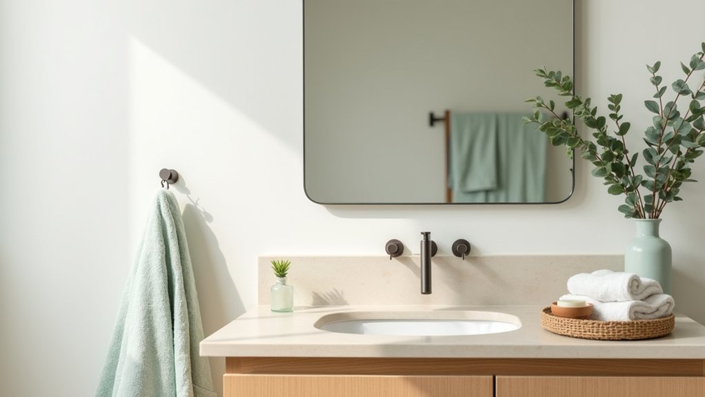
Once your towels, mats, and curtain bring in the right texture, add a few living and spa-like touches that make the whole soft palette feel fresh, not fussy.
For smart plant placement, cluster one medium pothos on a stool, tuck a small fern on the vanity corner, and hang a trailing plant near the shower where steam boosts growth. Keep pots matte stone, sand, or clay to stay on-trend and calm.
Then layer spa-like accessories that read boutique, not clutter: a refillable amber soap bottle, a teak bath tray, and a slim lidded canister for cotton rounds. Swap mismatched packaging for coordinated labels, and add a eucalyptus bundle or essential-oil reed diffuser for a clean finish.
Edit weekly so the look stays effortless.
Frequently Asked Questions
How Do I Prevent Soft Bathroom Colours From Looking Dirty Over Time?
Choose wipeable paints, clean grout, and seal surfaces; test swatches, refine wall texture, and upgrade lighting choices. You’ll keep soft tones crisp, on-trend, and resale-ready. Maintain weekly, ventilate daily, and replace dingy caulk promptly.
Which Paint Finishes Resist Bathroom Humidity While Keeping a Soft Look?
Choose satin or pearl for walls and semi-gloss for trim; these Paint sheen options balance softness with scrubability. You’ll get Moisture resistant finishes that handle steam, resist mildew, and still photograph well in today’s spa-inspired bathrooms.
Are Natural Accents Safe Around Water, or Will They Warp and Mold?
Yes—natural accents can stay safe near water if you choose sealed Natural materials and prioritize Water safety. Use teak, bamboo, or stone, seal edges, ventilate well, and avoid raw wood by showers.
What Budget-Friendly Swaps Mimic Wood and Stone in Wet Bathrooms?
You can swap in luxury vinyl tile, porcelain wood-look planks, and peel-and-stick stone-look panels—budget friendly materials built for moisture. Nearly 1 in 3 remodelers choose LVT. Add DIY natural accents: sealed bamboo trays, faux-stone resin.
How Can I Add Colour Subtly in a Rental Without Repainting?
You can add subtle color in a rental by using Temporary wallpaper on a single wall or niche and Decorative decals on mirrors or tiles. Swap textiles, art, and accessories in muted, on-trend palettes.


