
 Andrew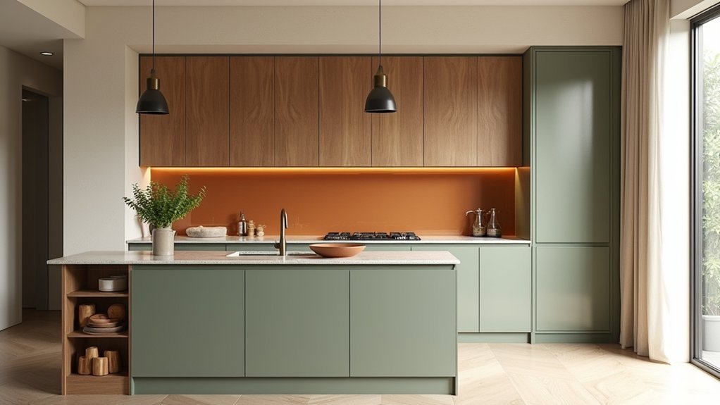
In 2026, you’re choosing kitchen colours that sell your space as much as they suit your lifestyle. Warm whites, creams, sand, and clay set a calm base, while sage, navy, charcoal, and black add controlled contrast. Your lighting decides whether these tones look rich or flat, so you can’t pick from a swatch alone. The smartest approach balances mood, durability, and resale—starting with one key decision most kitchens get wrong…
Kitchen Colour Trends 2026 at a Glance
As 2026 kitchen design shifts toward warmer minimalism and high-function finishes, you’ll see colour choices that do more than “look nice”—they shape mood, hide daily wear, and boost long-term appeal.
You’ll spot soft greige, creamy off-white, and sand as the new “safe” neutrals, while muted sage and clay deliver calm through Color psychology without feeling trendy-today, dated-tomorrow.
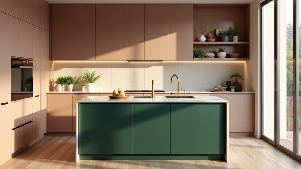
For bolder value, you can use ink navy, charcoal, and near-black on islands or lowers to anchor the room and mask scuffs.
Warm metal accents and natural wood pair easily, keeping resale flexibility high.
Prioritize paint durability: washable matte, scrubbable eggshell, and cabinet-grade enamels protect your investment, cut touch-ups, and keep finishes looking fresh longer.
Choose 2026 Kitchen Colours for Your Light
To get 2026’s most in-demand kitchen colours to look premium, you’ve got to start with your natural light and how it shifts throughout the day.
Then match your paint undertones to your artificial lighting—warm LEDs, cool task lights, and statement pendants can all change the read.
Finally, adjust for room exposure, because north-, south-, east-, and west-facing kitchens each push colour warmer or cooler.
Understand Natural Light
Where does your kitchen’s daylight actually come from—and how strong is it across the day? Track morning, midday, and late-afternoon shifts, because the natural light impact changes how 2026 colours read on cabinets and walls.
North-facing rooms stay cooler, so you’ll sell the look with warm off-whites, clay beiges, and soft olive. South-facing spaces handle deeper tones—ink blue, forest green, and espresso—without feeling heavy, boosting perceived quality.
Use sunlight reflection techniques to stretch brightness: choose eggshell or satin finishes, pair pale counters with slightly richer cabinetry, and add a light backsplash that bounces daylight onto work zones.
In shaded kitchens, lean into creamy neutrals and muted pastels so the room feels premium, not flat.
Match Artificial Lighting
Even the best 2026 kitchen colour falls flat if your bulbs fight it, so match paint and cabinetry to the lighting you actually switch on. Start by identifying bulb temperature: warm LEDs (2700–3000K) enrich clay, caramel, and creamy whites, while neutral (3500–4000K) keeps greiges, oat beiges, and soft sages crisp and modern.
Cool (5000K) can sharpen blue-greens and graphite, but it may make warm neutrals look dull. Use Color psychology to steer mood: warm light boosts comfort and appetite; neutral light signals cleanliness and premium finish; cooler light feels energetic and sleek.
Choose Lighting fixtures that reinforce the palette—brass warms, black frames modernize, and opal diffusers prevent harsh glare on glossy cabinets.
Adjust For Room Exposure
Your bulbs set the baseline, but daylight exposure decides whether a 2026 kitchen colour reads rich and welcoming or flat and washed out.
In north-facing rooms, you’ll want warmer, earth-led shades—clay, sand, muted terracotta—to offset cool light and keep cabinetry looking premium.
In south-facing kitchens, you can lean into crisp moderns like soft white, sage, or pale greige without them turning dull.
East light brightens mornings, so choose balanced mid-tones that won’t glare; west light runs golden late, so test moody olives or inked blues for depth.
Use window treatments to control shifts across the day, then anchor the palette with wall art that repeats your undertones for a cohesive, high-value finish.
The New Neutrals: Warm Whites and Creams
In 2026, you’ll see warm whites and creams replacing stark neutrals, giving your kitchen a softer glow and a more premium feel.
You can choose creamy whites to add instant warmth without sacrificing that clean, modern look buyers love.
To keep it from feeling flat, you’ll pair these neutrals with texture—think veined stone, natural oak, ribbed glass, or matte finishes.
Creamy Whites For Warmth
Why are creamy whites showing up in so many 2026 kitchen plans? You’re seeing a shift from stark, cool whites to softer tones that feel lived-in and premium. Creamy whites brighten like a classic white, but they soften shadows and reduce that clinical glare under LEDs, so your space reads welcoming all day.
If you want warmth in kitchens without committing to bold colour, this is your safest upgrade. You’ll get a versatile backdrop that suits contemporary, transitional, and heritage looks, and it photographs better for resale listings and social content.
Cream-based cabinets also hide minor scuffs and fingerprints more gracefully than pure white, helping your kitchen look newer longer. Choose a slightly yellow or beige undertone to complement warm metals and natural light.
Pairing Neutrals With Texture
Creamy whites set the tone in 2026 kitchens, but texture does the heavy lifting that keeps them from feeling flat. You’ll get a high-end look by layering textured neutrals across cabinets, splashbacks, and worktops, so light bounces differently all day.
Choose matte paint on uppers, then add reeded wood, limewash, or microcement on islands to create depth without adding colour clutter.
For a value-driven upgrade, swap glossy tiles for handmade-look ceramics, honed stone, or brushed metal fixtures—tactile finishes photograph better, wear better, and make neutrals feel intentional.
Balance softness with contrast: creamy doors, a nubby plaster hood, and warm oak shelves. Keep grout, hardware, and lighting in warm undertones so the palette stays cohesive and premium.
Earthy Kitchen Colours 2026: Sand, Clay, Taupe
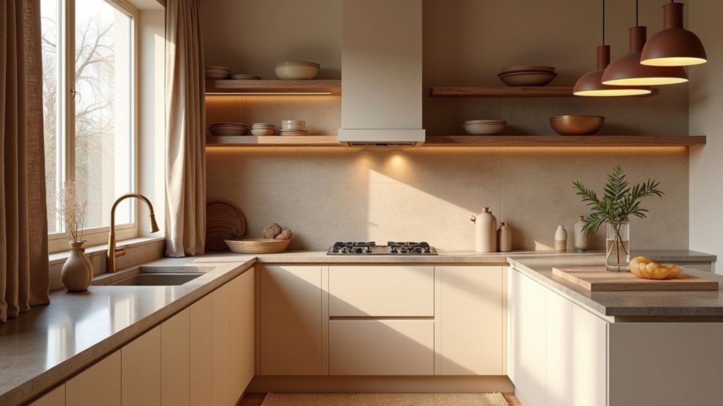
As 2026 kitchens pivot toward comfort-driven design, sand, clay, and taupe are taking the lead as the new neutrals that still feel warm and intentional. You’ll get a high-end look without the risk of a short-lived trend, because these shades flatter most countertops and read rich in both daylight and warm LEDs.
Use sand on walls to brighten, clay on cabinetry for grounded warmth, and taupe on trim or islands to add depth.
You’ll also make smarter, future-proof upgrades when you pair these tones with sustainable material choices like FSC wood, recycled glass, or low-waste cabinetry.
Choose eco-friendly paint options with low-VOC formulas to improve indoor air quality and resale appeal.
Finish with brushed brass or matte black hardware for a premium, cohesive palette.
Green Kitchen Colours 2026: Sage to Olive
Earthy neutrals like sand, clay, and taupe set a warm foundation, and 2026’s greens build on that comfort with more personality and resale-friendly appeal.
Choose soft sage on cabinets for an airy, “updated classic” look that buyers trust, then add depth with olive on an island or pantry wall to signal premium design without feeling risky.
Pair green with brushed brass, warm woods, and creamy stone to keep it timeless and bright.
You’ll also future-proof the refresh by selecting Sustainable paint options with low-VOC formulas that photograph well and wear better.
Finish the story with Eco friendly kitchen accessories—bamboo organizers, recycled-glass canisters, and linen textiles—to reinforce the wellness angle that’s driving kitchens in 2026.
Keep trim crisp white for contrast.
Blue Kitchen Colours 2026: Smoky to Navy
While green keeps kitchens grounded, 2026’s blues—from smoky blue-gray to inky navy—deliver a cleaner, more architectural look that still feels livable and resale-safe.
Choose dusty mid-blues on cabinets to sharpen sightlines and make stone or quartz veining read crisper. If you want depth without heaviness, specify smoky navy on lowers and keep uppers warm white; you’ll get contrast buyers recognize without narrowing your appeal.
For smaller kitchens, pastel blue works like a soft neutral, brightening north light and pairing easily with brushed nickel, light oak, or pale terrazzo.
Finish the palette with off-white walls and a muted brass tap for warmth. You’ll land a modern classic that photographs well and holds value.
Moody Kitchen Colours 2026: Charcoal and Black
If you want a high-end look that still sells, charcoal and black will anchor 2026’s moodier kitchens with crisp, architectural contrast. You’ll get instant depth that reads custom, especially when you pair matte cabinetry with lightly veined stone or warm wood to keep the space inviting.
Charcoal works as the safer “near-black” for broader buyer appeal, while true black delivers a premium, gallery-like finish in modern homes.
To maximize value, use consistent undertones across floors, counters, and hardware so the room feels intentional, not heavy. These moody palettes photograph dramatically, boosting listing impact and perceived quality.
Keep sheen controlled—satin on walls, matte on cabinets—to reduce glare and fingerprints. Finish with bold accents through metalwork and lighting that reinforces clean lines and upscale performance.
Add Pops of Colour Without Repainting
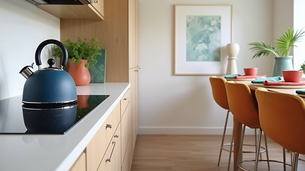
Moody charcoal and black kitchens already deliver drama and resale polish, but you don’t have to repaint to keep the look fresh for 2026. Instead, layer in high-impact colour that’s easy to swap when trends shift or you list your home.
Start with Decorative accessories in optimistic tones—cobalt canisters, rust linens, or citrus stools—to brighten dark surfaces without permanent change. Add wall art with saturated blocks, abstract botanicals, or graphic typography to pull the eye upward and make the room feel larger.
Upgrade hardware with brushed brass or warm copper for instant contrast and a premium signal to buyers. Consider a statement runner, patterned tea towels, or a coloured small appliance to create a cohesive accent story.
You’ll refresh the space fast, protect your budget, and keep options open.
Match Kitchen Colours With Cabinets and Tops
How do you choose a 2026 kitchen colour that looks intentional—not trendy—next to your cabinets and countertops? Start by reading undertones: pair warm whites, putty, or clay with honey oak and cream veining; match cool greiges, ink blues, or soft sages with ash, walnut, or crisp marble.
Use samples in your actual lighting and check them morning and night.
Next, narrow cabinet paint options by contrast level. For resale-friendly value, keep cabinets within one to two shades of your wall colour, then add depth with hardware and lighting. If you want bolder, ground it with matte finishes and a muted base.
Prioritize countertop material coordination: echo a dominant stone fleck in your paint, and let your backsplash bridge any gap.
Frequently Asked Questions
How Do Kitchen Colours Affect Home Resale Value in 2026?
Kitchen colours can boost your 2026 resale value—if you pick wisely. Lean on Kitchen colour psychology and Trending colour palettes: warm neutrals and soft greens widen buyer appeal, while bold extremes can quietly shrink offers.
Which Paint Finishes Are Best for Kitchen Walls: Matte, Eggshell, or Satin?
Choose eggshell or satin for kitchen walls; they clean easily and resist moisture, boosting buyer appeal. Use matte only if you’ll accept scuffs. Match paint sheen preferences to wall texture options, and you’ll protect ROI.
How Often Should Kitchen Walls Be Repainted for Hygiene and Durability?
You should repaint kitchen walls every 3–5 years, sooner in heavy-use zones. Paint longevity factors include grease, steam, and scrubbing. Use wall cleaning tips—wipe weekly, degrease monthly—to extend durability and keep surfaces hygienic.
Are Low-Voc or Zero-Voc Paints Worth It for Kitchens?
Yes, they’re worth it for kitchens—you’ll cut odors and improve indoor air. Choose Eco friendly paints for VOC reduction benefits, and you’ll get durable, scrub-resistant finishes that match today’s healthier-home trends and resale appeal.
What Kitchen Colour Choices Work Best for Open-Plan Homes?
For open-plan homes, you’ll get the best flow with warm neutrals or soft greiges, then add a contrasting island for impact. Use Color psychology to balance energy, and prioritize Lighting considerations to keep tones consistent.


