
 Andrew
Colour works like a silent soundtrack, setting the pace of your home. When you pick hues with a clear psychology goal, you don’t just decorate—you steer how you’ll sleep, focus, host, and recharge. You can make a small room feel wider with cooler tones, or warm up a space to feel more inviting without adding clutter. But light, undertones, and placement can flip the effect, so your next move matters…
Choose a Colour Psychology Goal First
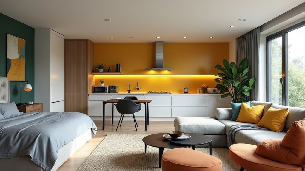
Before you pick up a paint swatch, decide what you want the room to *do* for you—calm you down, energize you, sharpen focus, or encourage connection. When you lead with a goal, you’ll spend less time second-guessing and more time getting a result that supports how you live.
Define the primary mood, then pick one supporting note (warmth, crispness, or softness) so your choices stay coherent.
Audit fixed elements you can’t easily replace—flooring, upholstery, stone—and plan for Color transfer from rugs and wood tones so your “neutral” doesn’t read muddy.
Build hue harmony by selecting a dominant color, a secondary, and a restrained accent, then repeat them across textiles and trim for a unified, high-value finish.
Use Colour Psychology to Tweak Room Size
You can make a room feel larger fast by choosing light, reflective colours that push walls outward and keep sightlines open.
When you want intimacy or a premium, layered look, use darker tones to add depth and pull focus to key zones.
Then sharpen the perceived footprint with contrast—crisp trim, accent walls, or colour-blocking—so boundaries read clean and intentional.
Light Colours Expand Space
When a room feels tight or boxed in, light colours can visually push the walls outward by bouncing more natural and artificial light around the space. You’ll get instant breathing room with soft whites, pale greiges, and airy pastels that lift the ceiling line and reduce visual clutter.
To maximise the effect, choose light hues with a subtle warm or cool undertone that matches your flooring and daylight direction. Keep trims, ceilings, and built-ins one or two shades lighter to sharpen edges and heighten spatial illusions.
Use satin or eggshell on walls to reflect light without glare, and mirror the palette in large textiles to avoid contrast “breaks.” If you want a cost-effective upgrade, repaint first; it delivers the biggest perceived-square-foot return.
Dark Tones Add Depth
Use hue symbolism to set the mood while stretching perception: navy reads calm and expansive. Green feels grounded yet open, and charcoal signals modern sophistication.
For best value, sample large swatches at different times of day. Pick low-sheen finishes that reduce glare while still reflecting enough light to keep the space breathable.
Contrast Defines Boundaries
Dark tones set the emotional baseline, but contrast tells the eye where the room starts and stops. Use boundary contrast to “edit” perceived square footage without moving a wall. Paint trim a crisp, lighter shade to sharpen edges and make ceilings feel higher; go tone-on-tone to blur lines and widen the room’s read.
If you want a snug nook, anchor one wall with a deeper color and keep adjacent surfaces lighter for clean visual separation.
Balance is where value shows: match undertones so contrasts look intentional, not patched. Repeat the accent color in textiles or art to justify the boundary.
In open-plan spaces, switch wall color or rug tone at transition points to define zones and guide traffic, cleanly.
Colour Psychology for Calm Bedrooms
For a calmer bedroom, you’ll get the best return from soothing cool tones—think soft blues, gentle greens, and misty greys that signal your brain to slow down.
Muted neutrals like warm taupe, oatmeal, and stone keep the space grounded without feeling flat, especially when you balance them across walls, bedding, and window treatments.
Add pale pastels as controlled accents to soften contrast and keep the room feeling quiet, cohesive, and sleep-ready.
Soothing Cool Tones
When your bedroom needs to feel like a true reset, cool tones—think soft blues, muted greens, and blue-leaning greys—signal calm to the eye and help quiet the space visually. Use them on the largest surfaces first: walls, headboard, and bedding, so the palette reads consistent at a glance.
To keep it polished, build complementary colour schemes with restrained accents—warm brass hardware, honey oak, or a terracotta vase—so the room feels balanced, not cold.
Dial in Texture and finish choices: matte paint reduces glare, washed linen softens edges, and a low-pile wool rug absorbs visual noise. Repeat one cool tone across two or three elements to look intentional and elevated, then keep patterns minimal for cleaner sleep cues.
Muted Neutrals And Pastels
Muted neutrals and soft pastels give you the same calm signal as cool tones, but with a warmer, more cocooning feel that suits bedrooms that need comfort as much as quiet.
Start with Muted neutrals on the walls—oat, greige, warm ivory—so light bounces gently without glare and your space feels instantly settled.
Then layer pastel palettes in controlled doses: dusty blush bedding, misty lavender cushions, or pale sage drapery. Keep saturation low to reduce visual “noise” and help your mind downshift faster at night.
For a premium, pulled-together look, match undertones (warm with warm) and repeat the accent colour three times across the room.
Finish with matte paint and natural textures to keep everything soft.
Colour Psychology for Focused Home Offices
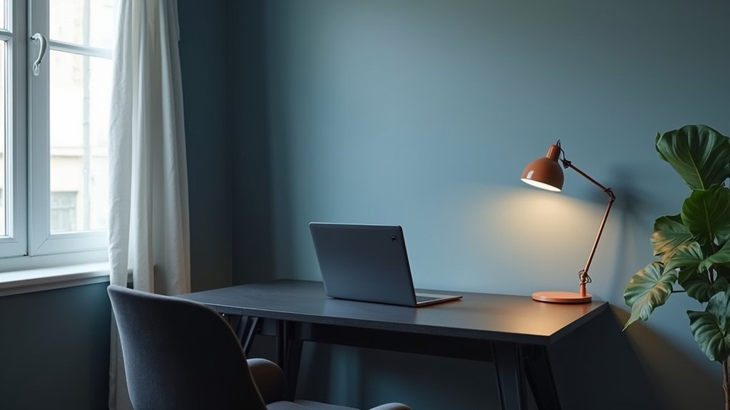
Although your to-do list mightn’t change, the colours in your home office can quickly shift how alert, calm, and persistent you feel throughout the day. Choose Color combinations that support deep work: soft blues or blue-greens for steady concentration, paired with crisp white to keep the space feeling clean and decisive.
Use the Psychological effects of warm accents sparingly. A controlled hit of terracotta, mustard, or coral on a pinboard, chair, or desk lamp can boost motivation without overstimulating you.
If you juggle calls and creative tasks, try a balanced greige base with a muted teal wall for focus and a small black detail for authority. Keep finishes matte to reduce glare, and repeat one accent colour across accessories to prevent visual noise.
Colour Psychology for Welcoming Living Rooms
In your living room, warm neutrals like creamy whites, soft greiges, and muted taupes set a comfortable baseline that makes guests feel at ease.
You’ll boost sociability with controlled accents—think terracotta, warm blush, or olive—placed in pillows, art, or a single statement chair.
Keep the balance by repeating those accent tones sparingly and anchoring them with your neutral core, so the space feels inviting, not busy.
Warm Neutrals And Comfort
When you want your living room to feel instantly welcoming, warm neutrals deliver comfort without locking you into a single style. Choose creamy whites, oatmeal, greige, soft taupe, or clay to lower visual noise and make seating feel more inviting.
You’ll also benefit from Color symbolism: these shades signal stability, calm, and approachability, with cultural associations that often read as homey and trustworthy across many markets.
To keep the look polished, match undertones to your light: south-facing rooms handle beige and sand; cooler light prefers greige or mushroom. Use a durable, washable eggshell on high-touch walls, and repeat the neutral in rugs and curtains for cohesion.
Then set warmth with matte finishes and natural textures so the room feels lived-in, not flat.
Sociable Accents And Balance
Warm neutrals set the comfort baseline, but sociable accents bring the room to life and keep it from reading too safe. Choose Accent colours that signal connection—soft terracotta, olive, muted teal, or warm mustard—then repeat them at least three times for a designer-grade finish.
Keep balance by controlling saturation and placement. You’ll get better Room harmony when bold notes stay in movable pieces: cushions, throws, art, and a single statement chair, rather than committing to a full accent wall.
Anchor the palette with one dark “weight” (charcoal, espresso, or navy) in a rug border or media unit so the space feels grounded. If your room skews cool, add brass or oak; if it skews warm, add black metal for contrast.
Colour Psychology for Appetite in Dining Rooms
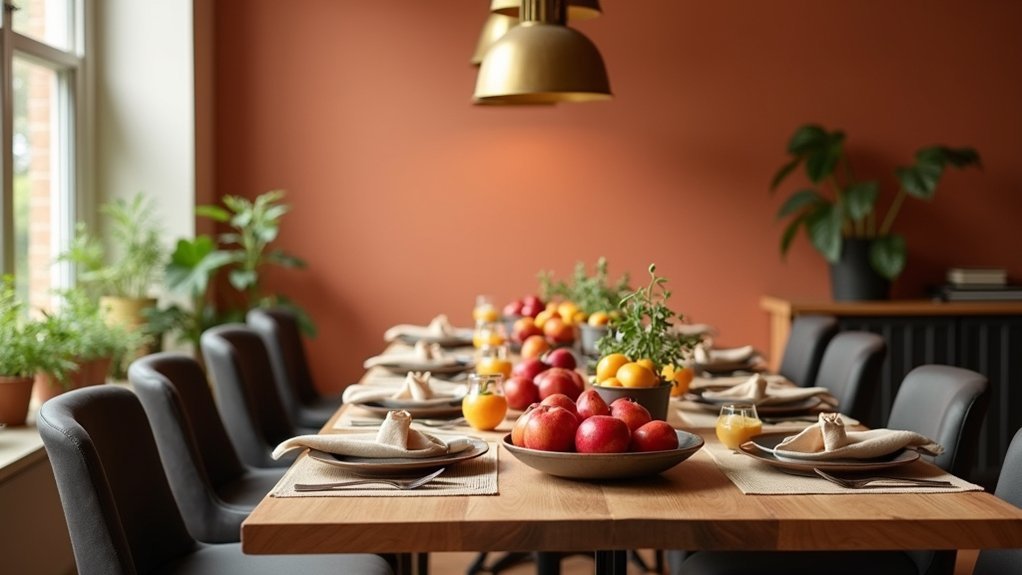
Although your menu sets the stage, your dining room’s colour palette can nudge guests to feel hungrier, linger longer, or wrap up faster. For appetite stimulation, lean on warm reds, terracottas, and buttery ambers in accent walls, upholstery, or art; they subtly raise energy and make aromas feel more inviting.
If you want longer stays and higher check averages, balance those warms with creamy neutrals and walnut tones to keep the space comfortable, not frantic.
For food presentation, aim for contrast: matte charcoal or deep green backdrops make plates pop, while soft whites keep colors true under warm lighting. Use cool blues sparingly; they can dampen appetite, but work well in small doses for premium, calm dining.
Colour Psychology for Energetic Kitchens
Once guests leave the dining room, your kitchen palette becomes the engine that keeps tickets moving and energy up. Choose warm, high-visibility hues—tomato red, saffron, tangerine—to cue urgency and action through Color symbolism, while keeping walls slightly muted so food plating stays true.
Add clean, bright task lighting to amplify contrast at prep zones and reduce mistakes during rushes. Use yellow in accents for speed and optimism, and balance it with charcoal or stainless tones to prevent visual fatigue.
Respect Cultural influences: in some markets red signals celebration, in others it reads warning, so test swatches under your actual bulbs.
Finish with durable satin paints and wipeable backsplashes that protect margins, time, and staff morale daily.
Colour Psychology for Fresh, Clean Bathrooms
Because guests equate bathroom colour with hygiene, you should build a palette that reads instantly fresh and well-maintained—crisp whites, soft aqua, pale sage, and cool light greys that reinforce cleanliness while reflecting light to make small footprints feel larger.
Keep finishes high-contrast and easy-care: white tile with light-grey grout signals order, while satin or semi-gloss paint wipes down fast.
If you want a spa upgrade without renovation, commit to Monochrome schemes in grey, white, or sage, then vary texture through towels, matte ceramics, and brushed nickel.
Add Vivid accents sparingly—cobalt soap dispensers, a terracotta plant pot, or a black-framed mirror—to create a premium, styled look without visual clutter.
Your bathroom will feel cleaner, brighter, and more valuable to buyers.
Test Colour Psychology With Light and Samples
A fresh bathroom palette only pays off if it holds up in your actual lighting, so test before you commit. Paint large sample swatches on poster board and move them around the room; you’ll see how hue shifts near tile, mirrors, and metal finishes, protecting your budget from costly repaints.
Check samples at three times: morning, midday, and night, then repeat with vanity lights on and off to evaluate lighting contrast. Hold your towel, grout, and countertop samples beside each swatch to confirm Color harmony, not just a nice standalone shade.
If you’re choosing between two close whites, compare undertones against a sheet of true white paper. Take photos to track what your eye misses.
Avoid Colour Psychology Mistakes That Clash
While colour psychology can set the exact mood you want, it’ll backfire if your palette fights the room’s fixed finishes. Start by auditing undertones in flooring, countertops, tile, and large upholstery; then choose paint that reinforces them, not “almost matches.” If you ignore undertones, you’ll get a sour mix: warm beige beside cool grey reads muddy and cheap.
Protect Color harmony by limiting competing heroes—pick one dominant hue, one supporting tone, and one accent. Watch saturation: high-chroma reds and yellows spike energy, but in small rooms they can feel cramped and raise stress, hurting emotional impact.
Balance bold colour with neutrals and repeat it in textiles and art. Finally, align temperature across bulbs and paint; mixed lighting makes “calm” colours look harsh.
Frequently Asked Questions
How Do I Adapt Colour Psychology for Open-Plan Rooms With Multiple Functions?
You adapt colour psychology by zoning: pair calm bases with bold accents—quiet meets buzz. Use Color contrast to define functions, and adjust palettes for Lighting influence. You’ll create cohesion, boost usability, and protect resale appeal.
Do Cultural Differences Change the Psychological Impact of Specific Colours?
Yes—cultural differences can shift how you perceive colours. You’ll see Cultural symbolism and Regional preferences affect trust, calm, or excitement. You should research target users, test swatches locally, and adjust palettes accordingly.
What Are the Best Colour Choices for Renters Who Can’T Repaint Walls?
Over 70% of renters prefer move-in-ready neutrals, so you’ll win with removable upgrades: master Color coordination via textiles, rugs, and art, and refine Accent wall choices using peel-and-stick wallpaper, panels, or large-scale tapestries.
How Can I Use Colour Psychology to Make a Room Feel More Luxurious?
You’ll make a room feel more luxurious by choosing rich, deep Color combinations, balancing matte and metallic finishes, and layering textures. You’ll drive Mood enhancement with warm lighting, cohesive accents, and high-contrast, tailored styling.
Which Paint Finishes Affect Mood Differently, Like Matte Versus Gloss?
You’ll find Matte finishes, mood enhancement by softening harsh edges and keeping things tastefully understated, while Gloss finishes, space perception by bouncing light to feel bigger and cleaner. Choose matte for calm value; gloss for polished impact.


