
 Andrew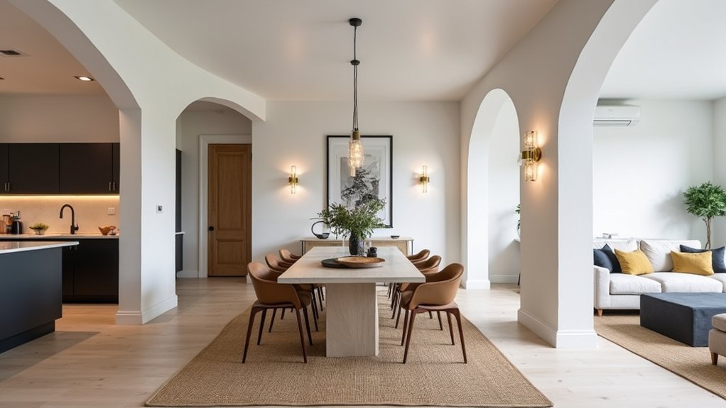
Like Bauhaus designers who treated a home as one system, you’ll get a more polished look when every room follows the same rules. Start by naming your core style and locking a whole-home palette: 60–70% dominant neutrals, 20–30% mid-tones, and 10% accents. Then you repeat two to three finishes, a few signature shapes, and one “hero” piece per space. Most homes fail at one step—yours doesn’t have to…
Define Your Home’s Core Interior Style
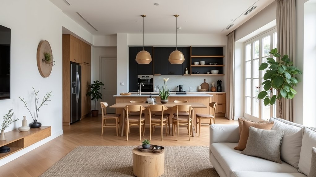
Where do you start when every room seems to “want” a different look? You define a core style by auditing what you already own and what you actually use. Track your top 10 pieces—sofa, dining set, rugs, art—and note shared traits: leg shape, wood tone, metal finish, and silhouette. If 7 of 10 items lean clean-lined, you’re closer to modern than traditional.
Next, map your furniture arrangement: do you default to open circulation and fewer, larger pieces, or layered zones and many small accents? That choice signals your base style.
Finally, standardize wall treatments by category—paint vs. paneling vs. textured paper—then pick one “hero” approach and one supporting option. You’ll shop faster and waste less.
Pick a Whole-Home Color Palette That Flows
How do you make every room feel connected without painting the whole house the same color? Build a tight palette: one dominant neutral (about 60%), one supporting mid-tone (30%), and one accent (10%). This 60/30/10 ratio mirrors how staged homes photograph and helps buyers read spaces as intentional.
Use Color psychology to steer mood: warm off-whites and clay tones boost perceived comfort; cool grays and blue-greens signal calm and focus. Keep undertones consistent across rooms, then vary saturation to create hierarchy—lighter in low-light halls, deeper in rooms with strong daylight.
Map progressions at sightlines: doorways, stair landings, and open-plan edges. Finally, specify paint finishes strategically—eggshell for walls, satin for high-traffic zones—to keep sheen shifts controlled.
Choose Consistent Materials and Finishes Throughout
To lock in a cohesive look, you’ll get the most ROI by repeating a few key materials—like one wood tone, one stone, and one metal—across the whole home.
Keep your finish sheens consistent (e.g., satin walls, matte ceilings, uniform hardware sheen) so shift read intentional instead of piecemeal.
This tight material-and-sheen edit reduces visual noise, simplifies purchasing, and aligns with what buyers expect in well-designed interiors.
Repeat Key Material Choices
Even if you mix eras and price points, repeating a tight set of materials and finishes makes a home read as intentionally designed, not randomly assembled. Pick 3–5 “anchor” materials—like white oak, matte black metal, honed stone, linen, and clear glass—and deploy them in every zone. You’ll get Material consistency without forcing identical furniture.
Use a simple audit: list your anchors, then check each room for at least two repeats. Buyers and renters notice continuity; listings that photograph as a unified package typically command stronger offers and faster decision-making.
Create Texture variation inside the same material family: pair oak veneer with oak slats, stone tile with a stone-look countertop, or linen drapery with boucle upholstery. Keep accents seasonal, but hold anchors steady so updates don’t trigger expensive rework later.
Harmonize Finish Sheens Homewide
While color and form grab attention, sheen consistency is what makes a home photograph as “finished” rather than pieced together. Track finish sheens room to room the way designers track undertones: pick a tight range and repeat it. If your walls are eggshell, keep adjacent halls and open-plan areas eggshell too; shifts read as patchwork under mixed daylight and LEDs.
Use matte on ceilings, satin on trim, and reserve gloss for one deliberate accent, like a lacquered door or bar.
Buyers notice when metals and wood topcoats clash. Standardize to one hardware sheen family (brushed nickel or matte black) and one wood sheen level (matte or satin). Then create Texture variation through grain, weave, and stone, not random shine.
Repeat Signature Shapes to Create Interior Cohesion
To make your space read as intentional, pick one or two signature shapes—like an arch, a radius curve, or a clean rectangle—and repeat them across rooms.
You’ll echo key silhouettes by matching curves and angles in high-visibility pieces (sofa arms, mirrors, lighting, hardware), which creates cohesion without buying a full set.
Treat it like a repeatable design system: the more consistently you reuse the same geometry, the more polished and “priced-right” your home looks.
Echo Key Silhouettes
Because your eye tracks patterns faster than it processes color or texture, repeating a few signature silhouettes is one of the quickest ways to make a space feel cohesive without buying a matching set. Pick 2–3 key silhouettes that match your lifestyle (e.g., tailored lounge chair, drum shade, pedestal table) and place them in multiple rooms.
Designers call these repeatable interior motifs; buyers read them as “intentional,” which lifts perceived quality without a big budget. Audit your home by category: seating, lighting, tables, and decor. For each, choose one shape to echo, then vary material, scale, and price point to avoid sameness.
Shop with filters—shade type, table base, chair profile—so your cart stays consistent across retailers. Track repeats in a simple checklist.
Repeat Curves And Angles
Even if your furniture comes from different brands and decades, repeating the same curve-to-angle ratio makes the whole space read as “designed.” Choose one dominant geometry—soft arcs (rounded sofas, oval mirrors, drum pendants) or crisp lines (rectangular tables, square shades, linear shelving)—then echo it in 3–5 touchpoints per room so the pattern shows up quickly at a glance.
To keep it market-smart, treat shapes like a visual KPI: if you can’t spot the geometry in 10 seconds, add another cue. Use repeatable, budget-friendly swaps—pillows, hardware, lamps, art frames—before big-ticket furniture.
Extend the geometry into architecture: ornamental moldings can reinforce arcs with rounded profiles, while decorative trims can sharpen lines with flat, squared casings. Maintain one “accent” exception per room so it feels curated, not themed.
Keep Furniture Styles Aligned From Room to Room
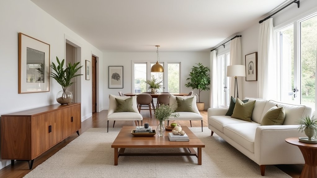
When your furniture styles stay consistent from room to room, the whole home reads as intentional, which is exactly what drives stronger buyer perception and fewer “something feels off” reactions. Buyers decide fast, so you can’t afford visual noise.
Lock in 2–3 repeatable cues: a shared wood tone, one metal finish, and a consistent leg profile (tapered, block, or hairpin). Then edit each room to match that baseline.
Mix eras only with a rule: keep silhouettes aligned and vary texture, not shape. If your living room is mid-century, don’t jump to ornate farmhouse in the dining room—bridge with simpler profiles and similar scale.
This Furniture harmony creates Style continuity, helping photos read clean and walkthroughs feel seamless.
Use Lighting to Unify Your Interior Style
Although buyers clock furniture first, lighting is what makes your style feel consistent in every photo and walkthrough, and it directly affects perceived room size, cleanliness, and finish quality.
Standardize your lighting temperature across the home—stick to 2700K–3000K for a warm, upscale read or 3500K for a cleaner, modern look. Mixing bulbs is a fast way to telegraph “piecemeal updates.”
Layer the plan: set a baseline Ambient glow with evenly spaced ceiling fixtures or recessed cans, then add accent illumination to highlight artwork, a fireplace, or a kitchen backsplash.
Put everything on dimmers; you’ll control contrast and reduce harsh shadows that cameras exaggerate.
Match visible metals on key fixtures so progression feel intentional, not accidental.
Keep bulb lumen output consistent per room.
Tie Rooms Together With Cohesive Décor and Textiles
Since buyers scan for visual continuity as fast as they scan for condition, you should use décor and textiles to repeat a tight set of cues from room to room—think one metal finish, two to three core colors, and one to two consistent textures (linen, boucle, jute) that show up in pillows, throws, rugs, and window treatments.
Anchor each space with a “hero” rug that hits your palette, then build textile layering: a neutral base, one patterned element, and one tactile piece. Keep scale consistent—larger patterns in larger rooms, tighter prints in smaller ones.
Use decorative accents to echo forms and finishes: matching frames, similar vase silhouettes, or repeat the same black/brass hardware tone. Aim for 60/30/10 color balance so rooms feel related, not copy-pasted.
Fix the Most Common Cohesive Interior Style Mistakes
Because buyers process a home in seconds, the most common “cohesive style” mistakes usually trace back to mixed signals: too many competing finishes, a palette that changes room to room, and scale errors that make spaces feel disconnected.
Fix them fast by standardizing your hard finishes: pick one metal tone, one wood undertone, and repeat them at least three times across sightlines. Limit your palette to three neutrals plus one accent; track it in a simple room-by-room checklist to prevent style inconsistencies.
Correct scale by anchoring each space with one appropriately sized “hero” piece, then keep supporting items within a consistent visual weight. Edit accessories ruthlessly: remove duplicates, random trends, and high-contrast clutter—these decorating mistakes read as chaos in listing photos and showings.
Frequently Asked Questions
How Can I Make an Open Floor Plan Feel Cohesive Without Matching Everything?
You’ll make an open floor plan cohesive by repeating a tight palette for color harmony, varying texture layering, and anchoring zones with rugs and lighting. Keep 2–3 materials consistent, then rotate accents for visual diversity.
What’s the Best Way to Blend Two Interior Styles Without Clashing?
Blend styles best by picking a shared Color palette and repeating 3–5 core tones across rooms. Add Texture contrast—smooth plus nubby, matte plus metal—to signal intention. Use 70/30 dominance, then unify with lighting.
How Do I Create Cohesion in a Rental With Strict Decorating Limitations?
You create cohesion by sticking to Color coordination: one neutral base, two accents, repeated in textiles. Use removable Decorative accessories—peel-and-stick art, lamps, trays. Standardize hardware and storage. Landlords approve reversible upgrades more.
In What Order Should I Update Rooms to Achieve Whole-Home Cohesion?
Update rooms in this order: entry/living, kitchen, primary bedroom, baths, then secondary spaces. Homes with cohesive palettes can feel 20% larger. Lock Color coordination first, then guarantee furniture harmony via repeatable finishes. You’ll waste less.
How Can I Keep a Cohesive Style While Showcasing Personal Collections?
You’ll keep Style consistency by curating a Personal display: repeat 2–3 finishes and one color family, group items by type, limit shelves to 60–70% full, and rotate seasonally. Use matching frames, plinths, lighting.


