
 Andrew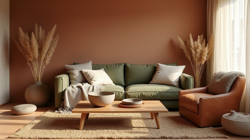
If you’re revitalizing a 1980s open-plan flat with north-facing light, you’ll notice beige can turn grey and lifeless fast. You get better results when you anchor the scheme with warm neutrals (sand, clay, putty) and add depth through olive, terracotta, or umber in smaller doses. Then you soften the look with bouclé, washed linen, and wool rather than glossy finishes. The key variable most people misjudge is…
Choose Earthy Colours That Feel Warm, Not Dull
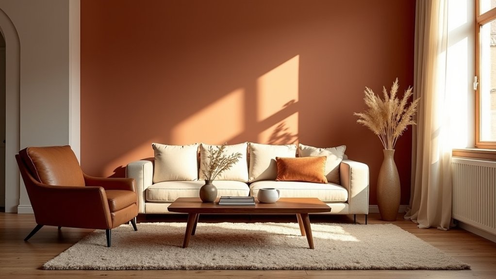
Why do some “earthy” palettes look rich and welcoming while others fall flat? You’re usually seeing undertone control, not color intensity. Warm earth tones skew red, gold, or olive; dull ones lean gray or greened-out beige. When you sample, check each shade under morning and evening bulbs, then reject anything that turns ashy on white paper.
Market data shows shoppers favor “sun-baked” neutrals—camel, terracotta, ochre—because they read cozy on camera and in open plans. Choose Eco friendly paints in those families with a soft-matte finish to keep light from bouncing harshly.
Add Botanical accents—sage ceramics, olive textiles, dried stems—to reinforce warmth without darkening the room. Keep contrast moderate, and you’ll avoid mud.
Build an Earthy Colour Palette That Layers Well
Although a single “perfect” terracotta can look great on a swatch, your room will feel warmer and more intentional when you build a layered palette with clear roles—base neutral, mid-tone, and a few deeper anchors—so colours don’t compete as light shifts.
Start with one stable base that covers the largest surfaces (walls, big rugs), then choose one mid-tone for upholstered pieces, and limit accents to two supporting shades.
Design retailers report shoppers keep returns low when palettes stay within one undertone family. You can test this fast: place samples together under morning and evening light; if any reads “pink” or “grey” alone, swap it.
Use Natural dye techniques in textiles for nuanced variation, and prioritise Eco friendly material sources so the palette looks rich, not flat.
Balance Warm Neutrals With Deep Earthy Tones
You’ll get the most broadly appealing warmth by layering creamy whites, sand, and taupe as your baseline, since these neutrals keep spaces feeling bright and flexible.
Then you’ll sharpen the look with deep earthy accents—olive, terracotta, umber, or charcoal—in smaller, high-impact moves like textiles, feature walls, or key furniture.
Keep the ratio weighted toward neutrals so the room stays inviting, and use the darker tones to add contrast and depth where your eye naturally lands.
Layer Warm Neutrals
When warm neutrals lead your palette, you can build instant comfort without sacrificing depth by pairing them with a few grounded, earthy anchors. Start with three related neutrals—cream, oat, and warm greige—then vary undertones to prevent flatness. Use matte walls, nubby upholstery, and lightly grained wood to create contrast without changing hue.
Market data shows buyers rate “calm” rooms higher when values stay close and textures do the work. Track Earthy colour symbolism: sand reads stability, clay signals nurture, and stone suggests longevity. Respect Cultural influences on earthy palettes by borrowing regionally familiar neutrals—linen, khaki, or putty—rather than forcing one universal beige.
Keep accents restrained so layering stays cohesive, not busy.
Add Deep Earth Accents
To keep warm neutrals from reading flat, introduce a few deep earth tones that add contrast without breaking the calm. Designers are leaning into grounded palettes because they photograph well, feel timeless, and suit both rental and permanent updates.
Use Deep earth accents in small, high-impact zones: a walnut side table, smoked leather ottoman, rust throw, or cocoa-toned lampshade. Aim for a 70/20/10 mix—neutrals, midtones, then darks—so the room stays airy.
Choose enriching textures to prevent the darker notes from feeling heavy. Pair clay hues with bouclé, espresso wood with linen, and deep olive with brushed brass.
Repeat one accent color three times to make it intentional and cohesive.
Use Soft Materials to Make Earthy Colours Cosy
Although earthy colours like clay, olive, and sand set a grounded palette, soft materials determine whether the room reads as merely “neutral” or genuinely cosy. Market data shows buyers associate comfort with touch cues, so you’ll get more warmth-per-dollar by upgrading textiles before repainting.
Lean on Colour psychology: earthy hues calm, but plush surfaces add perceived temperature and approachability. Choose brushed cotton, bouclé, washed linen, or velour in adjacent tones to soften contrast without dulling it.
Use Textile patterns strategically—small-scale checks or tonal stripes on cushions and throws add depth while keeping the palette quiet. Prioritise high-contact zones: sofa arms, bed runners, and rug underfoot.
Keep sheen low; matte weaves absorb light and make earth tones feel enveloping.
Mix Natural Textures Without Making Rooms Heavy
You’ll get the most warmth per square metre when you balance rough textures like reclaimed wood or stone with smooth finishes such as polished plaster or matte ceramics.
Keep the mix feeling light by layering breathable natural fibres—linen, cotton, jute—in thinner weaves rather than bulky piles.
Then add airy contrast accents (light-toned rugs, slim-legged furniture, glass or metal details) so the room reads textured, not heavy.
Balance Rough And Smooth
When earthy palettes dominate a space, texture does the heavy lifting—so balancing rough and smooth keeps the room inviting instead of visually dense. Current design trends show buyers respond best to “tactile contrast”: one grounded, one refined surface in every sightline.
Start with Textured wall finishes on a single plane (limewash, plaster, or subtle ribbing), then counter with sleek elements like satin paint, glass, or a polished stone top. Keep the ratio near 70/30: let calm, smooth surfaces lead, and use roughness as punctuation.
On seating, pair a nubby upholstery with a tighter weave on pillows; choose contrasting fabric patterns, but keep scale disciplined—one large motif, one micro-texture. Finish with matte metals to bridge both worlds without adding weight.
Layer Light Natural Fibers
How do you bring in more natural texture without making an earthy room feel bulky? You layer light natural fibers in thin, flexible doses: a flatweave jute rug under a tighter wool runner, linen curtains, and a cotton coverlet instead of chunky knits. Market demand favors breathable, tactile surfaces, but weight creeps in when you repeat dense weaves at every level.
Start with one anchoring fiber, then add two supporting ones with different scales. Keep piles low, choose open weaves, and limit thick fringe. Prioritize natural fiber sourcing with traceable origins and consistent grading so textures look intentional, not mismatched.
Use sustainable material selection—organic cotton, responsibly sourced wool, and low-impact dyes—to reduce off-gassing and maintain softness over time. Rotate layers seasonally to prevent visual buildup.
Add Airy Contrast Accents
Although earthy palettes thrive on warmth, the room can start to read heavy if every surface sits in the same matte, mid-tone texture band. You fix that with airy contrast: introduce a few lighter, smoother, or subtly reflective elements that break up visual density without turning the scheme cold.
Design markets are leaning toward “quiet contrast” over stark black-and-white, so choose pale oak, bleached linen, ivory ceramics, or brushed nickel rather than high-gloss chrome. Use accent layering with restraint: one elevated plane (sheer curtains or a light rug), one highlight object (glass lamp, alabaster bowl), and one vertical lift (tall branch in a slim vase).
Keep each accent at 10–15% of the room so warmth stays dominant while the textures breathe.
Pair Earthy Colours With Wood and Rattan Finishes
Because wood and rattan already carry warm undertones, they amplify earthy colours—clay, olive, sand, and terracotta—without making a room feel heavy.
Designers lean on this pairing because it reads timeless, photographs well, and satisfies today’s demand for natural, wellness-led interiors.
Start by matching undertones: pair red-leaning terracotta with walnut or teak, and cooler olive with ash or oak. Use one dominant wood finish, then add Rattan furniture as a secondary texture to prevent visual clutter. Keep grains visible; heavy stains can mute Earthy tones.
Balance matte and satin: a matte clay wall looks sharper beside satin timber, while rattan’s weave softens hard edges. If you’re mixing pieces, repeat the same rattan tone in at least two spots to unify the scheme.
Pick Paint and Fabrics for Each Room’s Light
When you choose paint and fabrics based on the light a room actually gets, earthy palettes stay warm and intentional instead of turning flat, murky, or unexpectedly neon. Start by mapping exposure: north light skews cool, so you’ll want clay, ochre, and warm greige, plus nubby linens that hold depth.
In bright south rooms, go softer—sand, putty, and muted olive—and choose matte finishes to prevent glare from bleaching colour.
East light boosts morning warmth, so you can handle a Bold pattern in terracotta or cinnamon; west light intensifies late-day saturation, so balance it with oatmeal upholstery.
Test swatches at three times daily.
Use one Vibrant accent per room to keep demand-led contrast.
Add Lighting That Flatters Earthy Colour Schemes
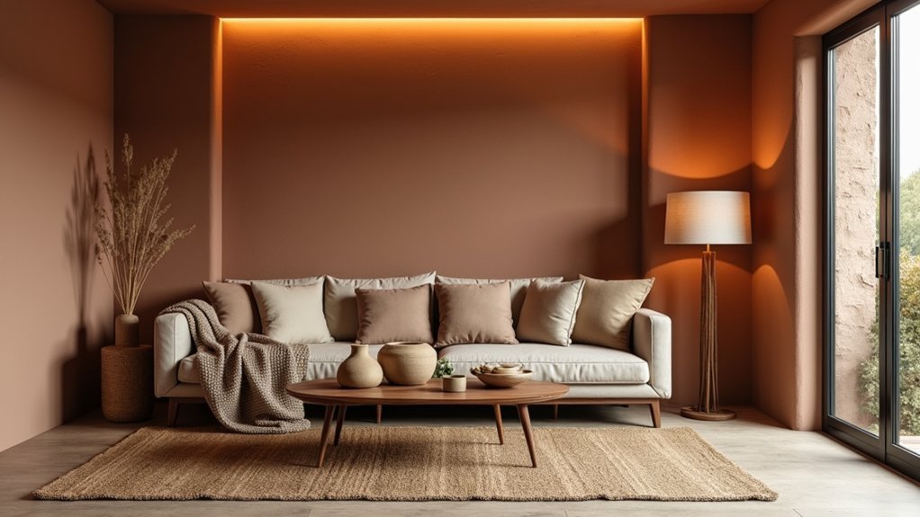
To keep earthy palettes looking rich instead of muddy, you’ll get better results with warm-temperature bulbs (roughly 2700–3000K), a range designers and retailers consistently position as “cozy.”
You’ll also want to layer lighting—ambient for overall glow, task for function, and accent to sharpen texture in woods, linens, and clay tones. When you control these layers separately, you can tune the room’s warmth and contrast without changing your paint or fabrics.
Choose Warm-Temperature Bulbs
Although your paint, textiles, and wood tones set the palette, warm-temperature bulbs determine whether those earthy colours read rich or washed out. Aim for 2700K–3000K LEDs; they boost reds, ochres, and clay notes, aligning with Color psychology that links warmth to comfort and social ease.
Cooler 4000K+ lamps can skew taupe toward gray and make terracotta look flat.
Check CRI, too: choose 90+ so greens and browns stay nuanced, especially beside eco-friendly paints that use mineral pigments and can shift under harsh light.
Use dimmable bulbs to keep evenings cozy without changing fixtures. In-store, compare Kelvin labels and test a bulb near your swatches; you’ll spot undertones immediately.
Layer Ambient Task Accent
Because earthy palettes rely on subtle undertones, you’ll get more consistent, flattering colour by layering three light types—ambient for overall glow, task for function, and accent for depth—instead of relying on a single overhead fixture.
Start by layering ambient lighting with dimmable ceiling or wall-wash sources so clay, olive, and sand read even at night; designers report this reduces “muddy” colour complaints in open plans.
Add task lighting where your eyes work: under-cabinet LEDs, swing-arm reading lamps, and vanity bars with diffusers to avoid harsh shadows on textured linens.
Finish with accent lights—picture lights, uplights on plants, and shelf spots—to build contrast that makes soft materials look richer.
Tie the mood together: Incorporate natural scents via cedar, beeswax, or eucalyptus nearby.
Style Earthy Colours With Simple, Tactile Accessories
When you pair earthy colours with simple, tactile accessories, the palette reads intentional rather than flat, which is why many current interiors lean on texture as much as tone. You’ll get more perceived depth without repainting, so brands are pushing touch-first finishes like matte ceramics, nubby wool, and oiled wood.
Start with Minimalist accessories in repeatable shapes—bowls, trays, and cylinder vases—so the eye tracks form, not clutter.
Then introduce one or two Vibrant accents to lift the scheme: a saffron cushion, cobalt glass, or rust artwork. Keep them small and high-contrast, and echo each accent once elsewhere to create a controlled rhythm.
Prioritise hand-feel: linen napkins, boucle throws, and leather pulls make earth tones read premium, not muddy.
Avoid Common Earthy Colour and Texture Mistakes
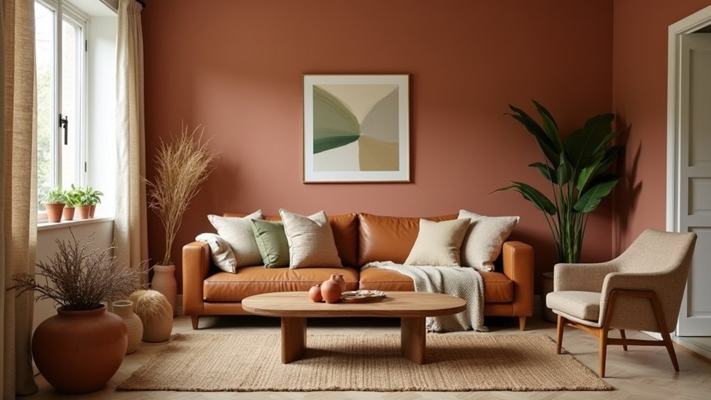
If you lean too hard on earth tones and touchable finishes, the room can quickly shift from “warm and layered” to “dim and heavy,” which is why designers now treat restraint as a key part of the trend. Audit your palette first: keep Color saturation moderate on large surfaces, then push richer clay, moss, or cocoa in smaller, movable pieces. You’ll avoid the flat “all-midtones” look buyers now reject in favour of clearer value range.
Next, engineer Texture contrast: pair nubby bouclé with smooth wood, matte plaster with a little glazed ceramic, and wool with crisp linen. Don’t stack only soft, fuzzy materials; it reads dated and absorbs light.
Finally, reserve black accents sparingly so warmth stays dominant in daylight.
Frequently Asked Questions
How Do I Make Earthy Colours Work in a Small Apartment?
You’ll make earthy colours work in a small apartment by keeping walls light, anchoring with one warm tone, and using Textile layering. Maximize Natural lighting, mirror placement, and limit contrasting accents to avoid visual clutter.
Which Earthy Shades Are Best for Renters Using Removable Decor?
Like a Renaissance painter, you’ll pick clay terracotta, warm taupe, muted sage, and sand—Natural pigments that renters can layer via peel-and-stick wallpaper, textiles, and art. Add Botanical accents in throws, vases, and decals.
How Can I Update Earthy Interiors to Feel Modern, Not Rustic?
You’ll modernize earthy interiors by balancing warm tones with sleek furniture and modern accessories. Choose clean-lined profiles, matte black or brass accents, minimal patterns, and streamlined lighting. Layer texture sparingly and keep surfaces edited for impact.
What Budget-Friendly Swaps Create an Earthy Look Without Renovations?
You can swap textiles, lighting, and decor—74% of buyers value natural materials—for an earthy look without renovations. Add Natural fiber textures (jute rugs, linen throws) and choose Organic paint options for small accent refreshes.
How Do Earthy Colour Schemes Affect Mood and Sleep Quality?
Earthy colour schemes give you calming effects by lowering visual stimulation, which can support sleep enhancement through faster wind-downs. You’ll get best results with matte taupes/greens, warm dimmable lighting, and low-contrast bedding, per trends.


