
 Andrew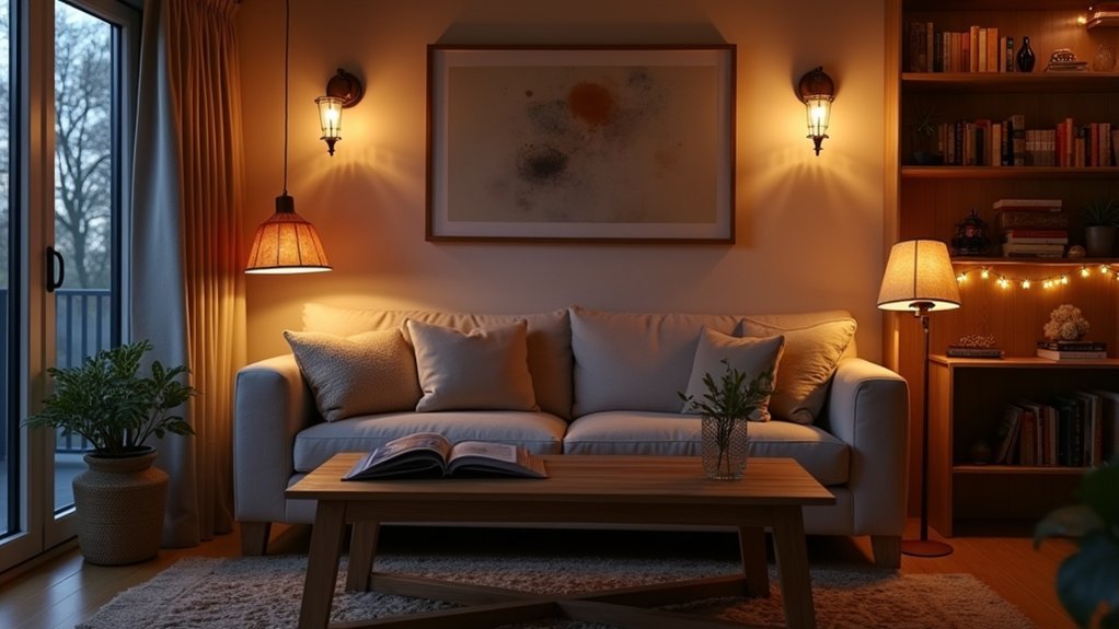
You set the vibe, you guide the focus, you control the comfort. Decorative lighting isn’t just a fixture choice—it’s a practical tool for making a room feel calm, energized, or intimate on demand. When you layer pendants, sconces, and lamps, dial in color temperature, and add dimmers, you get flexible scenes that match real life. The key is where you place light and what you let stay in shadow—because that’s what changes everything…
Start With the Mood You Want
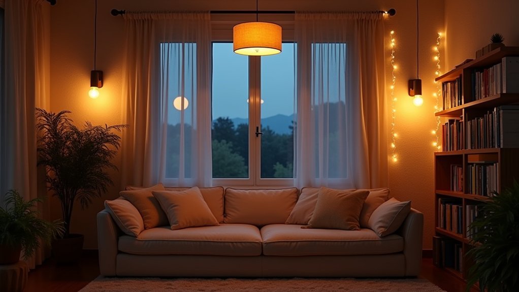
Before you buy a single fixture, decide exactly how you want the room to feel—calm and spa-like, energized and social, or warm and intimate—because every lighting choice should serve that goal.
Use color psychology to translate that mood into Kelvin targets and finishes: 2700K reads cozy, 3000K feels balanced, 3500K+ looks brisk and task-forward.
Then map fixture placement to the activities you actually pay for: conversation zones, reading spots, prep surfaces, and circulation paths. You’ll get more value by lighting where people look and linger than by overlighting the ceiling.
Audit natural light by day, note glare points, and choose dimmable drivers so you can protect comfort without sacrificing brightness when you need it.
Layer Decorative Lighting for Better Mood Control
Once you’ve set the mood target, you’ll control it far better by layering light than by relying on a single “main” fixture. Start with Ambient layers that give the room an even base: a dimmable ceiling pendant, cove lighting, or a pair of plug-in sconces on opposite walls.
Next, add task light where you’ll work or read, so you won’t over-brighten the whole space just to see clearly.
Then, finish with accent and decorative pieces—table lamps, picture lights, LED strips in shelving—to create depth, highlight textures, and guide attention.
Control each layer separately with dimmers or smart plugs, and group scenes for quick shifts.
Keep fixtures and finishes coordinated for color harmony and a cohesive, premium look.
Choose Decorative Lighting by Color Temperature
You can steer a room’s mood fast by choosing decorative lighting based on color temperature—warm versus cool. Check the Kelvin rating on the bulb: lower K (about 2200–3000K) reads cozy and calming, while higher K (around 3500–5000K+) feels crisp and energizing.
Match those Kelvin ranges to how you want the space to perform, and you’ll get better ambiance without buying more fixtures.
Warm Vs Cool Lighting
Although fixture style grabs attention first, color temperature determines whether a room feels cozy and intimate or crisp and energized. Choose warm lighting when you want skin tones to flatter, woods to read richer, and dining or lounging zones to feel inviting. It supports soft shadows and an easy Ambient ambiance that helps guests linger.
Choose cool lighting when you need clarity and momentum—think kitchens, vanities, home offices, and display shelves where details matter. Cool light sharpens edges, boosts perceived cleanliness, and makes whites look brighter.
Use Color contrast to your advantage: pair cool task light with warmer decorative accents so the room stays functional without feeling sterile. Match finishes and textiles to your choice—brass and warm paint love warmth, while chrome and crisp neutrals favor cool.
Kelvin Ratings And Mood
Because a bulb’s Kelvin rating sets the color cast before brightness even enters the equation, it’s the fastest way to dial a room’s mood with decorative lighting.
Use 2200–2700K to make living rooms and bedrooms feel intimate; it flatters skin, softens shadows, and helps you unwind.
Choose 3000–3500K when you want a clean-but-cozy vibe for dining areas and hallways, where décor should look true without feeling clinical.
Go 4000K for task-forward spaces like laundry rooms, and reserve 5000–6500K for garages or craft zones where contrast matters most.
When you shop, compare Kelvin ratings across fixtures so sconces, pendants, and lamps match. Consistency prevents color clashes and keeps your mood lighting intentional.
Always test at night.
Use Dimmers to Shift the Room’s Mood
When the same room needs to handle dinner, downtime, and deep-focus tasks, dimmers give you instant control over the mood without swapping fixtures. You’ll soften glare for conversation, drop light levels for movie night, or boost brightness for paperwork in seconds, preserving your room’s design while changing how it feels.
Start by confirming dimmer compatibility with your bulbs—especially LEDs—so you avoid flicker, buzzing, or limited range. Choose a dimmer rated for the load type and total wattage, and look for low-end trim settings that let you dial down smoothly.
If you want convenience, add lighting automation: set schedules, scenes, and voice control to match your routine, reduce energy use, and extend bulb life. That’s a small upgrade with daily payoff and resale appeal, too.
Pick Decorative Lighting Fixtures That Set the Tone
Now you’ll set the mood at first glance by matching fixture style to your room’s aesthetic—modern, vintage, or somewhere in between.
You’ll also lock in the tone by choosing material finishes that echo your hardware and textiles, from warm brass to crisp chrome or matte black.
Finally, you’ll get a polished, high-value look by nailing scale and proportion so pendants, sconces, and chandeliers feel intentional rather than oversized or underpowered.
Match Fixture Style
Even if your bulbs and brightness levels are perfect, the fixture style still sets the emotional “temperature” of a room. Start by naming the mood you want—serene, energized, intimate, or dramatic—then choose silhouettes that deliver it.
Clean lines and low-profile forms read calm and modern; curved arms, layered shades, or sculptural profiles feel expressive and curated. Match scale to the space: oversized pendants create a bold focal point, while smaller multiples feel rhythmic and controlled.
Keep the look consistent across sightlines so the room feels intentional, not patched together. Coordinate fixture style with your furniture era and architectural details, and preview how material finishes will interact with your existing palette. That alignment boosts perceived quality without inflating spend.
Choose Material Finishes
Because finishes catch the eye before light levels register, you’ll want to choose materials that reinforce the mood and work hard with your existing palette. Warm brass and aged bronze read inviting and upscale; polished chrome and glossy nickel feel crisp, modern, and energetic. Matte black adds contrast and a tailored edge, while soft white or linen shades keep things calm and airy.
Pay attention to material textures: ribbed glass diffuses glare, clear glass sharpens sparkle, and alabaster or opal tones smooth the glow.
Balance cost with finish durability by checking lacquered vs. living finishes, fingerprint resistance, and scratch tolerance on high-touch pieces. If you’re mixing metals, repeat one dominant finish and use the other as an accent for cohesion.
Scale And Proportion
If you want decorative lighting to feel intentional—not accidental—match fixture scale to the room’s proportions and the visual weight of your furnishings.
In a compact space, choose slimmer pendants or semi-flush mounts so ceilings feel higher and pathways stay clear.
In open plans, go bolder: an oversized chandelier or layered clusters can anchor seating zones and prevent the room from feeling adrift.
Use quick checks for scale balance: chandeliers should span roughly half to two-thirds the table width, and vanity lights should align with mirror width, not just wall space.
Keep proportion harmony by pairing heavy fixtures with substantial pieces (sofas, islands), and airy fixtures with lighter profiles.
When you size correctly, you’ll spend smarter, avoid costly returns, and set a confident mood.
Place Decorative Lighting to Shape Contrast
While your ambient lighting sets the baseline, decorative lighting is where you create contrast on purpose—pulling the eye to what matters and letting everything else recede.
Start by mapping sightlines from doorways and seating, then place statement fixtures where you want immediate visual hierarchy.
Use contrast techniques like pairing a sculptural pendant with quieter ceiling planes, or setting a luminous shade against matte, darker finishes.
Keep spacing intentional: cluster smaller lamps to read as one strong element, or isolate a single piece to give it breathing room.
Control glare with shades and dimmers so contrast feels premium, not harsh.
Finally, align each placement with your room’s focal points—fireplace, artwork wall, or dining table—so the mood reads curated and valuable.
Add Accent Lighting to Highlight What Matters
Once your decorative fixtures establish contrast and hierarchy, accent lighting lets you pinpoint the pieces that carry the room—art, texture, architecture, and the zones where people actually gather.
Use adjustable spots or slim picture lights to pull attention to focal points without overpowering your ambient glow. Aim beams at a 30-degree angle to reduce glare and flattening, and keep fixtures discreet so the highlight, not the hardware, reads first.
Layer in small-scale sources—LED strips in shelving, uplights behind plants, or wall grazers on brick—to reveal depth and premium materials. Choose warmer color temperatures for richer finishes, and add dimmers so you can fine-tune intensity as daylight shifts.
You’ll spend less time rearranging decor because light does the editing.
Match Decorative Lighting to Each Room’s Activities
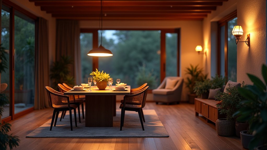
Because every room pulls double duty, you’ll get the most value from decorative lighting when you match each fixture’s look and output to what actually happens there—task-heavy prep, relaxed lounging, focused work, or late-night wind-down.
In the kitchen, pair a statement pendant with bright, glare-controlled bulbs so chopping stays safe and surfaces read true.
In the living room, prioritize an ambient glow from shaded floor lamps and dimmable sconces, then add decorative accents on shelves to lift depth without hot spots.
In bedrooms, choose warm-color lamps and low-level wall lights that won’t disrupt sleep, plus switches you can reach from bed.
In home offices, use crisp, directional light to cut eye strain, and keep decorative pieces secondary so focus wins.
Frequently Asked Questions
How Do I Calculate the Right Bulb Wattage for Decorative Fixtures?
Aim for 10–20 lumens per square foot; most rooms feel right around 1,500–3,000 lumens total. For bulb brightness, divide needed lumens by bulbs, then use watts via efficacy for wattage calculation.
Are Smart Bulbs Worth It for Decorative Mood Lighting Setups?
Yes, smart bulbs are worth it if you want flexible mood lighting fast. You’ll get Smart technology control, tunable color/brightness, scheduling, and better Energy efficiency. You’ll also reduce bulb swaps and optimize scenes.
How Can I Hide or Manage Cords for Decorative Lighting Neatly?
You can make cords disappear like shadows: run them along baseboards with paintable raceways for cord concealment, bundle with Velcro ties for cable management, use adhesive clips behind furniture, and hide adapters in cord boxes.
What Safety Tips Prevent Overheating When Using Decorative String Lights?
Prevent overheating by choosing LED, matching wattage, spacing bulbs, and avoiding bundled wires. Use timers, unplug when unattended, and inspect insulation. Follow fire hazard prevention and electrical safety tips: ventilate, keep away from fabric, use certified sets.
How Do I Maintain and Clean Decorative Lighting Fixtures Without Damage?
You’ll maintain fixtures by powering off, dusting weekly with microfiber, and using mild soap on damp cloth for grime. Apply cleaning techniques gently; follow material considerations: avoid abrasives on glass, solvents on plastics, and moisture near wiring.


