
 Andrew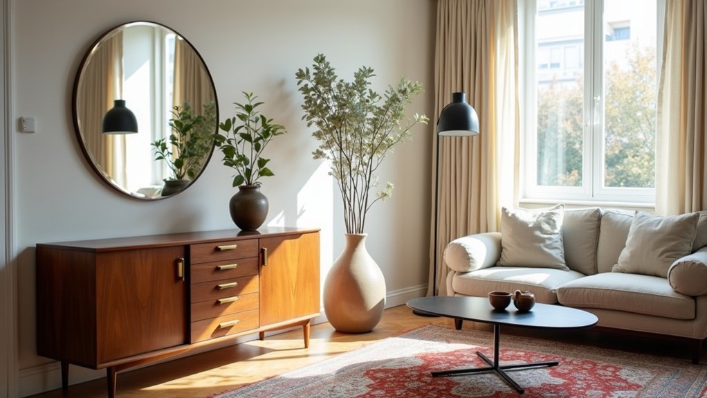
You want a space that feels current, curated, and lived-in. You’ll get there faster if you start with a clean modern base and layer vintage with intent, not volume—design pros often stick to an 80/20 split to avoid visual noise and protect resale appeal. Pick one “hero” piece, keep the palette tight, and repeat finishes so the mix looks planned. The real difference comes from what you don’t add…
Start With a Modern Base, Add Vintage Accents
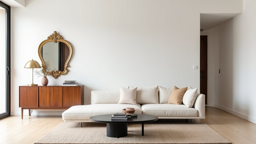
If you want vintage to feel intentional—not like clutter—start with a clean modern base: neutral walls, simple silhouettes, and consistent finishes you can scale over time.
Buyers consistently pay more for “move-in ready” rooms, so keep your big-ticket anchors—sofa, rug, drapery—in solid colors and low-contrast textures.
Then layer character where it’s cheapest to swap. Use one standout piece of antique furniture, like a walnut credenza, to add depth without rewriting the whole palette.
Add retro accessories—brass lamps, stacked art books, vintage ceramics—for high visual ROI and easy seasonal refreshes.
Keep wood tones within one temperature and repeat one metal finish to avoid a mismatched resale signal.
Photograph results in daylight; clean lines make patina read premium.
Use the 80/20 Rule for Vintage Pieces
While vintage adds instant character, too much of it can drag a room into “thrifted” territory and hurt buyer perception—so follow an 80/20 split: keep roughly 80% of what you see modern and cohesive (walls, major upholstery, primary lighting), and cap true vintage at about 20% (one statement casegood, a pair of lamps, curated art).
This ratio mirrors what sells: buyers pay more for spaces that photograph clean and read “move-in ready,” not themed. Audit your room by surface area and visual weight, not item count—an oversized antique furniture piece can consume the full 20% on its own.
Keep finishes consistent (one metal, one wood tone) and let retro accessories do the light lifting: trays, textiles, small ceramics. You’ll look curated, not cluttered.
Pick One “Hero” Vintage Piece Per Room
Pick one “hero” vintage piece per room—the item with the strongest silhouette, provenance, or resale demand—and let it set the visual hierarchy. You’ll get a cleaner, more current look when you surround it with modern supporting elements (simple upholstery, streamlined lighting, and restrained palettes) that don’t compete.
Balance scale and placement by giving the hero adequate breathing room and sightlines, so it reads intentional rather than cluttered.
Define The Hero Piece
Because a room reads fastest through one visual anchor, you’ll get the cleanest vintage-meets-modern result by naming a single “hero” vintage piece per space—think a mid-century credenza in the living room, a farmhouse table in the dining room, or an antique dresser in the bedroom—and letting everything else support it.
Choose Antique furniture with strong lines, solid joinery, and a scale that matches the room’s footprint; oversized pieces drive returns and resale loss. Aim for one statement item that would still sell alone on today’s market.
Vet it like an investor: check provenance, repair history, veneer condition, and drawer glide. Price-shop recent comps and factor restoration costs before you buy.
If you want Retro accessories, cap them at a small, curated set so they don’t compete with your hero.
Use Modern Supporting Elements
Once you’ve named the hero vintage piece, lock in a modern “supporting cast” that makes it look intentional—and keeps the room resale-friendly. Buyers scan for cohesion fast; simple, current companions reduce perceived “project” risk and help photos read clean online.
Use Contemporary minimalism as your baseline: solid-color textiles, streamlined silhouettes, and one neutral rug that won’t compete. Then add Industrial accents sparingly—blackened steel hardware, a matte metal floor lamp, or a slim-framed mirror—to echo today’s finishes and bridge eras.
Keep woods consistent in undertone, and repeat one metal finish twice so the vintage item feels anchored, not random. If the hero is ornate, choose low-profile seating; if it’s rustic, go for smooth lacquer or glass nearby. You’ll get contrast without chaos.
Balance Scale And Placement
Even if you love collecting, you’ll get a cleaner, more marketable look by giving each room just one “hero” vintage piece and scaling everything else around it. Buyers scan fast; one focal point improves recall and reduces visual noise.
Choose a hero with presence: a credenza, chandelier, or statement rug. Then lock in scale harmony by keeping surrounding pieces 20–30% smaller in visual mass (height, width, and bulk).
Use placement strategies that read intentional: center the hero on the room’s main sightline, give it clear negative space, and repeat its finish or color twice in modern accents. Anchor it with a contemporary backdrop—simple walls, streamlined seating, and tight art spacing—so the vintage form looks curated, not cluttered.
Mix Vintage Pieces With Modern Color Palettes
While vintage pieces bring character through patina and detail, a modern color palette keeps the room reading current and intentional. Start with a tight 3-color scheme: one dominant neutral (about 60%), one supporting mid-tone (30%), and one accent (10%) to anchor color harmony across eras.
Market data shows neutrals outsell bold walls, so let your vintage dresser or lamp be the “color risk” while paint and upholstery stay controlled.
Use pattern mixing strategically: pair one heritage motif (floral, toile, plaid) with one modern geometric, then repeat a shared hue at least three times—pillow, art, and rug—to reduce visual noise.
If your vintage piece is warm wood, choose warm whites and clay; if it’s chrome, lean into cool grays and inky blues.
Balance Vintage Texture With Clean Modern Lines
Because texture reads faster than style, you’ll get a more modern-looking room by pairing one or two high-texture vintage anchors (a carved-wood credenza, tufted leather chair, or nubby wool rug) with clean-lined counterparts that keep the silhouette crisp—think slab-front cabinets, track-arm seating, and simple metal frames.
Limit heavy patina to about 20–30% of what you see at first glance; beyond that, buyers often perceive the space as “dated,” not curated.
Use Contrasting textures to create value: rough wood against smooth lacquer, aged brass beside powder-coated steel.
Keep color harmony tight—two neutrals plus one muted accent—so texture, not color noise, does the work.
If the vintage piece is dark and tactile, brighten with flat, light modern surfaces and minimal hardware.
Repeat Shapes and Materials to Unify Old and New
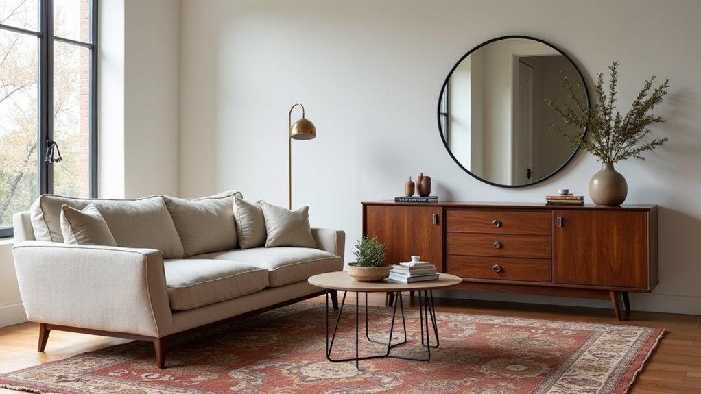
To make vintage and modern read as one story, you’ve got to repeat what the eye can quickly track: key silhouettes. Echo a curved vintage chair with a round mirror or arched floor lamp, then reinforce the mix by repeating complementary materials—brass, walnut, boucle—across at least three touchpoints.
This kind of visual consistency reduces “mismatch risk” and makes the room feel intentionally styled, not randomly collected.
Echo Key Silhouettes
If your vintage find feels “random” next to modern pieces, the fix usually isn’t more decor—it’s repetition. Anchor the room by echoing its outline: match the curve, taper, or blocky profile across two to three items.
Designers often use a 60/30/10 mix; you can mirror that by repeating one standout shape at the 30% level, so it reads intentional, not themed.
Start by naming your vintage piece’s geometry—arched, spindle-legged, scalloped, or cylindrical. Then pick modern counterparts that borrow that contour: a curved sofa with an arched mirror, or a streamlined credenza with rounded pulls.
This “silhouette stacking” keeps Antique silhouettes legible while letting Retro aesthetics feel current. Track your repeats like inventory: 3 echoes per room usually does it.
Repeat Complementary Materials
When your vintage piece and modern staples share two to three materials, the room reads curated instead of “collected.” Start by identifying the dominant finish on the vintage find—warm walnut, chrome, patinated brass, cane, or bouclé—then repeat it across high-visibility modern touchpoints (lighting, hardware, a side table base, or a frame).
Design audits show buyers perceive spaces as higher-end when finishes repeat, so keep your material palette tight: 60% primary, 30% secondary, 10% accent.
Use Material contrast deliberately—pair chrome with matte black or walnut with stone—so the vintage item feels intentional, not random.
Lock in Color harmony by matching undertones (gold brass with warm whites; chrome with cool grays). If you can’t match, echo texture: cane in a cabinet door, bouclé in a pillow.
Blend Vintage Decor With Modern Lighting
Although vintage furniture brings instant character, modern lighting makes it look intentional and current. Treat light as the connector: sales data from major retailers shows layered lighting packages outsell single-source setups, so you’ll get better resale appeal when you mix ambient, task, and accent.
Start by keeping one statement piece authentic—restore antique lighting in an entry or dining zone—then balance it with contemporary fixtures elsewhere. Use a 2700–3000K color temperature to flatter aged woods and patinated metals, and choose high-CRI LEDs (90+) so vintage textiles read rich, not muddy.
Scale matters: pick oversized pendants over heavy casegoods to prevent visual clutter, and use slim floor lamps near ornate silhouettes to add contrast. Put everything on dimmers for day-to-night flexibility.
Avoid Common Vintage + Modern Styling Mistakes
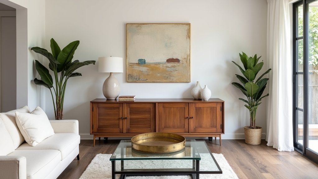
Because mixed-era rooms can slip from “curated” to “chaotic” fast, you’ll get the best results by avoiding a few repeat offenders that show up in buyer feedback and listing photos: overloading the space with small vintage objects, ignoring scale between heavy antiques and sleek modern pieces, and letting competing finishes fight for attention.
First, edit hard: buyers scan photos in seconds, and Antique clutter reads as “not enough storage.” Limit vignettes to one hero piece per surface and group the rest in closed cabinets.
Next, balance mass: if you use a bulky armoire, pair it with low, streamlined seating and leave negative space. Keep finishes to two metals and one wood tone.
Finally, control print: mismatched patterns tank cohesion. Repeat one color across eras and vary scale, not theme.
Frequently Asked Questions
How Do I Verify a Vintage Piece’s Authenticity Before Buying?
Verify authenticity by checking provenance, comparing materials and construction to documented examples, and inspecting Vintage markings against maker databases. You’ll price-check recent auction comps, demand clear photos, and use third-party appraisals when uncertain.
What Are Safe Cleaning Methods for Delicate Vintage Fabrics and Wood?
You’ll protect delicate vintage fabric using low-suction vacuuming through a screen and pH-neutral spot tests; practice Fabric preservation. For wood, use microfiber, diluted soap, then wax; Wood cleaning techniques. Example: 1950s chair, 2-minute test.
How Can I Mix Vintage and Modern Styles in a Rental Without Drilling?
You’ll mix vintage and modern in a rental by using Command strips, tension rods, and leaning art. Choose Eco friendly decorating swaps (LEDs, reclaimed textiles) and Space saving solutions like nesting tables, modular shelving, and slim lamps.
Where Can I Find Affordable Vintage Pieces Besides Antique Stores?
Shop smart, not hard: hit thrift chains, estate sales, Facebook Marketplace, and Craigslist—top Affordable sources. Browse Vintage markets and flea fairs late-day for 20–40% markdowns. Set alerts, bundle buys, and negotiate.
When Should I Restore a Vintage Item Versus Keeping Its Original Patina?
You should restore when damage threatens function or value and comps show restored prices exceed costs; prioritize Restoration timing. You should keep Patina preservation when wear proves authenticity, boosts demand, and repairs risk devaluing pieces.


