
 Andrew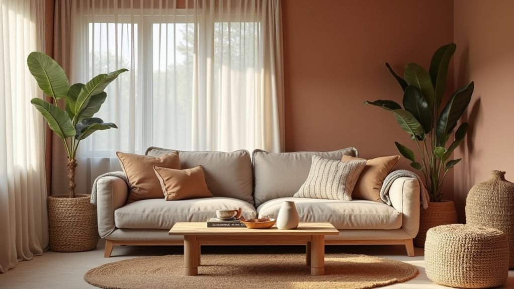
Like a slow exhale at the end of a long day, an earthy, fabric-forward interior settles your space without trying too hard. You start with warm neutrals—clay, sand, taupe—in matte finishes, then layer in sage or olive for that current, nature-led balance. Add linen drapes, woven rugs, and plush cushions to soften light, sound, and edges. The key is keeping it relaxed, not flat—and that’s where the next choices matter.
Pick an Earthy Colour Palette That Relaxes
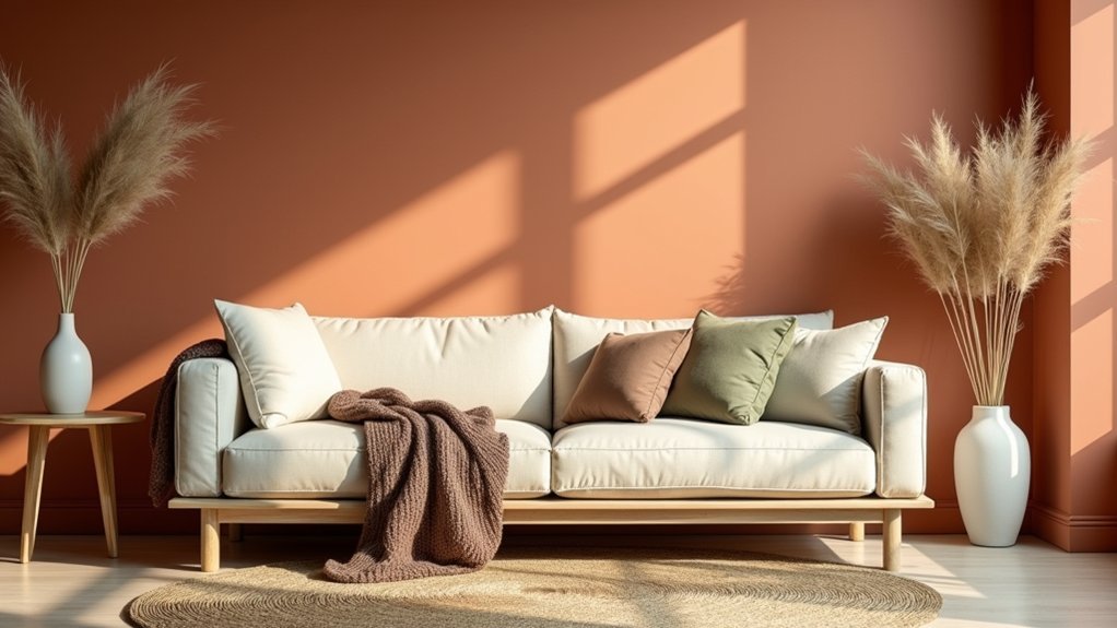
Want an instant way to make your space feel calmer? Pick an earthy colour palette built on clay, sand, oat, taupe, and stone. These grounded shades align with colour psychology: low-saturation hues reduce visual noise and help your rooms read as settled, not busy.
Start with a warm neutral on walls, then layer tonal variations through rugs, ceramics, and artwork so the look feels curated, not matchy. Today’s interior design trends favor “desert modern” and organic minimalism, so choose matte finishes and slightly dusty undertones over bright beige or sharp white.
Test swatches in morning and evening light, and commit to one dominant shade plus two supporting tones for a cohesive, relaxed flow.
Balance Warm Neutrals With Muted Greens
Because warm neutrals can skew flat or overly beige on their own, you’ll get a more relaxed, high-end look by balancing them with muted greens like sage, olive, eucalyptus, or moss. Use greige walls, oat upholstery, and natural timber as your base, then layer green through cushions, throws, and painted cabinetry for a tonal shift that feels calm, not themed.
Keep saturation low so your Earthy palettes read modern and wellness-led. Aim for a 70/30 split: neutrals dominate, muted greens punctuate. Repeat the green at least three times—art, a velvet pillow, and a ceramic lamp—to make it feel intentional.
Choose matte finishes and warm metals to prevent the scheme from turning cold, and sample paint in changing daylight.
Add Terracotta and Clay Without Overpowering
While terracotta and clay bring instant warmth and an artisan edge, they read most relaxed when you treat them as accents, not the main event. Start small: swap one vase, lamp base, or planter into a key sightline, then repeat that tone once more across the room for cohesion.
Choose matte, sunbaked finishes over high-gloss so the colour feels grounded and current. Keep terracotta accents to 10–15% of your visible palette, and let surrounding neutrals do the heavy lifting.
You’ll avoid the “Tuscan overload” effect and stay aligned with today’s natural-minimal trend. Mix in clay decor with simple silhouettes—arched vessels, hand-thrown bowls, ribbed pots—and vary scale instead of adding more pieces.
Choose Soft Fabrics That Feel Instantly Calm
Keep fabric patterns low-contrast: tonal stripes, small checks, or blurred botanicals read relaxed and current.
Build colour harmony by repeating two to three earth-led shades (sand, oat, clay, olive) across key items, then anchoring them with warm neutrals.
Prioritise touch points: a slipcovered sofa, a padded headboard, a generous duvet.
For busy homes, look for stain-resistant finishes and high-rub ratings so softness lasts, not just looks good.
Mix Textures for a Relaxed Interior Look
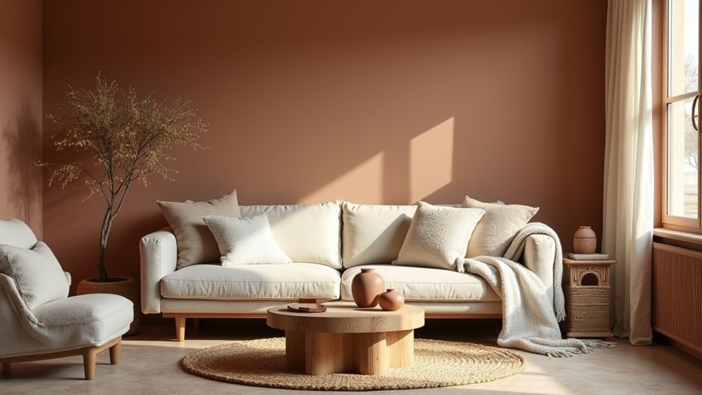
Once you’ve nailed a calm colour story, texture does the heavy lifting that makes a room feel relaxed rather than flat. Balance matte and tactile finishes: limewashed walls, brushed oak, hand-thrown ceramics, and woven jute add quiet depth without visual noise.
Introduce a few refined contrasts to keep the look current. Pair a boucle or linen-upholstered chair with a smooth microcement side table, or mix ribbed glass with blackened metal for a subtle industrial edge. Hang artistic wall art with a textured surface—canvas, plaster, or relief print—so it reads softly in natural light.
Finish with statement lighting in paper, rattan, or alabaster to cast warm, diffused shadows. You’ll get a layered, lounge-worthy feel that still photographs clean and premium.
Layer Cushions and Throws in Earthy Colours
You’ll get an instantly calmer look by layering cushions and throws in warm neutrals—think sand, clay, taupe, and olive—for that current, nature-led palette.
Pair soft textures like washed linen, bouclé, and brushed cotton to add tactile comfort without visual clutter.
Keep it polished by balancing a couple of subtle patterns with solid anchors, so the arrangement feels relaxed but intentional.
Mix Warm Neutral Tones
Because colour temperature sets the emotional tone of a room, warm neutrals—think sand, camel, oat, clay, and soft terracotta—create an instant sense of ease without looking flat.
Use Color psychology to guide your mix: camel adds gentle energy, oat reads clean, and clay grounds the scheme.
Build depth by combining two to three dominant neutrals with one accent, then repeat each shade at least twice across your cushions and throws for a curated, retail-styled look.
Keep undertones consistent—either golden-warm or pink-warm—so everything feels intentional.
When you shop, prioritise fabric durability: choose tightly woven covers, hidden zips, and resilient seams so the palette stays polished through daily lounging, pets, and frequent refreshes.
Pair Soft Fabric Textures
While warm neutrals set your palette, soft texture is what makes it feel lived-in and luxe, so layer cushions and throws in earthy shades like olive, rust, mocha, and dusty taupe.
Start with a tactile base: a heavyweight linen cushion for structure, then add brushed cotton and a slubby wool throw for softness. Aim for varied weaves so the room reads elevated, not flat, and keep fills plump for a premium look.
Prioritise textile durability in high-touch zones—choose tight-knit covers, reinforced seams, and colourfast dyes that won’t fade in sun.
Make fabric maintenance effortless with removable covers, hidden zips, and machine-washable blends. Rotate pieces seasonally to refresh the edit while protecting fibres and keeping your scheme calm.
Balance Patterns And Solids
Even in a calm, earthy palette, pattern is what stops your cushion-and-throw stack from feeling one-note, so mix prints with solids in a controlled ratio. Aim for a 70/30 split: mostly solids in oatmeal, clay, or moss, then add one or two patterned pieces.
For pattern pairing, combine different scales—tiny checks with a bold stripe, or a soft tribal motif with a solid bouclé.
Keep colour coordination tight by repeating one accent tone across items, like rust piping echoed in a throw border. Ground busy prints with matte linen or brushed cotton, and reserve high-pile textures for solids so the look stays premium, not chaotic.
Finish with an oversized knit throw to soften edges and signal relaxed, curated comfort.
Use Rugs to Warm Up Hard Floors
How do you make tile, concrete, or hardwood feel instantly more inviting? You layer in area rugs that add tactile comfort and visible floor warmth without renovations. Choose low-pile wool for a refined, on-trend look that’s easy to vacuum, or go for plush shags in earthy neutrals when you want a softer, lounge-like vibe.
Anchor seating with a rug large enough for front legs to sit on it; this trick makes the room feel calmer and more cohesive. In high-traffic zones, pick flatweaves or performance fibers that resist stains and keep their shape.
Add a rug pad to stop slipping and boost cushioning. Finish by coordinating tones with your wood, leather, and linen for a relaxed, collected feel.
Hang Curtains That Soften Light and Sound
Choose sheer panels or airy linen to filter harsh glare while keeping your space bright and current. Layer them with a heavier drape to cut echo and street noise, giving you that boutique-hotel calm at home.
Mount your rod high and wide so the fabric frames the window, makes ceilings look taller, and maximizes light control.
Choose Sheer Or Linen
When you want a room to feel calmer without a full redesign, sheer or linen curtains deliver an instant upgrade by diffusing harsh daylight and muting echo.
Choose sheer curtains in warm white, sand, or greige to keep views soft while protecting privacy during the day.
For a more grounded look, pick linen with a visible slub; it reads artisanal and aligns with today’s quiet-luxury trend.
Hang panels high and wide so your windows look larger and the fabric falls in clean, relaxed folds.
Aim for a slight break at the floor for a tailored-but-easy finish.
Match curtain texture to other textiles—especially linen upholstery—so the room feels intentional, not piecemeal.
Finish with matte hardware in black, bronze, or brushed nickel.
Layer For Acoustic Comfort
Even if your palette and furniture feel dialed in, a room won’t read truly relaxed until you address sound and glare together. Layer curtains to create a softer, boutique-hotel hush without sacrificing earthy style.
Pair a sheer base with a heavier drape—linen blend, velvet, or recycled wool—to diffuse daylight while adding mass that dampens echo. Choose lined or interlined panels; that extra layer is one of the easiest Soundproofing techniques you can buy off the shelf.
For open-plan rooms, combine drapes with Acoustic panel options disguised as fabric-wrapped art, keeping the look tonal and tactile. You’ll notice calmer conversations, less street noise, and warmer light that flatters clay, oak, and stone finishes.
Mount High And Wide
How do you make a room feel taller, quieter, and more polished without swapping a single piece of furniture? Mount your curtain rod high and wide. Place it 6–10 inches above the frame (or just below the ceiling) and extend it 8–12 inches past each side. You’ll frame the window like architecture, hide awkward trim, and make walls read higher—an easy, on-trend upgrade buyers notice.
Choose lined, softly textured fabrics—linen blends, brushed cotton, or wool-look weaves—to diffuse glare and reduce echo. Hang panels so they kiss the floor for a tailored finish. Keep them open to protect expansive views, then draw them to tame hard light at dusk.
This setup delivers hotel-level calm while still celebrating mountain vistas.
Bring in Wood, Rattan, and Stone Accents
Although paint and textiles set the mood, wood, rattan, and stone accents give a relaxed interior the kind of tactile warmth that feels current and lived-in.
Choose wood accents with visible grain—oak, ash, or walnut—to echo today’s organic-modern trend, and keep finishes matte or lightly oiled for an effortless look.
Add rattan through a pendant, cabinet fronts, or a lounge chair to introduce airy texture without visual weight.
Ground the scheme with stone accents such as a travertine tray, soapstone side table, or a limestone-look lamp base; these read premium and timeless in the market.
Repeat each material twice in the room for cohesion, and mix warm and cool tones so your palette stays balanced, calm, and distinctly elevated.
Keep a Relaxed Interior From Feeling Flat
To keep your relaxed interior from reading one-note, you’ll want to layer tones and textures so the space feels effortless yet intentional.
Add contrast with a few well-placed accents—think inky hardware, sculptural ceramics, or a bold pillow—to sharpen the look without breaking the calm.
Then mix matte and sheen across paint, textiles, and metals to catch light subtly and give the room that current, styled finish.
Layer Tones And Textures
When your palette stays soft and your layout stays simple, you need tone-on-tone variation and tactile contrast to keep the room feeling intentional, not empty. Work within Nature inspired palettes—clay, sand, mushroom, olive—and shift value subtly from walls to upholstery to rugs so each surface reads distinct.
Build depth with Cozy fabric layering: pair a washed-linen sofa with a wool bouclé chair, add a brushed-cotton throw, then finish with a mix of nubby and smooth cushions in the same family.
Bring in matte ceramics, lightly grained oak, and a jute or sisal weave to anchor the scheme without visual noise. Aim for three texture types per zone, repeated twice, so your relaxed look feels curated and current.
Add Contrast With Accents
Where does a calm room get its energy without breaking the mood? You add contrast with accents that feel intentional, not loud. Start with contrast artwork: a charcoal line drawing on warm white, a moody landscape against clay walls, or a black frame on sandy linen. Keep the palette tight and the scale bold, so one piece does the work of three.
Then layer decorative accents with purpose. Swap in a rust cushion, a deep-olive throw, or a smoked-glass vase to sharpen your earthy base. Repeat each accent colour twice—art plus a textile, or a vase plus a book spine—so it reads curated.
Use negative space and clean groupings to keep the room relaxed, and shop for pieces with timeless forms.
Mix Matte And Sheen
Although a relaxed palette leans quiet, you’ll keep it from reading flat by mixing matte and sheen in a controlled way. Start with matte finishes on big surfaces—clay-toned paint, limewash, or a textured wool rug—so the room feels grounded and calm.
Then layer in sheen contrasts where you want a subtle lift: a satin-trim edge, glazed ceramics, burnished brass pulls, or a low-lustre leather ottoman.
Keep the ratio weighted toward matte (about 70/30) to stay soothing, and repeat sheen in two or three touchpoints so it looks intentional. Choose warm, muted reflectivity over high gloss; it reads premium and on-trend without turning harsh.
Test samples under evening lamps to confirm softness.
Frequently Asked Questions
How Can I Make Earthy Interiors Work in a Small Space?
Make earthy interiors work in a small space by sticking to tight color coordination, layering natural texture in compact doses, and choosing slimline furniture. You’ll amplify light with warm neutrals, mirrors, and curated, tactile accents.
What Lighting Temperatures Best Complement Earthy Colours and Soft Fabrics?
Choose warm 2700–3000K color temperature; it flatters earthy tones and soft textiles. Like my client’s clay sofa, it glowed at dusk. Layer dimmable ambient lighting with 3500K task accents to keep spaces trend-ready, premium.
Which Paint Finishes Suit Earthy Palettes in High-Traffic Rooms?
Choose washable matte or eggshell finishes for earthy palettes in high-traffic rooms; they hide scuffs yet clean easily. Use satin on trim for Texture pairing, and keep Colour coordination tight with consistent undertones across walls.
How Do I Adapt Earthy Colours for Renters Without Painting Walls?
Skip paint—rent-friendly earthy tone starts with what you can peel off. Use Decorative wall decals in clay or olive, then add Layered textile accessories: linen throws, jute rugs, terracotta cushions. You’ll shift mood instantly.
What Are Easy Ways to Keep Soft Fabrics Clean With Pets?
Choose washable slipcovers and performance fabrics, and vacuum weekly using rubber tools for pet hair removal. Rotate throws, use lint rollers by doors, and apply enzyme sprays for fabric stain prevention. Keep grooming wipes handy daily.


