
 Andrew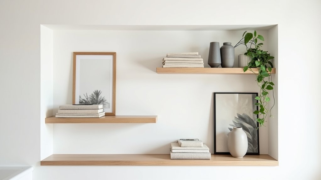
You don’t need more decor—you need stricter editing and a clear plan. Start by clearing each shelf, then put back only what you use or what earns its place visually. Keep a tight color palette, vary heights, and group items in threes so your eye moves calmly instead of bouncing around. Leave real negative space and anchor each shelf with one larger piece. Next, you’ll decide what stays out and what should be hidden.
Edit Your Shelves Before You Style
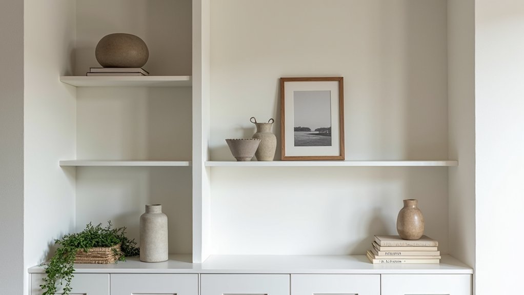
Before you add a single decorative object, clear the shelves completely and decide what actually deserves space. Sort everything into keep, relocate, donate, and trash so you’re not editing in place.
For Shelf organization, group remaining items by purpose: reference books, media, office supplies, display pieces. Set hard limits: one row per category, one backup per consumable, and no duplicates unless you use them weekly.
Check scale and condition; retire chipped frames, faded boxes, and mismatched binders. Put daily-use items at eye level, rarely used items higher or lower, and archive items in labeled containers.
This is clutter reduction with rules, not vibes. Once the shelves hold only useful, intact, relevant items, you’ve earned the right to style.
Pick a Simple Color Palette for Shelving
Now that your shelves only hold items worth keeping, lock in a simple color palette so the display reads as intentional instead of busy. Choose one dominant neutral (white, black, oak, or warm gray) as your base, then add one supporting color and one accent metal or wood tone. That three-part rule creates color harmony without feeling matchy.
Control palette contrast by repeating the same finishes across pieces: group ceramics by glaze, keep frames in one tone, and limit book spines to two colors by turning jackets inward or stacking covers down.
If you want bold, choose one saturated accent (cobalt, rust, emerald) and repeat it two or three times, then stop. Use the shelf backing as a “fourth color” only if it’s consistent.
Balance Scale and Height on Every Shelf
Even if your color palette stays tight, shelves can still look chaotic when every object sits at the same height and visual weight. Fix that by building clear Visual hierarchy: place your tallest piece at the back or to one side, then step down in height across the shelf so the eye moves smoothly.
Anchor each shelf with one substantial item (a large bowl, box, or framed print) and offset it with slimmer pieces to prevent a top-heavy feel. Vary depth, too—push some items back and pull a few forward to create layers without crowding.
Keep Color coordination consistent, but let scale do the organizing. If something feels fussy, swap it for one larger, simpler form.
Use the Rule of Three for Shelf Groupings
Once you’ve established a clear height and scale hierarchy, group smaller pieces so they read as intentional instead of scattered. Use the rule of three: combine one anchor object with two supporting pieces that vary in shape and finish.
Aim for grouping symmetry without making it mirror-perfect; keep visual weight balanced by pairing, say, a rounded vase with a boxy object and a linear accent. Lock the trio together through color coordination—repeat one dominant tone and one subtle accent across all three items.
Keep spacing consistent so each set reads as a unit, not separate clutter. If a shelf feels busy, reduce to one trio and one standalone piece. Repeat the three-item rhythm across shelves to create order and calm.
Layer Shelf Decor Front to Back

To make your shelves look intentional, you’ve got to build depth by layering decor from back to front. Start with taller, flatter pieces like framed art or a tray in the rear.
Then place medium objects in the middle and smaller accents up front so everything reads clearly.
Stagger heights across the shelf to keep the arrangement balanced and prevent a straight, static skyline.
Create Depth With Layers
Because flat arrangements can make a shelf look cluttered or static, build depth by layering your decor from back to front. Start with an anchoring backdrop: a framed print, shallow basket, or large book stood upright against the wall.
Next, place mid-depth pieces slightly forward—small art, a clock, or a lidded box—so edges overlap without hiding key details.
Finish with a few front accents like a compact plant, candle, or sculptural object to create a clear foreground.
Use Texture contrast to separate planes: pair smooth glass with woven rattan or ribbed ceramic.
Add Material variation to keep layers readable: mix wood, metal, paper, and stone.
Leave breathing room between groupings so each layer stays distinct.
Stagger Heights For Balance
Layering gives you depth; staggering heights gives that depth balance so the shelf doesn’t read as one heavy band. Place your tallest pieces at the back or ends—vases, framed art, or a stack of books—then step down in size toward the center and front.
Keep each cluster to three heights: tall, medium, low, so your eye moves smoothly. Use a low tray or bowl up front to “anchor” the group without blocking what’s behind it.
Maintain color coordination by repeating one dominant hue twice per shelf, then add one contrasting accent.
For material mixing, pair glossy ceramic with matte wood, or metal with woven texture. Leave a small gap around each height change to prevent visual noise.
Leave Negative Space to Avoid Visual Noise
After you’ve layered pieces front to back, you’ve got to leave negative space so the shelf doesn’t read as clutter. Build in breathing room by keeping some sections intentionally empty and letting a few key items carry the visual weight.
Use the rule of thirds—group objects in one or two thirds of the shelf and leave the remaining third open—to create a clean, controlled rhythm.
Build In Breathing Room
Even if you’ve got plenty to display, you don’t need to fill every inch of a shelf. Build in breathing room by treating empty space as a design element, not a missed opportunity. When you leave gaps around objects, your eye can rest, and the pieces you keep gain impact.
Aim for a minimalist design mindset: remove anything that doesn’t earn its spot through function, beauty, or meaning. Keep at least a few inches of open area on each shelf, and avoid lining items edge-to-edge.
Vary heights, but don’t stack every surface; one clear zone per shelf reduces visual noise. If you use baskets or boxes, limit them so they don’t become a solid block. This negative space creates visual harmony.
Use The Rule Of Thirds
When you want shelves to look intentional instead of cluttered, use the rule of thirds to control both objects and empty space. Divide each shelf mentally into three zones and commit to leaving one zone mostly open. That negative space keeps your eye moving and prevents visual noise, especially on shorter shelves.
Group items in threes: a tall anchor, a medium piece, and a small accent. Keep the tallest object at one third, not centered, and stagger heights to create rhythm.
Use Color coordination by repeating one hue across all three pieces, then add Texture contrast with one matte, one glossy, and one woven or raw element. If a zone feels busy, remove the smallest item first and restore the open third.
Add Practical Storage That Still Looks Styled
Then add decorative baskets to corral flexible categories—chargers, remote controls, craft supplies, or kids’ items—while keeping access easy.
Stick to two basket sizes max, and repeat the same weave or color to reduce visual noise.
Label discreetly on the inside rim so you don’t introduce extra typography.
Place heavier containers on lower shelves for safety and balance.
Reserve eye-level space for a few open pieces that signal what you actually use daily.
Style Shelves With Books Without the Clutter
Once your storage baskets have the small stuff contained, books can take over as the main visual structure without making the shelves feel crowded. Use a repeatable pattern: group 8–12 books vertically, then stack 3–5 horizontally to create a “platform” for Decorative accessories.
Keep spines in one tight color family, or turn a few around to soften contrast without looking random. Limit book heights within each section so your lines stay clean and intentional.
Leave 20–30% open space per shelf to prevent visual noise. Anchor each shelf with one larger book stack, then add one small object per cluster—nothing more.
Finish with Lighting enhancements: a slim picture light above, or a small lamp on a lower shelf, aimed to wash the spines evenly.
Fix Common Shelf Styling Mistakes Fast
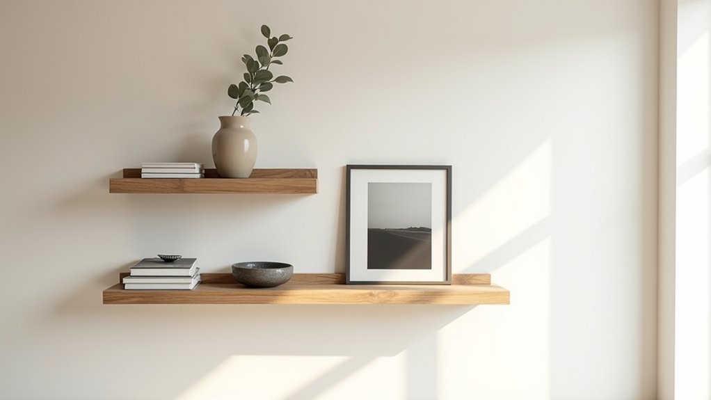
Even if you’ve followed every “rule,” a few predictable missteps can still make shelves look busy, flat, or unfinished. First, fix crowding: remove 20% of items, then group what’s left in threes with breathing room. If everything’s the same height, add a tall anchor (vase, framed art) and step pieces down for a clear silhouette.
Next, tighten Color coordination: limit the palette to two neutrals plus one accent, and repeat that accent at least three times across shelves. If Decorative accessories feel random, corral them on one tray or stack, then pair each small object with a book or box to give it weight.
Finally, kill “floating” decor: push items forward to the shelf edge, and align frames so sightlines feel intentional.
Frequently Asked Questions
How Do I Style Open Shelves in a Home With Small Children?
You style open shelves by placing sturdy, Children friendly decor low and fragile pieces high. Use Safety conscious arrangements: anchored shelves, rounded objects, non-slip mats, and lidded bins. Rotate displays, keep clear edges, and wipeable surfaces.
What Lighting Works Best to Highlight Shelves Without Looking Busy?
You’d think more lights help, but fewer do: use discreet Accent lighting—warm (2700–3000K) LED strips or puck lights on a dimmer. Pair with Layered illumination from ceiling ambient and one task light, so shelves glow, not shout.
How Often Should I Restyle Shelves to Keep Them Feeling Fresh?
Restyle your shelves every 2–3 months, or seasonally, to keep them fresh. Stick to your decor theme and maintain color coordination. Swap one-third of objects, edit duplicates, and reassess spacing and heights.
Should I Use Matching Bins or Mixed Storage Containers on Shelves?
Use Matching bins if you want a calm, unified look; choose Mixed containers if you need flexible sizing. You’ll worry it’ll look messy, but repeat two materials and one color to visually organize.
How Do I Style Shelves Around a TV or Fireplace Without Distraction?
Style shelves around a TV or fireplace by keeping Decorative accents minimal and low-contrast. Use Color coordination with two to three hues, vary heights symmetrically, hide remotes in bins, and leave breathing space.


